 Welcome back to the Top 150 DC Covers of All Time countdown. If you have any questions about what criteria was used to select the covers, you can read the ground rules here in the countdown Prologue. For a complete listing of selections, check out the Top 150 DC Covers Master List. And as always, I strongly recommend clicking on the covers to see larger, better and more detailed versions of these classic covers.
Here's the next soul-crunching batch of awesomeness: 90) Our Fighting Forces #71
October, 1962 -- Jerry Grandenetti and Jack Adler
This unusual cover was actually part of a mini-trend that Grandenetti and Adler put together during their years working on DC's war books; G.I. Combat #69 and #83 are two other examples. But as atmospheric and interesting as those two covers are, this one really takes the cake, due to two tweaks; first, the addition of some color to the jungle canopy gives the image an interesting three dimensionality and second, unlike the other covers, this one features two soldiers instead of one. Two soldiers and, of course, their dog Pooch. Together their worried gazes form the intersection where realism and surrealism meet -- which is exactly where most of the best comics from the Silver Age resided.  89) More Fun Comics #60
October, 1940 -- Bernard Baily
Here's another symbolic (?) image of a giant Spectre looming over some hapless sinners, this one from the character's early days. I really like the tiny figure of the gangster blasting uselessly with his Tommy gun, but the real key to this cover is the big yellow circle behind Spectre, which really helps his frightening form pop from the background. 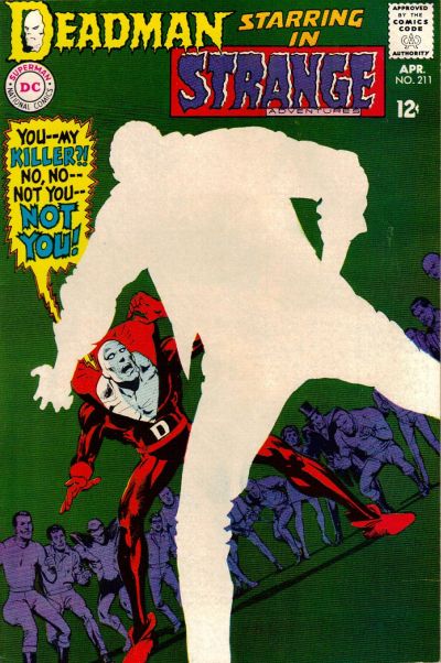 88) Strange Adventures #211
April, 1968 -- Neal Adams
The central mystery of the original Deadman series in Strange Adventures revolved around Boston Brand's search for his own killer. In this issue, he finally finds his killer, but in order to preserve the mystery, Adams (or someone in art editorial) decided to completely blank out the details of the killer on the cover, instead simply depicting him as an expanse of negative space. I can only imagine how much this cover jumped out off the newsstand compared to the rest of the regular stuff from April of 1968. This cover still seems modern even today; for example, here's a very similar design from 2005 that was lauded as one of the best covers of the year when it came out.  87) Tarzan #222
August, 1973 -- Joe Kubert
This cover is interesting for a couple reasons beyond just the usual Kubert excellence. The main thing that's cool about this cover is the way he uses color -- in this case skin tone -- to make both Tarzan and the priestess pop out of the cluttered mass of characters. In that respect it's actually very reminiscent of this infamous Barry Windsor Smith cover from Conan #24, which appeared on my Marvel top cover list. Both of these came out in 1973. I doubt Kubert was influenced by Smith, but it's interesting to think about what kind of shared influences might have been floating around at that time.  86) Jimmy Olsen #53
June, 1961 -- Curt Swan and Stan Kaye
Hey look, it's Jimmy Olsen, only he's been turned into a giant turtle monster that seems to be... eating... a bridge? Plus it has a nice yellow background. I kind of don't think this one needs much further explanation.  85) Brave and the Bold #85
September, 1969 -- Neal Adams
This is a key turning point for both Adams and Green Arrow, as it marks the first issue where Adams debuted the new, revamped Green Arrow that he developed alongside Bob Haney and Denny O'Neil. Out goes the bland green onesie, in comes the Robin Hood inspired ensemble complete with new goatee. Fittingly, Adams features Green Arrow front and center in a dramatic pose to show off the new direction. Some elements of this cover aren't perfect for me -- they appear to be standing on some sort of random grid straight out of Tron and Batman's comparatively bright costume cand cape distract from the central green Arrow figure -- but it's an arresting cover. I also want to give props to the very, very brief design period this came from, which featured the little white band across the top of the cover with the series title. I wish they had played with that more because I really like it.  84) Warlord #27
November, 1979 -- Mike Grell
Our second Grell cover comes from his breakout series, Warlord. Everyone pretty much knows what a huge Warlord fan I am and it was difficult for me to keep from stuffing this list with awesome Grell covers, because seriously, his run of Warlord covers is pretty much unparalleled for me. Instead, we'll have to settle for this example, which deserves to be blown up in order to get a good look at the detail work. This features a dynamic rendition of Warlord himself alongside a finely rendered -- and currently exploding -- background scene. And a bit of Warlord trivia for you: at the time this cover came out, Warlord was reportedly DC's top selling book. Now you can see why.  83) Justice League of America #138
January, 1977 -- Neal Adams
This is an interesting variation on a theme of sorts for Adams; for a few other high profile covers on this list (such as Wonder Woman #179 from a couple days ago), DC employed this reddish sunburst effect to dramatize the cover. Here Adams uses this technique again, only this time he goes with blue instead. One of the most famous Adam Strange covers ever and another example of how this second stringer had far more than his fair share of memorable covers.  82) Flash Comics #37
January, 1943 -- Sheldon Moldoff
Sheldon Moldoff was one of the most detailed artists working during the Golden Age, and this is one of his masterpieces. Yes, there are a couple of curious things about it -- for instance, Hawkman and Hawkgirl appear to be running even though they are in midair, while Modloff always drew their wings to look more like hair than feathers -- but this picture of the Hawks flying amidst a massive swarm of birds is just a great cover. It's too bad I don't have a scan of a better condition copy with sharper colors, but you should really blow this up to take a better look at it.  81) The Atom #36
May, 1968 -- Gil Kane
Kane returns to the list after a brief absence and he does it in a big way, no pun intended. Kane's Atom covers were renowned at the time for their inventiveness and sense of motion and this is arguably the best. It not only features some absolutely prototypical Kane figure work, it also has the cool meta-conceit of one Atom punching the other literally through the cover of the comic to reveal the pages beneath. Which all adds to one thing: it looks cool as hell. Even though I do have to admit I'm not a fan of the lettering work in the word balloon; that could have been done better.
Tomorrow: #80-71 brings you excitement like you've never known. Adam Strange! The Teen Titans! And... the Sea Devils! Be there!
Popular Posts
-
 Welcome back to our sporadic look at comic book weddings. Previously we gazed in slack jawed wonder at a gallery of some of the weirdest wed...
 -
 Welcome back to another installment of Great Moments in Comics, where we take a look at some of the forgotten episodes in comics history tha...
 -
 Welcome back to the Top 150 DC Covers of All Time countdown. If you have any questions about what criteria was used to select the covers, yo...
 -
 Earlier this month I purchased a comic book that most people have never heard of, but which has had an important role in shaping both and po...
 -
 The final issue of J. Michael Straczynski's acclaimed run on Thor has come to an end with the publication of Giant Size Thor Finale #1,...
 -
Welcome back to the Top 150 DC Covers of All Time countdown. If you have any questions about what criteria was used to select the covers, yo...
-
 Who is the greatest supervillain of them all? Is it Lex Luthor? The Joker? Dr. Doom? The Red Skull? Magneto? The Headmen? The Tetrarchs of E...
 -
Issue #0 of the Classic Comics Forum Podcast can be found here! https://drive.google.com/open?id=0B48clexSo9ctSWdaWE9OTk52clE
-
 This is it, true believers! After a week of wallowing in the greatest comic art known to man, we've finally reached the end of our count...
 -
 Welcome to the Master List for the Top 150 DC Covers of All Time. Let's face it: 150 is a lot of covers to keep track of. So we have com...
About The Vault
On his first trip to a comic book store, Vault creator Scott Harris bought Amazing Adventures #6 and Flash #137 for a quarter each. It's all been downhill from there. To contact Scott with complaints or feedback, use this Boom Tube.

All images on this site are copyright and trademark their respective owners. I make no claims on any of them except the claim that a lot of them are totally sweet; they appear here through fair use only.
0 comments:
Post a Comment