
Game Review: Diablo 3

Diablo 3 is out. But is it a game? Or is it the most brilliant money making scam in internet history?

Movie Review: The Avengers

Okay, okay, I posted my Avengers review. Get off my back already, geez.

The Most Important Comic Book You've Never Heard Of

Action Comics #1. Detective Comics #27. Why is All-American Men of War #89 as important as these great comics -- and why have you never heard of it?.

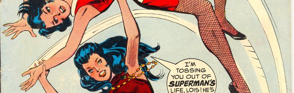
Tales From the Vault: Lois Lane #93

If you thought Superman was a total tool before, you ain't seen nothing yet.

Mass Effect 3: The Official Review

Mass Effect 3 isn't the end of the world, it just portrays it.

Showing posts with label Frank Miller. Show all posts

Monday, August 23, 2010

The Top 150 DC Covers of All Time: #20-11

Welcome back to the Top 150 DC Covers of All Time countdown. If you have any questions about what criteria was used to select the covers, you can read the ground rules here in the countdown Prologue. For a complete listing of selections, check out the Top 150 DC Covers Master List. And as always, I strongly recommend clicking on the covers to see larger, better and more detailed versions of these classic covers.

Let's get on with the top twenty!


20) All-Star Squadron #1
September, 1981 -- Rich Buckler and Dick Giordano

This is a cover that's kind of crept up on people over the years. It's not as splashy as some of the other choices on the list, but when you ask people what their favorite covers are, it comes up surprisingly often. As a result, it's been homaged several times over the years. On a personal note, I think Hawkman looks particularly cool on this cover for some reason. Maybe it's just because you don't normally see him, you know, thinking about stuff, but for whatever reason this is just a memorable, fun image.


19) Showcase #34
October, 1961 -- Gil Kane and Murphy Anderson

As we've seen, Gil Kane turned out great covers for decades, but while he has some earlier entries on our list, to me this is the earliest prototypical Kane cover. The Anderson inks do add a different feel from the later stuff that he inked himself -- the guy trapped in the bottle seems lankier than usual, almost Kubert-esque -- but overall it's just a really fine example of Kane's striking figure work. It's also the first appearance of the Silver Age Atom and for decades has been considered by fans to be one of the best covers of the Silver Age.


18) More Fun Comics #54
April, 1940 -- Bernard Baily

Our final cover to feature the Spectre is the standard by which all other Spectre covers are judged. It has most of the elements that would later be used in other great Spectre books -- the mysterious look, the symbolically (?) gigantic form -- though it doesn't have the black background so many others would use. But this one still stands out above the rest just for sheer epicness, with the biplanes flying at him and the mass of soldiers at his feet. I particularly like the plane he's clutching in his right hand. He just looks like a truly frightening, unearthly power.


17) Strange Adventures #110
November, 1959 -- Gil Kane and Jack Adler

A personal favorite, this cover was actually one of a number of "giant hand" covers DC put out during the 50's across their genre books. but none of the others have the sheer visceral whallop of this cover, thanks in part to the coloring and inking job done by Adler. On a personal note, you know those guys at comic shows who have giant poster versions of famous covers for sale, so you can frame them as art and hang them in your den or office? Of all the covers on this (or the Marvel) list, this is the one I would most like to have a framed print of. It transcends comics for me to become a wonderful artifact of a whole era's aesthetic. Just awesome.


16) Batman #11
July, 1942 -- Fred Ray and Jerry Robinson

For the eleventy-billionth day in a row, we have our requisite Joker cover and as usual, it's backed by a nice black background. At least, what little you can see of it. Most of the cover, obviously -- and most of the reason this cover is so awesome -- is covered in playing cards, the high point of which is, of course, the fact that Robin, Batman and Joker are the face cards and Batman is punching Joker so hard he's knocking him clear off the Joker card. Obviously not the last time we'd see the card motif used for Joker covers -- we've already seen another famous example earlier in the countdown -- but the first and still the best use of this simple but visually arresting concept. Just about perfectly done here.


15) Flash #123
September, 1961 -- Carmine Infantino and Murphy Anderson

One of the most famous covers in comics history, Flash #123 re-introduced the Golden Age Flash to the world of comics after a 12 year absence and in the process revived the entire stable of Golden Age DC character by introducing the concept of Earth-2. Having alternate universes ended up being problematical in the long run, but the idea was never so simply explained as here, thanks to Infantino's depiction of the hapless construction worker calling for help to two different Flashes at the same time. This classic cover has been homaged too many times to count.


14) Batman #404
February, 1987 -- David Mazzucchelli

It's a shame that Mazzuchelli didn't produce more mainstream comics work, because he's arguably one of the best comic artists of the past thirty years. And though his output was small, just about everything he worked on has come to be regarded as a classic of the artform, including this simple but haunting cover, which kicked off Batman: Year One and the post-Crisis Batman reboot. This pretty much gives you the whole origin story in one striking image.


13) Superman #199
August, 1967 -- Carmine Infantino and Murphy Anderson

Speaking of covers that have been homages multiple times, this latest collaboration between Infantino and Anderson is one of the most popular covers (and stories) in DC history. The action really plays to Infantino's strengths, as he goes an excellent job of depicting the two in motion, something he had perfected in his years of working on Flash. The black background, classic Superman logo and "Who is the Fastest Man Alive" text combine to provide energy that just about explodes right off the cover.


12) Batman: The Dark Knight #1
1986 -- Frank Miller

Earlier on the countdown we saw the fourth issue of Miller's acclaimed mini-series and here was are, back again with the first issue. Like the cover for issue 4, this is a testament to design and iconography, as Miller relies on the reader to pretty much know who the silhouette is and what the imagery means without actually spelling it out. It's also hard to look at this cover without almost hearing in your mind the crack of thunder with this lightning bolt, which is an interesting sensation for a purely visual medium; I have to say it's maybe the only cover on this list that made me think in terms of sound as well as sight.


11) Batman #227
December, 1970 -- Neal Adams

You guys have no idea how hard it was for me to keep this out of the top ten. From a pure artistic stand point, this may be Neal Adams' best cover for DC, and it is certainly one of his most famous. It was covers like this that helped return Batman to his dark roots after the years of TV show camp had damaged the character. This cover is also an homage to Detective #31, which appeared earlier on the list. It was a hard decision trying to figure out whether an homage should actually rank higher than the original, but I felt that the iconic status of Detective #31 was based in no small part to how popular and awesome this cover from Adams is. Based on that and just the sheer sweetness of this cover (which includes what I think is the best Batman logo ever) I had to rank this cover higher. One of the best.


Tomorrow: At last, the Top Ten!


Bookmark and Share

Friday, August 13, 2010

The Top 150 DC Covers of All Time: #110-101

Welcome back to the Top 150 DC Covers of All Time countdown. If you have any questions about what criteria was used to select the covers, you can read the ground rules here in the countdown Prologue. For a complete listing of selections, check out the Top 150 DC Covers Master List. And as always, I strongly recommend clicking on the covers to see larger, better and more detailed versions of these classic covers.

Let's see what books round out the first fifty selections.


110) Green Arrow #1
February, 1988 -- Mike Grell

Full disclosure: I love Mike Grell. I could easily do a whole Mike Grell Top 50 Covers list without even breaking a sweat. Between his long runs as cover artist on Warlord and Green Arrow, Grell was probably the most consistently excellent cover artist ever. Unfortunately, I didn't have room to fit in nearly as many of his covers as I would like, but one that did make the cut is this symbolic painting of Green Arrow towering over his new home, Seattle, where he would remain for the rest of Grell's 80 issues on the title. A strong start to a great series.


109) Tomahawk #116
June, 1968 -- Neal Adams and Jack Adler

It's Adams again, this time where you least expect him -- on a western (though, technically, Tomahawk wasn't actually a western either... it's complicated). Aided immeasurably by the inks and color work of Jack Adler, this almost impressionistic image of a Native American bearing down for the kill sets an awesome mood.


108) Girls' Romances #108
April, 1965 -- Gene Colan

This is a solid if typical design from Gene Colan -- weeping woman in foreground, brooding love interest in the background and a nicely placed thought balloon filling some empty space. A fine if unspectacular cover. Except, somebody had the brilliant idea of just coloring the entire thing bright pink. This was perfectly in keeping with the pop art sensibilities of 1965, but wildly innovative for the usually conservative DC romance line. As a result, by being modern, this cover ended up looking well ahead of its time. A striking, memorable cover.


107) G. I. Combat #88
July, 1961 -- Joe Kubert and Jack Adler

This is an interesting example of the effects of text on cover design, which we've been discussing in the comments over the course of this countdown. There's no question that the image is perfectly powerful without any text and would work just fine -- and arguably better -- without the words. However, in this case, the text isn't added to provide information but rather to set a mood. Kubert was very into the ironies of war -- many of his stories were based entirely on this concept -- and while it's unlikely that any soldier would write "Danger Sniper!" on his helmet in giant white letters, the idea that someone with that would then be blasted through the head with what appears to be a 7 million caliber bullet is perfectly in keeping with Kubert's sensibilities. I think because of this, the cover works better with the text, but you could argue it either way.


106) The Witching Hour #1
March, 1969 -- Nick Cardy

Another great cover from the criminally underappreciated Nick Cardy, who still has several more covers to come. I love the mood of this, the composition and the awesome logo; what a great way to launch a new title. However, I did have to drop this significantly down the list for thwo reasons. The first is really just a tiny nitpick; I think they could have colored the figure of the witch on the tower in the foreground just a little more subtly in order to make her pop from the shadows more. The second is a major wtf: if you look to the left edge of the cover, you'll see what appears to be a pillar of buildings going up the side of the cover. I've studied this cover at great length and just have no idea what's going on there, it's completely incongruous with what's happening in the rest of the picture. I mean, M.C. Escher wants to know what's happening here. If I'm missing something obvious, let me know, but this one has me stumped. Luckily, the composition draws your eye away from this and towards the moon, so it's not a fatal flaw, but someone messed something up or else this might be a top 50 cover. As it is, it's still ridiculously cool despite these issues.


105) Supergirl #1
September, 1996 -- Gary Frank and Cam Smith

This cover gets props for a couple reasons, the first and most obvious being that it provides and instant and dramatic introduction to an all-new, modern Supergirl that readers can see at one glance is wildly different from the versions that have come before. it's really a very effective image. From a design perspective, though, it's almost more impressive considering that the logo for the comic, such as it is, appears only as a tiny, half-obscured sticker on Supergirl's skateboard. it's a bold decision, but it only emphasizes how powerful the image is; with just one look at the cover you know exactly who the character is and what the tone of the series will be, making this perhaps one of the strongest first issue covers in DC history.


104) Limited Collectors' Edition C-25
1974 -- Neal Adams

There's not a whole lot to say about this one other than the fact that it's a very simple design -- Batman running across a big red background -- that is executed well enough that this depiction of Batman has become iconic through posters and lunchboxes and whatever. It's just a sharp, cool looking cover.


103) Wonder Woman #1
February, 1987 -- George Perez

You're going to want to blow this one up to really appreciate the intricate Perez detail work on this cover. Plus, most of the time, when this is referenced you only get to the the front panel and not the montage on the back cover as well. This, of course, represented a major overhaul of the entire Wonder Woman mythos, from her history right down to the new logo. One of the best known images of Wonder Woman ever drawn, by one of comics most accomplished artists.


102) Legion of Super-Heroes #294
December, 1982 -- Keith Giffen and Larry Mahlstedt

Fans of the Legion swear by the cover that preceded this one, but for my money, this Giffen image of the Legion bowing in subservience to the giant floating visage of Darkseid is the real classic. This storyline re-introduced Darkseid as a major league villain in the DCU and the swirling vortex of crimson Kirby crackles behind his head really help this cover pop.


101) DC Special #3
June, 1969 -- Neal Adams and Nick Cardy

Here's a great and unusually art pairing: Neal Adams with inking by Nick Cardy, for our second Supergirl cover of the day. The results, as you might expect, are sweet, as DC decides to embrace modernism and feminism and promote its female superheroes for basically the first time ever. The looks on the male superheroes' faces are priceless, as though they can't believe a bunch of skirts are taking over their book, but the real draw is the exuberant Adams Supergirl in the middle. I have to admit that even though I don't like the character or, really, any of her stories, I still have put together a decent collection of bronze age Supergirl comics; there's just something about a well drawn Supergirl cover that works every single time regardless of context or content. A classic as well as a personal choice.


Tomorrow: It's #100-91, featuring Superboy! Norm Breyfogle! And... Muhammad Ali? Buckle in!


Bookmark and Share

Monday, August 9, 2010

The Top 150 DC Covers of All Time: Prologue

Aaaaaand we're back. Yes, a year after rocking the internet world with The Real Top 70 Marvel Covers countdown, The Vault (which means, you know, me) is back with an exponentially larger feature: The Top 150 DC Covers of All Time. Yes, 150 isn't technically exponentially more than 70 -- that would be, like 4900 covers or something -- but the task itself was vastly more difficult, given the fact that DC has been the nation's number one comics publisher for decades and as a result has vastly more covers to go through than Marvel.

But that's exactly why I wanted to take a shot at ranking DC's incredible output. Because, let's face it, DC has put out some of the greatest comic book art of all time and not just in superheroes, but in every possible genre, from mystery to fantasy to romance, from westerns to war to teen humor. It's really an incredible output covering the entire history of comics, featuring art from the greatest artists of all time.

For the next fifteen long-ass days, then, we'll be counting down the Top 150 Covers in DC history as determined by a panel of experts: me, myself and I. Like last time, I did my best to incorporate the views of others in order to make this as fair and balanced a list as possible. In particular, the folks at the Comics Should Be Good blog and the CBR forums deserve recognition, as I've been informed and enlightened by their opinions and expertise on DC comics over the past year while this list has been fulminating. Having said that, unlike my Marvel list, there doesn't seem to be nearly as much consensus or discussion regarding DC covers, meaning that this list is by necessity going to reflect my personal opinions even more than the Marvel list did.

So what makes up a "Top" cover as opposed to a "Best" or "Most Iconic" cover? "Top" is a nicely nebulous term that for my purposes encompasses both of these factors and more, as in some ways I'm comparing apples to oranges when trying to weigh the merits of a superhero cover from 1940 against a sci-fi cover from 1955, a romance cover from 1964 and a horror cover from 1971.

Here, then, are the basic criteria I used for this list, tweaked slightly from when I did the Marvel countdown:

1) Iconography. Some covers have transcended the actual image on the cover or the importance of the story within the comic to become iconic images. This can happen for several reasons – the first appearance of a major characters, the story within the comic, the issue’s collectability or just the beauty of the art itself – but the result is that the cover has become iconic not just to readers of that book, but to comic fans in general and in some instances to the public at large. If I felt a cover was iconic, I gave it more consideration than other covers of similar design or attractiveness that are not as well known.

2) Importance. This ties in to the first criteria, but some stories are so important for one reason or another that the cover image becomes ends up becoming iconic as a result regardless of artistic merit. When researching the choices, there were some covers that I personally didn’t feel were particularly great images or designs but which other comic fans cited over and over again as being a top cover primarily due to the importance of the events in the comic. Many first issues, first appearances or character deaths fall into this category.

3) Popularity. No, it's not the end all and be all, but how popular a cover is directly ties in to some of the other factors here. What makes a cover iconic or memorable, after all, is mainly the visceral response it (and the story inside the book) provokes in the reader. So while I don’t personally love all the covers on the list, I did try to incorporate other opinions and spent a good deal of time reading different messages boards and studying other people's lists (to the limited extent that I could) to see just which covers really are widely popular with the greater fanbase.

4) Art and Design. Some covers aren’t necessarily important or iconic but are so beautifully drawn that they merit inclusion on the strength of the art and design alone (though it should also be noted that some covers have also become iconic solely because of their artistic merit). Of all the criteria for my list, this is the most subjective and there are a handful of covers on my list that are basically personal preference. I tried to be as objective as possible when compiling this list, but art defies objectivity, so this cannot and perhaps should not be avoided. Whenever a cover made it on to my list solely through personal preference it will be noted in my comments. Though this is the last of the four major criteria I'm listing, it's actually the most important to me personally.

In addition, before we get started, there are a few notes specific to this DC list I'd like to mention. Firstly, as I was compiling the list, it became apparent to me that, as I suspected, DC has generally been much more bold and experimental with its designs than Marvel. Part of this, of course, is as a result of Marvel's competition; it should come as no surprise that the two periods with the most creativity in terms of cover design were the early Golden Age, when DC was still competing with a wide array of other publishers for industry dominance, and the Bronze Age -- roughly 1967-1974 -- when DC had to react to Marvel's sudden market surge. As a result, those two periods, particularly the latter, have much greater representation than other, more stagnant design eras (particularly the period from 1946-1967 when DC, safe at the top, locked into an extremely stagnant and boring design aesthetic).

One side effect of this imbalance is the unmistakable dominance of one artist, Neal Adams. Adams has two major things going for him. Firstly, he's justly revered as one of the greatest comic book artists -- particularly in cover design and execution -- ever. And secondly, the period of his greatest output coincided with Carmine Infantino being named art director in 1967. This meant that Adams (and the other artists) essentially had free reign to experiment with design elements, and Adams in particularly was massively prolific, providing dozens of covers for every genre DC was publishing, many with envelope pushing designs. So you'll be seeing a lot of him for those reasons.

On the flip side, there are three things you won't be seeing much of -- or any of -- on this list. The first is modern comics. The main strike against putting them on a list like this (though there are a few that snuck in and I did review most of them) is simply that they are, by definition, new, meaning that it's too early to say just which covers will end up being memorable or iconic once enough time has passed to judge such things, which I generally think takes a good 10-15 years at minimum. This is further complicated in my opinion by modern coloring techniques. While classic four color comic books may have been simplistic compared to today's excellent coloring, those simpler colors also provided the side effect of strengthening and highlighting the composition and design of a cover, whereas today's more subtle coloring techniques do just the opposite, often obscuring and muddying composition in service of muted tones and gradients. The result is that many modern covers, while individually beautiful and expertly rendered, are not particularly memorable; they tend to blend together. Good? Yes. Memorable? Not necessarily.

This actually is not quite as true for DC as it is for Marvel, thanks to the fact that DC is much more experimental with their design work. But that is mostly thanks to their groundbreaking Vertigo imprint, which brings me to the second thing you won't be seeing on this list: Vertigo Comics. I had originally intended to include them; however, after studying their output, I came to the conclusion that Vertigo's aesthetic was so inherently different from almost everything else DC has done that it needed to be considered separately. Comparing apples to oranges is one thing, but this would be like comparing apples to dominoes. At some point I hope to do a separate top cover list for Vertigo so we can look at some of the awesome covers they have been doing over the past 20 years, but for this list, I had to leave them off. [This also caused some issues in terms of titles like Hellblazer and Swamp Thing, which started at DC and switched to Vertigo. it's a little complicated but essentially I decided to leave those titles off the list entirely and treat them as Vertigo in their entirety]

And for similar reasons, I also left off DC's pre-hero covers. While some people seem to be under the impression that early Golden Age art is sub-par, the opposite is true; DC's mid-30's, pre-hero covers feature impeccable art from some of the best magazine illustrators of the time. But they also are completely different in style, tone and substance than anything DC did once superheros came into existence, so I decided to leave them out and look at them closer another day.

But, anyways. That's a whole ton of talk with not nearly as much action. Or Action. And after reviewing 10,000+ covers, I'm ready to actually show some of them now. So without further ado, let's stop the chit-chat and get to it: The Top 150 DC Covers of All Time.


Tomorrow: #150-141. The Justice League of America! Wonder Woman! Zatanna! And more! Be There!

And you can check out The Top 150 DC Covers of All Time Master List here.


Bookmark and Share

Thursday, November 19, 2009

Presidents in Comics: The Reagan Era

Welcome to the third installment in our week-long look at the depiction of American presidents through comics history. If you missed our first two days, you can get yourself up to speed by checking out our overview of the Golden and Silver Ages and how they treated Roosevelt, Kennedy and Johnson, and then take a moment to see how Richard Nixon's stint in office changed the way presidents were portrayed in comics forever. Go on, we'll wait. Dum dem dum.

Okay, back? Good. Because you're in for a treat, as today we're going to look at how another Republican president was treated in four colors: Ronald Reagan.

Now, you're probably thinking, but wait, mister Vault man, what about Ford and Carter? Have no fear, we haven't forgotten them. However, after the firestorm of Nixon's presidency and the explosion of commentary it triggered in the comics world, the terms served by Ford and Carter were relatively benign (with one big exception which we'll get into momentarily). Yes, there were a few cameos here and there; over in Marvel Two-in-One, for instance, cyborg killer Deathlok crossed over from his future alternate reality to assassinate Carter, only to be thwarted when it turned out his target was actually the Impossible Man. And Carter also had a brief cameo in the Super-Villain Team-Up crossover with The Champions when he, along with the rest of the world, was mentally controlled by Dr. Doom's brain gas.

But for the most part, these few appearances were fairly benign in nature. Whether it was the politics of the men or their brief stints in office, for whatever reason they managed to avoid the kind of treatment that plagued Nixon. The most famous appearance by Carter, for example, is his tiny cameo on the cover of Superman vs. Muhammed Ali. That about says it all.

Of course, we did mention that one glaring exception, which is the crowning moment in the fictional comic book life of Gerald R. Ford. It's too bizarre and complicated to fully get into here, but suffice it to say that in the pages of Iron Man, a long, drawn out epic called "The Battle of the Super Villains" took place over the course of more than a year from #69-81 which involved the machinations of a mysterious new villain by the name of Black Lama. At the end, in one of the bigger non sequitors in Marvel history, it was revealed that the Black Lama was actually... an alternate universe version of Gerald Ford. Turns out that King Jerald, who claimed the throne of his homeland when the previous king abdicated (yet another weird Nixon appearance), traveled to our world and was overcome by some sort of mental force that transformed him into a vessel of pure evil. Once he returned to his own reality, though, the madness lifted and Iron Man helped him regain his throne from that world's shady analogue of Vice President Rockefeller, Baron Rockler.

Yeah.

Anyway, other than that bizarre blip, like we were saying, most of the appearances by Ford and Carter were pretty tame, a trend that would swiftly come to an end thanks to the presidency of Ronald Reagan.

That's not to say that Reagan's inauguration returned comics to the days of Nixon; in fact, for the most part, Reagan's two terms in office more closely resembled the Golden Age standard, with the president appearing mostly in cameo roles where he decorated heroes for their work, gave them missions or delivered resounding monologues about the importance of freedom. Or all three. The main difference between the majority of Reagan's appearances and those by, say, Roosevelt or Johnson, is that a new level of political sophistication was added without necessarily becoming political commentary. In 1986's Legends, for instance, the president is shown pragmatically discussing with Superman the effects of Desaad's anti-hero smear campaign, a use that gives the president a fairly sympathetic, classic treatment while also allowing a more nuanced view of the president's role than might have been possible prior to Nixon.

That was pretty much par for the course during the Reagan years, but there were two major exceptions that would prove to be the most influential and buzzed about Ronald Reagan appearances in comics and go on to define his presidency for many comics fans. The first of these appeared in one of the most famous comics of all time, The Dark Knight Returns.

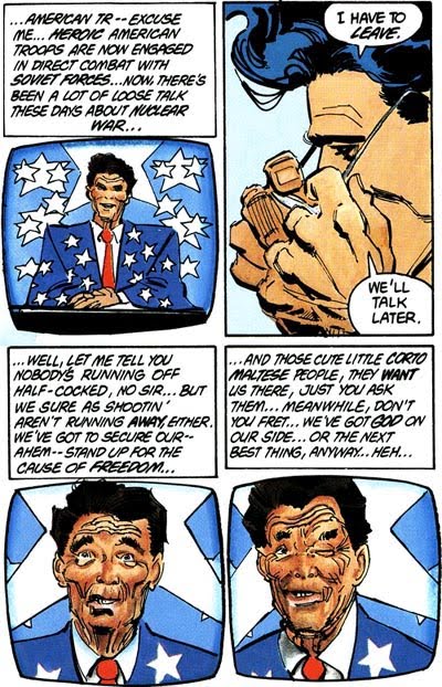
This series, which featured Reagan in a small but prominent role, is particularly interesting in contrast to (or conjunction with) his appearance in Legends, which was running concurrently with The Dark Knight Returns. In both books Reagan and Superman have a close working relationship, with Superman consulting with and deferring to the president in both series. The Dark Knight Returns, however, shows the potential dark side of such a relationship, as it portrays a Superman who has become less of a superhero and more of a government agent, taking orders from Reagan and going on covert missions to support the American power structure rather than the American people. As you might expect, the Reagan in this series is more of an ideological mummer, dressing up in star spangled suits and taking his "aw shucks" brand of senility to the American people on the airwaves to gain support for his military actions. It's a biting commentary on both Reagan's policies and American society in the 80's and has become, along with Captain America's Nixon, probably the most important use of a president in comics.

Somewhat less serious but almost as infamous is Reagan's appearance in Captain America #344. This took place during a long storyline where Captain America was ordered by the government to become an agent under their command (you may sense a bit of a theme here) and instead quit the role of Captain America in protest. The call-back to Englehart's famous Nixon storyline was both obvious and intentional, so it's only fitting that the story would involve the president. For most of the run (which lasted an impressive 19 issues), Reagan had just a bit part; it was shown more than once that Reagan was not aware of what his government commission was doing, with the implication that he probably didn't know much about what any other part of his administration was doing either. This had the double effect of making him seem both incompetent and sympathetic, because he clearly was on Cap's side but just didn't know anything was wrong to begin with, otherwise he would have stopped the whole mess (which eventually he does, in Captain America #350).

That's how Reagan was portrayed through most of the story. In issue #344, however, writer Mark Gruenwald took it out a whole new door as part of the culmination of his arc-within-an-arc about the Serpent Society. In this case, the evil nihilist Viper had seized control from the more pragmatic businessman (and founder of the Society) Sidewinder with the aim of toppling American government by poisoning the District of Columbia water supply. Cap and his friends are too late to stop this, and all of Washington is tainted by the supply. The poison doesn't kill people, though -- it turns them into mindless snake-men.

This led to the classic cover for #344, showing Steve Rogers (in his new identity as The Captain) standing in the Oval Office as a mutated, snake-man version of Ronald Reagan (shown in sinister silhouette) swoops in from the shadows with on goal in mind: to KILL! This great image from Ron Frenz is accompanied by the classic and pointed blurb "The Captain vs. the Deadliest Snake of All!"

In keeping with the tone of the series, the contents of this issue actually portray Reagan in a somewhat more benign fashion. With the populace of the city all turned into mindless snake people, Viper is able to waltz unmolested right into the Oval Office, where she stands around for a while, drinking in the sight of the president reduces to a nearly brainless animal state. Just as she is about to shoot him, however, The Captain shows up. Viper then gets to just about laugh herself hoarse as Cap is attacked by the mindless Reagan. Cap manages to fend him off without injuring him, Viper gets captured and the antidote is administered. Reagan, however, is still not made aware of the fact that it was Steve Rogers who saved the day, as by this time the government commission is in full cover-up mode and doing their best just to eliminate Cap and push it all under the table.

Overall, the Reagan era both returned presidents to their usual role in comics and also established a new standard going forward. While the days of Nixon appearing as a supervillain in every comic under the sun were gone, so too was the feeling that the president should be treated with kid gloves. Instead, a new, more nuanced and informed style of depicting the president emerged, one that allowed for commentary without needing to devolve into outright parody. But those times when it did, of course, invariably proved to be the most memorable.

Tomorrow: So how would seemingly liberal mainstream comic writers deal with a two-term Democrat in the White House? We'll find out tomorrow when we look at the 90's and the Bill Clinton era. See you then.


Bookmark and Share

Tuesday, September 8, 2009

The Real Top 70 Marvel Covers: #50-41

So, you want to know what's number one in the hood, G? Well, first you have to find out what's #50-41 in the hood, which in this case refers to the entire history of Marvel Comics. We're on a quest to determine the real top 70 covers for Marvel, so keep reading and get your awesome shoes on, 'cause it's time to dance. Metaphorically. And for a shortcut, here's the Real Top 70 Marvel Cover Master List.

Oh, and click on the images to make them big and stuff. Let's go!


50) X-Men #190

It's always interesting when artists experiment with cover design, particularly when they incorporate the logo into the image. X-Men #190, which comes in at number 50 on our list, is an excellent example of what can be done when editorial unleashes the artist and allows this kind of experimentation (and we'll be seeing more funky logo work later in the countdown). Drawn by Chris Bachalo, this cover is also just a cool use of Iceman, which is a very rare thing indeed.


49) Captain America #332

Another day, another classic cover from Mike Zeck. This time it's from his great run on Captain America, which produced a number of striking and memorable covers. None of them, however, topped this classic, which began the 19 issue epic by Mark Gruenwald exploring why replacing Steve Rogers with a new Captain America is just a bad plan since the man makes the costume. Given recent events in Cap, this story is more timely than ever; the cover, however, has never gone out of style. P.S. -- Special props for the crying Abraham Lincoln portrait in the corner box.


48) Iron Man #128

In the history of Iron Man, which is close to a half decade at this point, no image is as famous among comic fans or as identified with the character as this cover from Bob Layton. It's just a great change of pace cover -- no action, no fighting, barely even a costume. Indeed, it's really a cover about Tony Stark rather than Iron Man. This image (and the storyline that followed) has become so ingrained in the minds of comic readers that you almost can't think about Iron Man without thinking about this cover. That's not necessarily always a good thing, but it certainly speaks to the power of this image.


47) Marvels #4

The second of our covers from Alex Ross and Marvels brings us another classic comic cover motif -- characters reflected in someone's eyeball. It also is a striking rendition of a classic storyline; in a way, the image is enhanced by the reader's knowledge of what it represents. That sinister grin on Green Goblin's face is a twist of the knife because you know what's going to end up happening to his captive, Gwen Stacy. Ross plays nicely on the reader's familiarity with the subject matter in this classic cover.


46) Thor #337

Speaking of covers that incorporate the logo into the image, here's Thor #337. Perhaps no cover has so successfully used the logo as this introduction of Beta Ray Bill and Walt Simonson to the book. Simonson viscerally shows how he is smashing the book's somewhat stagnant stereotypes by bringing in a shocking new version of Thor and by literally blasting the old logo and corner box to pieces. One look at this cover pretty much tells you everything you need to know about what is inside and what is to come in this title: the old is gone and in its place, anything can happen.


45) New Avengers #1

This cover from David Finch is notable not only because it appears on my list even though my dislike of New Avengers is pretty well known, but also because it's one of the most recent covers I chose. Part of this is because it's simply too soon to tell in most cases just what covers are going to end up being memorable; and part of it has to do with the design philosophy currently in place at Marvel. While pin-up style covers are often memorable and usually attractive, I think Marvel is kind of overusing this these days to the point where many of the covers are almost indistinguishable from each other. For instance, try randomly rearranging the covers for the entire current Thor series and see if you can tell which cover goes to which story. I bet you can't really tell (other than the Iron Man appearance). This inherently limits the iconic potential of the covers. They may all be beautiful, but is one beautiful cover more memorable than the next? New Avengers #1 managed to avoid this -- and also managed to become iconic despite the fact that there were several variant editions as well, another factor in reducing the iconic potential and basic memorability of today's covers (after all, if there are five versions for each issue, how can any one image becomes synonymous with the story?). For those reasons, and for being the top image identified with the industry's best selling title for the past half a decade, New Avengers #1 gets the nod. Plus, it honestly is a cool cover.


44) Daredevil #182

This is probably one of my more controversial decisions on the list (though there's one later that may be a bit more debatable). It's certainly true that the preceding issue, Daredevil #181, is a more famous cover (it's the yellow one with Elektra and Bullseye jumping at each other). However, in terms of the actual image itself, I've always found this cover to be the more powerful cover. #181 is the tease -- what will happen? But #182 is the heartbreak that follows -- it's the real power of the story. Elektra's death is only important because of how it affects Daredevil, after all, and that is perfectly and beautifully spelled out right here. Art, of course, by Frank Miller.


43) Fantastic Four #1

Okay, so you may be wondering why the cover that launched the Marvel Universe is ranked this low. Its historical importance cannot be denied or overstated, its true, and artist Jack Kirby does a fine job of both introducing the characters and providing a visual bridge for readers from the monster books Atlas had been putting out to this new superhero aesthetic. In other words, it's a solid, effective cover. However, it's not a great cover by any stretch (no pun intended); the greatness is in the history, not in the art. Because of this it should be included, but I can't really put it any higher, because there are other books that are both important and feature better art and design. Still a classic, though.


42) Captain America #113

This is one of my all-time favorite covers. Drawn by Jim Steranko during his all too brief but still legendary stint on Captain America, this cover has one of the most perfectly realized moods in cover history. From the monument to the grieving form of Rick Jones prostrate on the ground to the skulking figures of the Hydra squad closing in on him, every detail is perfect, especially the creep moon shining dully above. The green background chosen for the night sky is pitch perfect, which you can pretty much say about every aspect of this cover. A masterpiece.


41) Avengers Annual #2

One of the resources I consulted when figuring out my rankings was Wizard. Don't laugh too hard. Even though Wizard is usually worthless, they do occasionally have a good idea, and probably the best of these is their ongoing feature where they ask contemporary artists to list and discuss their ten favorite covers of all time. Some covers just come up over and over again (most of them are on this list) and one of the most often cited covers is this classic from John Buscema. Here Buscema is again expermienting with the heroes fighting each other on a black background, but this time he's got two entire teams facing off. There may be more famous team vs. team covers, like X-Men #100 or Avengers #141, but none quite have the same level of dynamism as this great example from the legedary Buscema.


Tomorrow: The Silver Age takes over, with a batch of classic images sure to drive you mad with the power of art. Get in your way back machine, because Merry Marvel is on the March!


Bookmark and Share