Game Review: Diablo 3

Diablo 3 is out. But is it a game? Or is it the most brilliant money making scam in internet history?

Movie Review: The Avengers

Okay, okay, I posted my Avengers review. Get off my back already, geez.

The Most Important Comic Book You've Never Heard Of

Action Comics #1. Detective Comics #27. Why is All-American Men of War #89 as important as these great comics -- and why have you never heard of it?.

Tales From the Vault: Lois Lane #93

If you thought Superman was a total tool before, you ain't seen nothing yet.

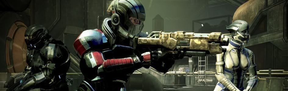
Mass Effect 3: The Official Review

Mass Effect 3 isn't the end of the world, it just portrays it.

Showing posts with label Bob Kane. Show all posts

Wednesday, August 25, 2010

The Top 150 DC Covers of All Time: The Top Ten

Welcome back to the Top 150 DC Covers of All Time countdown. If you have any questions about what criteria was used to select the covers, you can read the ground rules here in the countdown Prologue. For a complete listing of selections, check out the Top 150 DC Covers Master List. And as always, I strongly recommend clicking on the covers to see larger, better and more detailed versions of these classic covers.

Now, here it is, at long last: the top ten covers in DC history.


10) Watchmen #1
September, 1986 -- Dave Gibbons

I originally planned to place this cover at number two on this list -- yes, even above the cover that is actually at number two. But then something happened that changed my mind -- I actually looked at this cover again. Not that it isn't a great cover, because it is -- it introduces the great design for Watchmen, with the big bold logo down the side and the iconic smiley face button and it is, of course, expertly rendered by Dave Gibbons in an almost abstract composition. No, the problem wasn't the cover but what the cover isn't -- it isn't this, more famous cover from the Watchmen trade paperback. Which presented two issues for me. Firstly, the TPB cover is much better known simply because far more people have read Watchmen in TPB than in the original comic form; and secondly, the TPB cover is also superior artistically. It's just a masterpiece of minimalist design. So as great as this actual cover for Watchmen is, I couldn't justify it any higher than tenth because it's really just a prototype for the justly revered TPB cover.


9) Justice League of America #21
August, 1963 -- Mike Sekowsky and Murphy Anderson

The first crossover between the Earth-1 Justice League and the Earth-2 Justice Society also provides one of the great covers in DC history, courtesy of Mike Sekowsky and, of course, Murphy Anderson, who seemed to have inked just about every awesome cover DC had during the Silver Age. I love the design of this cover; there's just something fun and almost joyful about the Justice Society coming out of that cloud, even though this issue likely caused thousands of kids to horrify their parents by attempting their own Earth-2 seances. This issue also, of course, was the first of DC's many "crisis" stories, as well as the first in the annual JSA-JLA crossovers, a tradition that would last for over two decades. Just a fun, nostalgic cover for any fan of superhero comics.


8) Justice League #1
May, 1987 -- Kevin Maguire and Terry Austin

Since its publication over twenty years ago, this shot of the JLA looking up at the viewer with folded arms and grumpy expressions has been one of the most homages and parodied covers in all of comics. I would have sworn that this logo wouldn't have worked if I hadn't seen this cover, but the art and the unusual perspective are so powerful that they elevate everything, even that unfortunate font.


7) Crisis on Infinite Earths #7
October, 1985 -- George Perez

Both the DC and Marvel countdowns were filled with Pieta-style covers (such as the famous "Robin Dies at Dawn" Batman cover we looked at last week), but they all pale in comparison to this timeless cover by the master of detail, George Perez. While his covers can occasionally be accused of being too cluttered, this time around he find the perfect balance, mixing the powerful and unforgettable central figure of the weeping Superman holding his slain cousin with the background detail of the gathered heroes of the DCU looking on in mourning. Even that wonky DC 50th Anniversary banner can't detract from this indelible cover.


6) Green Lantern / Green Arrow #76
April, 1970 -- Neal Adams

While the Silver Age belonged to Marvel, in many ways the Bronze Age belonged to DC, as the company pushed the boundaries both in terms of design as well as innovation in storytelling and developing new characters. The DC revival and the Bronze Age in general -- an entire era of comics, really -- is summed up and represented in full by this renowned cover from Neal Adams. If you want to get really deep, the shattering of Green Lantern's lantern symbolizes the way DC itself was smashing their own traditions and cliches to try and form a new paradigm through stories like this one, the first of their "relevancy" comics; a symbolism, by the way, that I think Adams completely intended. Add in the fact that it's just really cool looking; brings back the classic (and much better) Green Lantern logo from the golden age; and features the new Green Arrow in full badass mode and there's no wonder that this is one of the best known comics of the past 40 years.


5) Star Spangled War Stories #138
May, 1968 -- Joe Kubert

I know I've said this before, but this time I'm serious: you have to click on this and see it at a larger resolution. As we've discussed before, War comics aren't exactly the most popular genre these days, so you may not be familiar with this cover; and though it's the first issue of Enemy Ace's ongoing series, to be honest there's not a whole heck of a lot of historical significance to it considering that series lasted less than 15 issues. Here's what is significant: this is probably the best war cover in comics history due to the fact that it's also, in my opinion and the opinion of many others, the best cover Joe Kubert ever did. Considering he's one of the greatest legends in comics history, that's saying something.l But most of all, it's just beautiful in design, detail and execution. Look at it and you'll see why it makes the top five.


4) Superman #14
February, 1942 -- Fred Ray

I've featured this cover before basically just because I wanted to look at it, so everyone pretty much knows how much I love it. It's not just one of the best and most famous war covers to come out of the Golden Age of comics, it's also an enduring and iconic image of Superman, directly associating him with America through the symbolism of the shield and eagle. What's more American than Superman, right? but when this came out, he had only been around for four years. It's covers like this -- or rather, it was this cover -- that really began to seal that link in people's minds. And it just is so damn nice to look at.


3) Batman #9
March, 1942 -- Jack Burnley

What's interesting about this cover is that just about everyone -- not just people in comics, I mean everyone in general -- is familiar with this image, it's just that most people don't know where it came from. Not that this cover has been reproduced all that much in broader media or anything, but the idea of Batman and Robin that people have in their minds was essentially generated here; this image has been so influential that it's become pervasive to the point of almost losing the origin. Basically, this is Batman and Robin. And beyond all that, of course, is the fact that's is a really sharp, effective and beautiful cover in its own right. It's fitting that it goes back to back with Superman #14, because the two covers share a DNA; not the first appearances of the character, maybe, but the genesis of the legends.


2) Detective Comics #27
May, 1939 -- Bob Kane

I actually struggled with the placement of this cover, strange as that sounds. There are so many classic, iconic and awesome Batman covers (as we've seen just over the last two days) that it's hard to pin all the importance on a cover like this one, even if it is his first appearance. On top of that, nearly every element of this cover was swiped by Bob Kane from other sources and sort of stuck together in this (admittedly very effective) pastiche. So I moved it around several times. IN the end, though, despite my reservations, I decided I couldn't justify putting this cover anywhere other than at number two (though if I had decided to make TPB covers eligible, that Watchmen cover might have snuck in). But, here it is, probably right where it belongs after all.


1) Action Comics #1
June, 1938 -- Joe Shuster

Could there ever be any other choice?


Next: What?! Where's All-Star Superman #1?! OMG!!! NOOOOOO!! Okay, calm down, dude. Relax. In a couple days I'll be posting my inevitable follow-up where I explain why stuff like All-Star Superman #1 and Justice League of America #1 didn't make the list and I'll also answer any questions or concerns that have cropped up during the countdown. So if you think I blew anything or left any important covers off, let me know now. Who knows -- I might even change something if you're persuasive enough.


Bookmark and Share

Thursday, August 19, 2010

The Top 150 DC Covers of All Time: #40-31

Welcome back to the Top 150 DC Covers of All Time countdown. If you have any questions about what criteria was used to select the covers, you can read the ground rules here in the countdown Prologue. For a complete listing of selections, check out the Top 150 DC Covers Master List. And as always, I strongly recommend clicking on the covers to see larger, better and more detailed versions of these classic covers.

Here we go.


40) Green Lantern / Green Arrow #86
September, 1971 -- Neal Adams

Over the last couple of days we've discussed some of the more effective word and thought balloons on covers; this cover, like those, probably has one of the most famous lines of dialogue on a cover ever in green Arrow's shocked "My ward is a Junkie!" This cover as a whole is still one of the most shocking covers in mainstream comics and, as usual, it was expertly drawn by Neal Adams.


39) Blackhawk #259
June, 1983 -- Howard Chaykin

Okay, it's all been building to this: and by all, I mean to two previous black and yellow war covers. First we looked at a cover that showed lighting inside a plane, where the yellow and black was used to provide dramatic lighting to a person. Then we looked at a cover that showed a low angle, looking up at some planes passing overheaed. Now we have the culmination. It's obvious here that Chaykin was very familiar with the classic covers from his predecessors and he puts it all together, from the angle to the people, with every bit of extraneous coloring removed so that this is reduced to its most elemental form. I also quite like the unusual decision to make the logo transparent. A personal favorite.


38) Detective Comics #31
September, 1939 -- Bob Kane

One of the all-time classic covers from the Golden Age, this cover, which was the third Batman cover, went a long way towards defining the mood of the whole series. It's justly famous but I had quite a hard time figuring out where to rank this because part of the reason it is so iconic is that it was homaged -- and the homage is perhaps better known and better done than the original. So some of the glory for this cover is reflected glory. Which cover, therefore, gets the credit? Both were great so they both got high rankings, but in this case, despite the added historical significance of this early cover, I decided to give the higher spot to the homage. Not sure that was the right call, but there it is.


37) Teen Titans #14
April, 1968 -- Nick Cardy

This cover is pretty much perfect in every respect. I love the angle, I love the shadows casting Robin's face into despair, I love the effect used to create the ghostly look to the other Titans, I love the lettering and I love the black border. This is basically a perfect cover and more proof, as we needed more at this point, that Nick Cardy is a wildly underappreciated comic book genius. The only real question for me was whether or not this cover should have been even higher. What do you think?


36) Batman #251
September, 1973 -- Neal Adams

Another day, another great Joker cover. Unlike the others, though, this one doesn't have a black background, but it does have a symbolically gigantic Joker striding like a behemoth through Gotham with Batman tied to an oversized playing card. The cover that really re-established Joker as a major villain for a new generation.


35) Wonder Woman #25
December, 2008 -- Aaron Lopresti

One of the very few covers from the last decade to make the list, this pick is a partially a personal choice. But this image has also been quickly embraced by much of the Wonder Woman community as well for the same reasons that I think it is one of the best depictions of Wonder Woman ever. The Rockwell-esque spirit of this cover, with the little girls emulating Wonder Woman, cuts right to the heart of the character and why Wonder Woman is an icon to millions in a way that is almost totally unconnected to her actual comic books. Making her into a poster (and I appreciate the logo and issue number being part of the cover as well) just helps emphasize her status as an icon to girls and women around the world in a very literal way. I may be wrong, but I think this is a cover that will have long term staying power for Wonder Woman enthusiasts.


34) Green Lantern #1
Fall, 1941 -- Howard Purcell

This lands in the top 40 for a few reasons, most of which have to do with how little this cover looks like anything else from its time period. It has a sharp black background and, of course, the excellent classic Green Lantern logo. And the big green power battery forms a nice backdrop for the unusually fluid action scene of Green Lantern fighting a guy with a scimitar. Indeed, this looks so little like the other books DC was putting out at the time I'm inclined to think some tomfoolery was at work in its design. But however this came about, it's a striking and bold cover to launch Green Lantern. And, as a bonus, it's also one of the few golden age Green Lantern covers not ruined by the presence of Doiby Dickles.


33) The Question #1
February, 1987 -- Bill Sienkiewicz

This ultra-modern cover from Sienkiewicz is a model of design. It's got a great logo and a great series of frames and mini-frames formed by the white lines. The topper for me, of course is the big smoke ? in the middle of the cover, forming a frame-within-a-frame for the Question's noggin. Some of the fashion on display may be a little outdated now, but the rest of this piece is timeless.


32) G. I. Combat #87
May, 1961 -- Russ Heath and Jack Adler

This was another tricky cover for me to slot correctly. As has been pointed out, war comics haven't really been popular since, well, before the Vietnam War, really. Correspondingly, I did drop most of the war covers back to the bottom half of the list. But once upon a time, back when war covers were popular, this was considered one of the best war covers ever and was singled out in fan voting at the time as being their favorite of the bunch. Because of this, it still has a high profile among fans of war comics but, due to the genre's unpopularity now, not much beyond that. Regardless, it's still a strong image whether you're into war comics or not and so deserves a decent ranking, but I moved this up and down the list several times before finally settling here. I'm still not sure this is quite the right spot, but what are you going to do, right?


31) Detective Comics #38
April, 1940 - Bob Kane and Jerry Robinson

No explanation is probably necessary for this choice, but for those who maybe aren't familiar with it, I'll point out the obvious and the not so obvious: this cover, which marks the first appearance of Robin, was so popular that it became a tradition at DC for many many years to debut big new characters by having them jump through paper hoops.


Tomorrow: #30-21 brings you everything you could ever have imagined in comics... and so much more.


Bookmark and Share

Thursday, November 12, 2009

Tales From the Vault: DETECTIVE COMICS #348

It's almost the weekend and that means just one thing: it's time for another juicy, random back issue. What better way to kick things off, after all, than with a relaxing jaunt through comics history? Up for consideration today: Detective Comics #348, which came out just a few short weeks before the Batman TV show hit the air and became a massive pop sensation. So what was the series like before camp took over? Let's find out...

...together!


Details: The story is titled "Birdmaster of BEDLAM!" and has a cover date of February, 1966. There aren't any credits, but Bob Kane's signature appears on the splash page. Not in a "created by" credit, but just his signature. The chances of this actually being Bob Kane art are about zilch, as he had a studio of schleps working under him by this point; he was, however, a big enough name to push the writer credit entirely out of the book, so there’s no mention of who wrote this story. Stay classy, Bob Kane.

Synopsis: Right off the bat (no pun intended, of course), a blurb on the splash page explains the plot of the story. In your face, decompression. Seems Birdmaster is a guy who collects all manner of rare flying animals, and so he needs Batman and Robin to finish his collection because of their codenames. Well, why not. Makes as much sense as The Collector did.

Our story really starts, though, in an airport, where the new Miss USA is kissing Bruce Wayne goodbye with the comment that the best part of winning the title is "a date with Bruce Wayne and Dick Grayson". Uh, that sounds like a really awkward date. Robin is watching them embrace with the comment "Wish I were old enough to rate a blast-off like that!" which... okay, I'm not going to rehash all the old Batman and Robin gay jokes, but really, they are totally asking for it with stuff like this.

Then she does end up giving Robin a peck on the cheek and he responds with this:

"Yeoww! All systems are go! Go! GO!"

Seriously, you cannot make this stuff up. Maybe Bob Kane can, but nobody else could.

Anyway, the chick, Mona, takes off (in a plane, not in a metaphor), but suddenly her plane crashes. Batman and Robin rush to the scene and put out the fire with their capes -- that's pretty good work -- but discover they are too late: Mona is dead. Wow, I have to say I didn't expect that. Batman and Robin investigate, and the pilot says that the plane was attacked by a flock of birds. This is backed up by maydays suddenly coming in from all the planes in the air, which are also being attacked by birds.

The FAA immediately grounds all planes, but Batman hops in his jet and he and Robin take off to try and lure the Birdmaster out of hiding. Of course, they get attacked, to which Robin responds by saying "Seems like he's trying to give us the bird!" Er... did the Code people even read this comic?

Anyway, the birds attack the Batplane, and Batman blasts a bunch of them with rockets, but a flock of "medic birds" swoop in and carry the injured ones to safety. Heck, even birds have universal health care! C'mon, Congress!

Batman and Robin just can't shake the birds, though, so they set the Batplane to autopilot and bail out. This temporarily throws the birds off the trail, but when the duo lands, they find themselves face to face with a group of men wearing bird costumes. Yes, henchmen of... THE BIRDMASTER! A fight ensues, but then, well.... let's let Batman explain:

"Look out, Robin! They've got NOSE-GUNS! They're shooting knockout gas at us!"

Yes, the bird people all snort toxic gas in unison and take out the dynamic duo, because they apparently work for Cheech and Chong. Then a bunch of birds swoop down with a giant net and cart them off to a giant cliffside citadel. Once there, they are deposited in a cage, captives of... BIRDMASTER! Birdmaster turns out to be a bearded goof wearing a turban, and he has his condors and vultures attack Batman and Robin for sport.

Cleverly, though, there's no top to the cage, so the duo just climb over the side and clobber all the henchmen. Fearing for his life, Birdmaster flees. He jumps in a plane and take off, and of course, his birds, trained to wreck any plane they see, smash into it and he dies in a fiery crash. Yes, it’s the rare double-dumbass oversight combo by the villain. And you were wondering why he never caught on.

THE END!

Next up is the backup story, an Elongated Man tale called "My Wife, the Witch!". Ralph and Sue are tooling around on vacation or something and they come to an inn. The innkeeper doesn't have their reservations, though, so the only room he has available is the haunted Room 13. They take it and have no troubles, but the next morning, while Ralph is getting his car looked at, Sue finds a tome of spells. Most of the spells are missing, but she tries a couple and they work.

Of course, she just has to call the garage and tell Ralph to buy a bunch of witchcraft supplies so she can try some more spells. Now, that doesn't seem like a great idea, but they are adventurers I guess. Truns out the town they are in is a town famous for witchcraft; yes, they are in the town of "Malem". I can't think of any reason why they didn't just call it Salem, but whatever.

While he's buying the goods, some thieves show up with pistols to rob the place. Ralph fights them, and he's apparently famous enough that they recognize him right away; even the good folks in far off Malem have heard of the Elongated Man.

Anyway, during the fight, one of them drops his weapon to surrender, but the gun is rigged to explode with gas when it hits the floor. Obviously. However, E-Man stretches his nose out the window to get fresh air, I kid you not, and defeats them all.

Back at the inn, Ralph shows up with the goodies and suddenly smells a mystery. He deduces that the ringleader of the gang purposely left out the book of spells so that Ralph would go to the local witch museum to buy supplies. He then sent his men there to get captured so he could keep all the loot himself. Why do these people always come up with the most convoluted plots imaginable? You’d think that Gardner Fox was writing th… oh.

Sure enough, E-Man is correct: that was the big plan. The ringleader is the innkeeper, and he rigged up the room so that Sue would think her spells were working. However, Ralph jumps him before he can make his getaway. Once again, the guy has a special gas gun, this time with a gas that blinds Ralph. Ralph, however, stretches himself so that his arms and legs cover the whole room, so that if the guy moves at all, Ralph will feel it and grab him. And... yep, it works.

THE END!


Extras: There’s not a lot going on outside the main stories (or inside them either), but it seems that the readers also were getting a little tired of the Bob Kane figurehead act, as several of them have written in to ask who wrote different issues; editorial responds by teasing them and asking them to guess who wrote the Birdmaster story. But you can’t fool us, DC; we know Kane would hobble anyone who dared reveal the truth.


My Grades: BIRDMASTER! gets a C- for being awful; a B+ for actually having the unexpected nuts to kill that chick at the beginning (sorry, Gail Simone!); and an A+ for slipping subtext past the censors. The Elongated Man story gets a B- for having Elongated Man in it, which is almost always a guarantee of coma-inducing boredom.


Bookmark and Share