Game Review: Diablo 3

Diablo 3 is out. But is it a game? Or is it the most brilliant money making scam in internet history?

Movie Review: The Avengers

Okay, okay, I posted my Avengers review. Get off my back already, geez.

The Most Important Comic Book You've Never Heard Of

Action Comics #1. Detective Comics #27. Why is All-American Men of War #89 as important as these great comics -- and why have you never heard of it?.

Tales From the Vault: Lois Lane #93

If you thought Superman was a total tool before, you ain't seen nothing yet.

Mass Effect 3: The Official Review

Mass Effect 3 isn't the end of the world, it just portrays it.

Tuesday, September 28, 2010

Breaking News: Bob Harras Named DC EiC

DC announced yet another stunning bit of news today, this time taking pretty much everyone off guard with their out-of-nowhere announcement that former Marvel Comics Editor-in-Chief Bob Harras has been named DC's new Editor-in-Chief.

Exactly what this means, mind you, is a bit unclear; DC hasn't actually had an Editor-in-Chief for years. But with the recent restructuring of the company, with Dan DiDio and Jim Lee named co-publishers, the elimination of Wildstorm from the face of the Earth and the move of everything non-comics to Los Angeles, it's clear that DC has some sort of game plan they are finally implementing.

The fact that that plan leans heavily on Bob Harras, however, is still a shocker on some levels. For the past several years, after all, Harras (who was once also writer on Avengers) has been toiling in near-obscurity as the editor in charge of DC's collections department -- collections as in trades and reprints, not as in billing. That position is about as far as you could get from Harras's glory days when he presided over Marvel Comics from 1995-2000.

Just how fans are going to react the news is almost as unclear as just what Harras's role will be in relation to DiDio and Lee. Many fans remember Harras as editor most for the whole Heroes Reborn fiasco (and I use the word fiasco in terms of fan reaction, not in terms of sales, as by all accounts the event did what it was intended to do). Harras is also somewhat unfairly held responsible by many fans for the many troubles Marvel had during this time period, when the company went bankrupt. That really stemmed from things way over his head, but the trickle down effect -- and the poor quality of many of the titles he inherited during the whole 90's Image/speculation era -- have led many fans to forget all the highlights of Harras's tenure in favor of the lowlights.

Among those highlights, of course, are not just the Heroes Return relaunches, which led to such fan favorite teams as Kurt Busiek and George Perez on Avengers, but also the greenlighting of Busiek's Thunderbolts series, the creation of the Ultimate universe and the launching of Marvel Knights, which eventually ushered in the era of his successor, Marvel Knights honcho Joe Quesada.

On balance, then, Harras's hits probably outweigh his misses as he helped return Marvel to a firm creative foundation after the near disaster of their bankruptcy. How his style or experience will effect DC, with their increasingly elaborate editorial structure -- in addition to DiDio and Lee, DC also has Geoff Johns on board in the official capacity of Chief Creative Officer, whatever the hell that is -- is a big question mark.

One thing is for sure though: DC is definitely shaking things up. And judging by their sales and the vocal complaints of the internet minority, anyway, that can't be anything but a good thing. Here's hoping Harras can straighten things out.

For more on the promotion of Harras, here's Newsarama with the press release and CBR with industry reaction.


Bookmark and Share

Tuesday, September 21, 2010

Two Weeks in Geek: September 12-25

Yes, it's a special Double-Sized, 80 Page Giant version of Week in Geek. Unfortunately, last week's geekery was eaten by the technical problems I was having with the website, but now that everything is up and running again I've combined those entries with the all-new batch from last week to bring you a massive data dump of geekdom sure to blow your face off like a pocket atom bomb. Which, in this specific case only, is a good thing.

Here it is, your Two Weeks in Geek:


September 13 -- Noomi Rapace to Play Girl With the Houndstooth Cap in ‘Sherlock Holmes 2′: Yes, the lady from those Swedish thriller movies is going to be in Sherlock Holmes 2. She'll have to be better cast than Rachel McAdams, who was ridiculous.

September 13 -- ‘Resident Evil’ Shows No Signs of Moving Out Any Time Soon: Yes, there is going to be a fifth Resident Evil movie. No, I don't know why.

September 15 -- Ryan Reynolds: Green Lantern Costume Like Wearing Alec Baldwin: A bit of fluff about superhero movies from the man with two trillion abs.

September 16 -- Jon Hamm Tells Kelly Ripa ‘I Could Be Your Man of Steel’: The rumor going around is that Jon Hamm is going to play Superman. He's probably 5-10 years too old, but they might be able to make it work if it's an Earth 2 story. Oh, we could only be so lucky.

September 20 -- Renner Talks ‘Avengers’ Fashion: Is Purple the New Black?: What's wrong with purple, exactly? For some reason Renner doesn't want Hawkeye to wear purple. That's nuts.

September 21 -- True Story: Winona Ryder Joins Tim Burton on ‘Frankenweenie’: Somewhere, The Cure is weeping a single blood tear into their goblet.

September 21 -- Owls, Srsly? Ya, Rly: A 3D animated movie about Nazi owls and the few feathered heroes who oppose them? Say... WTF?

September 21 -- An ‘Inception’ Video Game? We Must Be Dreaming!: I hope to god this is an MMO, because that would just be the tits.

September 22 -- Godzilla’s Climbing in Your City, He’s Snatching Your People Up: The producers of the new Hollywood version of Godzilla swear that they will be faithful to the original. Yeah, sure.

September 22 -- ‘X-Men: First Class’ Threatens to Drain World’s Dwindling Mutant Supply: Unless Caliban is in this, I'm not going to go see it. Or unless I am bored when it comes out.

September 22 -- Scarlett Johansson Spins a Solo Web For ‘Black Widow’: Yes, Marvel is in talks to do a solo Black Widow movie. This could be... okay... maybe. But only if they figure out how to have both Ivan and Winter Soldier in it.

September 24 -- Emma Stone as Black Cat in ‘Spider-Man?’ Sounds Purr-fect: Okay, this Black Cat rumor is mostly one I myself made up, but it sort of fits with what the studio is saying, so I'm going to remain hopeful.

September 24 -- Kate Beckinsale Is Going To Suck in ‘Underworld 4…’ Blood, That Is: No. Just... no.


Bookmark and Share

Breaking News: DC Shuts Down Wildstorm, Zuda

DC Comics announced in a press release earlier today that they are shutting down Jim Lee's Wildstorm imprint and absorbing the characters into DC. The move was one of several major changes announced, including the end of Zuda Comics as well as the relocation of numerous jobs from DC's New York headquarters to Los Angeles.

Wildstorm, of course, has been one of the premiere imprints in comics since it debuted nearly 20 years ago as part of the Image launch in 1991. Under Lee's guidance, Wildstorm published acclaimed and groundbreaking titles by creators such as Warren Ellis and Alan Moore, including influential series such as Gen13, WildCATS, Planetary, The Authority, Tom Strong, DV8, Ex Machina and Top Ten. For the last few years it has also been the publisher for Kurt Busiek's Astro City.

Considering Lee is now a co-publisher of DC itself, the move isn't necessarily a complete shock, but it's still a bit of a surprise that leaves many questions unanswered, particularly the future of the many Wildstorm characters. Will they now be folded into the DCU itself? Will some of them be DCU characters and others go to Vertigo to maintain their feel? And what will happen to creator owned works like Astro City (Busiek has said on his facebook page that he hasn't heard anything from DC yet)?

The decision to dump Wildstorm came at the same time as DC's decision to dump Zuda Comics, which as you know (thanks to my reviews last year) was a digital comics experiment that for a while provided a unique platform for new creators. That's gone and in it's place is... a nebulous something that DC is working on instead; their press release indicated that Lee will now be heading the new digital initiative, but what form that's going to take is unclear.

Also unclear is how the decision to move a number of jobs from New York to Los Angeles will affect DC. One has to assume that this is a result of last year's move by parent company Time/Warner to consolidate the management of DC under the Warner Bros. entertainment banner.

In short, pretty much nothing is certain as a result of these moves other than the fact that Wildstorm and Zuda no longer exist. It appears on first blush, though, that these moves all are part of a larger plan to focus on and leverage DC's core properties -- which unfortunately may come at the expense of their more innovative and creative smaller branches.

We'll see.


p.s. The DC website where they posted the press release seems to have crashed but I'll try to get a link to it when I can. Here's an interview with DC's head honcho Diane Nelson, though, where she sort of talks about the changes.


Bookmark and Share

Monday, September 20, 2010

New Comic Cavalcade: Thor, Avengers and More

Hey kids, welcome back to another edition of New Comic Cavalcade. It's been quite a while since I reviewed new issues, so as you can imagine, I now have a metric ton of comics to read. So this time around we're going to go back to the ultra short, two-sentence reviews for all the new comics. Ready? Okay, here we go:


Astro City Special: Silver Agent #2
A surprisingly satisfying ending to the story we've been waiting for for more than a decade. If it is an ending -- I'm not what those final panels mean, exactly, but they sure were interesting. My Grade: A-.


Thor #613 and 614
I was very skeptical of this storyline when it started, but it ended up being a lot better than it had any right to be. I still don't have any idea why this Kelda characters exists, though, despite the writer's attempts to justify her. My Grade: A-.


Thor: For Asgard #1 and 2
At this point Thor is basically appearing in five series at once; this six-issue story may seem limited, but since another limited series or one shot will replace it when it ends, they might as just make a second ongoing called "Tales of Asgard" or "Journey Into Mystery." It's kind of annoying, but this story -- though I can't figure out if it's even in continuity or an imaginary tale -- has some great art, so I'll probably stick with it. My Grades: B+.


Hawkeye and Mockingbird #4
I appreciate the return of the once-heroic Phantom Rider at the end of this issue and I hope the storyline ends with the character finally being redeemed after 20 years in the dead rapist doghouse. But I still find the return of Mockingbird to be both contrived and unnecessary, as is the presence of whoever this new Dominic Fortune is. My Grade: B-.


Avengers: The Children's Crusade #2
Yet again, Alan Heinberg's version of the Young Avengers turns out to be, inexplicably, the best Avengers series Marvel is putting out. I'm actually enjoying the search for Scarlet Witch despite the fact that I hate the character -- and enjoying this series despite things like the totally unnecessary Wolverine cover. My Grade: A.


Avengers #4
Could be worse; the art is good and Bendis is doing a great job of writing the future Avengers kids as a bunch of complete shits, so if they die at the end of this story I'll enjoy that at least. But let's get one thing straight right now: Kang isn't afraid of Hulk in any part, future or alternate reality. Period. My Grade: B-.


Secret Avengers #4
The first arc ends solidly, but overall this story was a little bit of a letdown, particularly Brubaker's somewhat weird version of Valkyrie and the apparently pointless inclusion of Nova. I am very intrigued by the Nick Fury stuff, though, and Brubaker has earned my trust, so I'll be sticking with it. My Grade: B-.


Steve Rogers: Super Soldier #3
Not sure what the point of this series is, really, but for me it's Brubaker's weakest Captain America work ever. The Cap-reverts-to-a-weakling plot didn't help, as it pointed out how much Eaglesham's artwork looks like Al Milgrom's from the dreadful Gruenwald storyline with the same plot, which, by the way, is not a compliment. My Grade: C-.


Captain America #609
Now this is more like it, as Brubaker is still hitting on all cylinders with his return of evil Zemo storyline. I even am kinda/sorta enjoying the Nomad backup. My Grade: A.


Jonah Hex #59
Another solid story, but one of the very few in the series that seems to suffer from being a single issue story instead of an extended or multi-part arc. The big setup introducing the Grey Ghost is interesting but doesn't have any room to develop before it's forced to suddenly end amidst a different, random plot. My Grade: B.


Bookmark and Share

Wednesday, September 15, 2010

Technical Difficulties

As you can see, the design for the site has changed. This is a temporary fix caused by technical difficulties that completed exploded my old design. Once I can get everything figured out I hope to premiere an all-new, all-awesome design, but this should work for a little bit at least well enough to make the site readable.

Sorry for any difficulties this may have caused.

Tuesday, September 14, 2010

In-House Ad Showcase

Hey guys. You know, reprints are kind of cool in that they allow you to get access to stories that you may otherwise never be able to find or afford and with today's trade market driving the industry, the time has never been better to pick up collections of material you've been curious about. But there are things lost when you get a collection or a reprint; the lettercolumn, the advertising, really the whole flavor of the comic itself. And maybe the biggest casualty for comics fans is In-House Ads.

These, of course, are the advertisements that companies would put in their comics promoting over titles or characters in their line. Often these are little more than just a small shot of a cover with maybe a few lines of text. But just as frequently companies would whip up promotional art, graphics and other weirdness that in some cases is better or more interesting than the comics themselves. And sadly, few of these house ads have been given nearly as much attention over the years as they deserve, because really, some of these are real gems.

With that in mind, today we kick off another semi-irregular feature here at The Vault, In-House Ad Showcase, where we'll dig up some of the more interesting in-house ads from the last 75+ years of comics so that fans can get another (or often first) look at some of these rarities and gems.

And what better way to start than with the ad that inspired this feature, a beautiful full-page splash from Jack Kirby advertising Avengers #3? I found this gem in the pages of Sgt. Fury #4, and it's a masterpiece. It's also a bit of a historical curiosity due to the fact that it features Iron Man in his all-gold armor, despite the fact that he actually was wearing his new red-and-gold armor in Avengers #3. Obivously the ad was done before the armor was redesigned. Anyway, here it is:


Next up is an early gem from another classic artist, Barry Windsor-Smith, who made a name for himself in the industry with his gorgeously detailed work on Conan the Barbarian and its related titles. Check out this great in-house ad that I found somewhere on the internet (sorry, I forget where, so my apologies to the hapless dupe I stole it from):


And we'll end with a more traditional style in-house ad, this time from DC. It's got the basic in-house ad style of presenting an entire cover along with some hype text, but what's unusual here is, well, just how awesome the cover and overall effect are. This ad is from 1973, but it's so effective that I just had to guy buy this comic as soon as I saw it -- over 35 years later. And I'm betting that you'll be on ebay with five minutes of seeing this ad yourself. Here you go:


Yes, it's a romance comic about a nun! And the guy hitting on her is a tortured Vietnam Vet trying to deal with PTSD. Don't worry, though, if you can't find your own copy (which I strongly recommend getting), some kind soul has uploaded it to the internet so you can read the whole thing here.


Next time: More Kirby! More early Marvel! More of everything you love about comics!


Bookmark and Share

Saturday, September 11, 2010

The Week in Geek: September 5-11

I know, I know -- you guys want comics! You want to delve into those longboxes face first and come up smelling like old newsprint. I promise, y'all. Soon, very soon. For now, though, I've still been too swamped with actual work to get much writing done on the Vault side of things.

Still, some of those articles are pretty cool and a couple of them are even comic book related. So here' the latest Week in geek so you can get caught up in everything important in the world. And don't worry, comics are coming shortly.


September 6 -- Queue It Up: ‘A Scanner Darkly’ Blu-ray: Dude, I haven't actually seen this movie for some reason, but if you haven't read the book I highly recommend it. And whatever you do, make sure you see this / read this sober. You've been warned.

September 8 -- What If Clint Eastwood Were Superman?: Shocker of the week: Clint Eastwood was once a comic geek! So what classic Golden Age hero did he obsessively collect? Here's a hint: the answer makes beautiful, perfect sense.

September 9 -- ‘Hobo With a Shotgun:’ Brother, Can You Spare a 20-Gauge?: I think the title pretty much says it all, right? The fact that is stars Rutger Hauer is genius; frankly, I can't see how the movie could live up to this trailer.


September 9 -- Nikita Has Company When It Comes to Butt-Kicking Ladies: A video rundown of some of the asskickingest ladies in film and TV history. I totally should have included Gwen Cooper from Torchwood. Darnit, Hindsight Lad!

September 9 -- ‘Captain America’ Proves He’s an Easy Rider: Photos of the stunt double on Captain America riding a tricked out Army motorcycle. Pretty cool.

September 9 -- Stephen King’s ‘The Dark Tower:’ Just How Much of This Is There?: This is one of the craziest deals I've ever heard of, as Ron Howard is going to adapt the "Dark Tower" serious into a film trilogy and a TV series simultaneously. Good luck with that bro. Seriously.


Bookmark and Share

Tuesday, September 7, 2010

The Week in Geek: August 29 - September 4

Whew. It's been a long week, but we here at The Vault have finally shaken off our post-DC Cover List doldrums and are back in the metaphorical saddle, ready to rock your socks off with amazing and astonishing new content. But before we do anything crazy like that, we thought we'd re-purpose some of last week's most interesting articles so that we can spend another few minutes in bed.

Get ready for another Week in Geek!


August 29 -- Comic Book Characters Still Available for Movies: The title pretty much says it all here. I was happy that I got to plus some of my favorite, lesser-known titles, though.

August 30 -- Queue It Up: ‘The Evil Dead’ Limited Edition Blu-Ray: If you're looking for straight laughs, I say skip this one and watch Evil Dead 2 instead. But this one certainly has more serious horror in it.

August 30 -- Talkin’ Bout Willis: Sly Wants Bruce As ‘Expendables II’ Villain Yes, there is going to be a sequel to The Expendables. No, you cannot blame me; I voted against it.

September 1 -- 'The Amazing Race' Season 17 Teams Announced: Maybe this doesn't count as geek, I dunno. But it is the best show in the history of television, so that has to count for something, right?

September 1 -- The Rock Rolling Into ‘Center of the Earth 2′: This, on the other hand, is definitely geek even though it's also a complete crap sandwich. Now who would rather watch Amazing Race? Yeah, that's what i thought.

September 3 -- Excellent! 'Bill & Ted 3' Still in the Works: Hard to believe, but it's true: the guy that played Bill is still alive. Good for him!

September 3 -- New ‘THX 1138′ Blu-ray is L33t: That's my headline, ya'll. Pretty awesome, right? This movie, of course, was the last one Lucas did that didn't ruin your childhood by simple fact that he made it before you were born.


Bookmark and Share

Wednesday, August 25, 2010

The Top 150 DC Covers of All Time: The Top Ten

Welcome back to the Top 150 DC Covers of All Time countdown. If you have any questions about what criteria was used to select the covers, you can read the ground rules here in the countdown Prologue. For a complete listing of selections, check out the Top 150 DC Covers Master List. And as always, I strongly recommend clicking on the covers to see larger, better and more detailed versions of these classic covers.

Now, here it is, at long last: the top ten covers in DC history.


10) Watchmen #1
September, 1986 -- Dave Gibbons

I originally planned to place this cover at number two on this list -- yes, even above the cover that is actually at number two. But then something happened that changed my mind -- I actually looked at this cover again. Not that it isn't a great cover, because it is -- it introduces the great design for Watchmen, with the big bold logo down the side and the iconic smiley face button and it is, of course, expertly rendered by Dave Gibbons in an almost abstract composition. No, the problem wasn't the cover but what the cover isn't -- it isn't this, more famous cover from the Watchmen trade paperback. Which presented two issues for me. Firstly, the TPB cover is much better known simply because far more people have read Watchmen in TPB than in the original comic form; and secondly, the TPB cover is also superior artistically. It's just a masterpiece of minimalist design. So as great as this actual cover for Watchmen is, I couldn't justify it any higher than tenth because it's really just a prototype for the justly revered TPB cover.


9) Justice League of America #21
August, 1963 -- Mike Sekowsky and Murphy Anderson

The first crossover between the Earth-1 Justice League and the Earth-2 Justice Society also provides one of the great covers in DC history, courtesy of Mike Sekowsky and, of course, Murphy Anderson, who seemed to have inked just about every awesome cover DC had during the Silver Age. I love the design of this cover; there's just something fun and almost joyful about the Justice Society coming out of that cloud, even though this issue likely caused thousands of kids to horrify their parents by attempting their own Earth-2 seances. This issue also, of course, was the first of DC's many "crisis" stories, as well as the first in the annual JSA-JLA crossovers, a tradition that would last for over two decades. Just a fun, nostalgic cover for any fan of superhero comics.


8) Justice League #1
May, 1987 -- Kevin Maguire and Terry Austin

Since its publication over twenty years ago, this shot of the JLA looking up at the viewer with folded arms and grumpy expressions has been one of the most homages and parodied covers in all of comics. I would have sworn that this logo wouldn't have worked if I hadn't seen this cover, but the art and the unusual perspective are so powerful that they elevate everything, even that unfortunate font.


7) Crisis on Infinite Earths #7
October, 1985 -- George Perez

Both the DC and Marvel countdowns were filled with Pieta-style covers (such as the famous "Robin Dies at Dawn" Batman cover we looked at last week), but they all pale in comparison to this timeless cover by the master of detail, George Perez. While his covers can occasionally be accused of being too cluttered, this time around he find the perfect balance, mixing the powerful and unforgettable central figure of the weeping Superman holding his slain cousin with the background detail of the gathered heroes of the DCU looking on in mourning. Even that wonky DC 50th Anniversary banner can't detract from this indelible cover.


6) Green Lantern / Green Arrow #76
April, 1970 -- Neal Adams

While the Silver Age belonged to Marvel, in many ways the Bronze Age belonged to DC, as the company pushed the boundaries both in terms of design as well as innovation in storytelling and developing new characters. The DC revival and the Bronze Age in general -- an entire era of comics, really -- is summed up and represented in full by this renowned cover from Neal Adams. If you want to get really deep, the shattering of Green Lantern's lantern symbolizes the way DC itself was smashing their own traditions and cliches to try and form a new paradigm through stories like this one, the first of their "relevancy" comics; a symbolism, by the way, that I think Adams completely intended. Add in the fact that it's just really cool looking; brings back the classic (and much better) Green Lantern logo from the golden age; and features the new Green Arrow in full badass mode and there's no wonder that this is one of the best known comics of the past 40 years.


5) Star Spangled War Stories #138
May, 1968 -- Joe Kubert

I know I've said this before, but this time I'm serious: you have to click on this and see it at a larger resolution. As we've discussed before, War comics aren't exactly the most popular genre these days, so you may not be familiar with this cover; and though it's the first issue of Enemy Ace's ongoing series, to be honest there's not a whole heck of a lot of historical significance to it considering that series lasted less than 15 issues. Here's what is significant: this is probably the best war cover in comics history due to the fact that it's also, in my opinion and the opinion of many others, the best cover Joe Kubert ever did. Considering he's one of the greatest legends in comics history, that's saying something.l But most of all, it's just beautiful in design, detail and execution. Look at it and you'll see why it makes the top five.


4) Superman #14
February, 1942 -- Fred Ray

I've featured this cover before basically just because I wanted to look at it, so everyone pretty much knows how much I love it. It's not just one of the best and most famous war covers to come out of the Golden Age of comics, it's also an enduring and iconic image of Superman, directly associating him with America through the symbolism of the shield and eagle. What's more American than Superman, right? but when this came out, he had only been around for four years. It's covers like this -- or rather, it was this cover -- that really began to seal that link in people's minds. And it just is so damn nice to look at.


3) Batman #9
March, 1942 -- Jack Burnley

What's interesting about this cover is that just about everyone -- not just people in comics, I mean everyone in general -- is familiar with this image, it's just that most people don't know where it came from. Not that this cover has been reproduced all that much in broader media or anything, but the idea of Batman and Robin that people have in their minds was essentially generated here; this image has been so influential that it's become pervasive to the point of almost losing the origin. Basically, this is Batman and Robin. And beyond all that, of course, is the fact that's is a really sharp, effective and beautiful cover in its own right. It's fitting that it goes back to back with Superman #14, because the two covers share a DNA; not the first appearances of the character, maybe, but the genesis of the legends.


2) Detective Comics #27
May, 1939 -- Bob Kane

I actually struggled with the placement of this cover, strange as that sounds. There are so many classic, iconic and awesome Batman covers (as we've seen just over the last two days) that it's hard to pin all the importance on a cover like this one, even if it is his first appearance. On top of that, nearly every element of this cover was swiped by Bob Kane from other sources and sort of stuck together in this (admittedly very effective) pastiche. So I moved it around several times. IN the end, though, despite my reservations, I decided I couldn't justify putting this cover anywhere other than at number two (though if I had decided to make TPB covers eligible, that Watchmen cover might have snuck in). But, here it is, probably right where it belongs after all.


1) Action Comics #1
June, 1938 -- Joe Shuster

Could there ever be any other choice?


Next: What?! Where's All-Star Superman #1?! OMG!!! NOOOOOO!! Okay, calm down, dude. Relax. In a couple days I'll be posting my inevitable follow-up where I explain why stuff like All-Star Superman #1 and Justice League of America #1 didn't make the list and I'll also answer any questions or concerns that have cropped up during the countdown. So if you think I blew anything or left any important covers off, let me know now. Who knows -- I might even change something if you're persuasive enough.


Bookmark and Share

Monday, August 23, 2010

The Top 150 DC Covers of All Time: #20-11

Welcome back to the Top 150 DC Covers of All Time countdown. If you have any questions about what criteria was used to select the covers, you can read the ground rules here in the countdown Prologue. For a complete listing of selections, check out the Top 150 DC Covers Master List. And as always, I strongly recommend clicking on the covers to see larger, better and more detailed versions of these classic covers.

Let's get on with the top twenty!


20) All-Star Squadron #1
September, 1981 -- Rich Buckler and Dick Giordano

This is a cover that's kind of crept up on people over the years. It's not as splashy as some of the other choices on the list, but when you ask people what their favorite covers are, it comes up surprisingly often. As a result, it's been homaged several times over the years. On a personal note, I think Hawkman looks particularly cool on this cover for some reason. Maybe it's just because you don't normally see him, you know, thinking about stuff, but for whatever reason this is just a memorable, fun image.


19) Showcase #34
October, 1961 -- Gil Kane and Murphy Anderson

As we've seen, Gil Kane turned out great covers for decades, but while he has some earlier entries on our list, to me this is the earliest prototypical Kane cover. The Anderson inks do add a different feel from the later stuff that he inked himself -- the guy trapped in the bottle seems lankier than usual, almost Kubert-esque -- but overall it's just a really fine example of Kane's striking figure work. It's also the first appearance of the Silver Age Atom and for decades has been considered by fans to be one of the best covers of the Silver Age.


18) More Fun Comics #54
April, 1940 -- Bernard Baily

Our final cover to feature the Spectre is the standard by which all other Spectre covers are judged. It has most of the elements that would later be used in other great Spectre books -- the mysterious look, the symbolically (?) gigantic form -- though it doesn't have the black background so many others would use. But this one still stands out above the rest just for sheer epicness, with the biplanes flying at him and the mass of soldiers at his feet. I particularly like the plane he's clutching in his right hand. He just looks like a truly frightening, unearthly power.


17) Strange Adventures #110
November, 1959 -- Gil Kane and Jack Adler

A personal favorite, this cover was actually one of a number of "giant hand" covers DC put out during the 50's across their genre books. but none of the others have the sheer visceral whallop of this cover, thanks in part to the coloring and inking job done by Adler. On a personal note, you know those guys at comic shows who have giant poster versions of famous covers for sale, so you can frame them as art and hang them in your den or office? Of all the covers on this (or the Marvel) list, this is the one I would most like to have a framed print of. It transcends comics for me to become a wonderful artifact of a whole era's aesthetic. Just awesome.


16) Batman #11
July, 1942 -- Fred Ray and Jerry Robinson

For the eleventy-billionth day in a row, we have our requisite Joker cover and as usual, it's backed by a nice black background. At least, what little you can see of it. Most of the cover, obviously -- and most of the reason this cover is so awesome -- is covered in playing cards, the high point of which is, of course, the fact that Robin, Batman and Joker are the face cards and Batman is punching Joker so hard he's knocking him clear off the Joker card. Obviously not the last time we'd see the card motif used for Joker covers -- we've already seen another famous example earlier in the countdown -- but the first and still the best use of this simple but visually arresting concept. Just about perfectly done here.


15) Flash #123
September, 1961 -- Carmine Infantino and Murphy Anderson

One of the most famous covers in comics history, Flash #123 re-introduced the Golden Age Flash to the world of comics after a 12 year absence and in the process revived the entire stable of Golden Age DC character by introducing the concept of Earth-2. Having alternate universes ended up being problematical in the long run, but the idea was never so simply explained as here, thanks to Infantino's depiction of the hapless construction worker calling for help to two different Flashes at the same time. This classic cover has been homaged too many times to count.


14) Batman #404
February, 1987 -- David Mazzucchelli

It's a shame that Mazzuchelli didn't produce more mainstream comics work, because he's arguably one of the best comic artists of the past thirty years. And though his output was small, just about everything he worked on has come to be regarded as a classic of the artform, including this simple but haunting cover, which kicked off Batman: Year One and the post-Crisis Batman reboot. This pretty much gives you the whole origin story in one striking image.


13) Superman #199
August, 1967 -- Carmine Infantino and Murphy Anderson

Speaking of covers that have been homages multiple times, this latest collaboration between Infantino and Anderson is one of the most popular covers (and stories) in DC history. The action really plays to Infantino's strengths, as he goes an excellent job of depicting the two in motion, something he had perfected in his years of working on Flash. The black background, classic Superman logo and "Who is the Fastest Man Alive" text combine to provide energy that just about explodes right off the cover.


12) Batman: The Dark Knight #1
1986 -- Frank Miller

Earlier on the countdown we saw the fourth issue of Miller's acclaimed mini-series and here was are, back again with the first issue. Like the cover for issue 4, this is a testament to design and iconography, as Miller relies on the reader to pretty much know who the silhouette is and what the imagery means without actually spelling it out. It's also hard to look at this cover without almost hearing in your mind the crack of thunder with this lightning bolt, which is an interesting sensation for a purely visual medium; I have to say it's maybe the only cover on this list that made me think in terms of sound as well as sight.


11) Batman #227
December, 1970 -- Neal Adams

You guys have no idea how hard it was for me to keep this out of the top ten. From a pure artistic stand point, this may be Neal Adams' best cover for DC, and it is certainly one of his most famous. It was covers like this that helped return Batman to his dark roots after the years of TV show camp had damaged the character. This cover is also an homage to Detective #31, which appeared earlier on the list. It was a hard decision trying to figure out whether an homage should actually rank higher than the original, but I felt that the iconic status of Detective #31 was based in no small part to how popular and awesome this cover from Adams is. Based on that and just the sheer sweetness of this cover (which includes what I think is the best Batman logo ever) I had to rank this cover higher. One of the best.


Tomorrow: At last, the Top Ten!


Bookmark and Share

Friday, August 20, 2010

The Top 150 DC Covers of All Time: #30-21

Welcome back to the Top 150 DC Covers of All Time countdown. If you have any questions about what criteria was used to select the covers, you can read the ground rules here in the countdown Prologue. For a complete listing of selections, check out the Top 150 DC Covers Master List. And as always, I strongly recommend clicking on the covers to see larger, better and more detailed versions of these classic covers.

We're getting close to the top now!


30) The Shadow #1
November, 1973 -- Michael Kaluta

Pretty much every one of Kaluta's gorgeously rendered covers for this short-lived Shadow series could have ended up on the countdown. The fact that this series didn't succeed says to me that the character is played out, because the presentation was just unbeatable. Of the lot, though, this first issue re-introduction is my favorite. if this couldn't sell comics, then it might be time to pack it in.


29) Flash #163
August, 1966 -- Carmine Infantino and Joe Giella

Over the last few days we've talked quite a bit about effective word balloons, as well as to a lesser extent text in general on a cover. But this one, which combines word balloons with graphic design to create an unforgettable combination, takes the cake. Quick question: can anyone think of cover dialogue from a Marvel book that is as memorable as the DC balloons from the last few days? I can come up with one or two examples maybe, but that's about it.


28) New Gods #1
March, 1971 -- Jack Kirby and Don Heck

Kirby's DC stuff may not have ever really caught on with the fans, and his writing is debatable, but he still knew how to knock his first issue covers out of the park. Everything about this cover seems to come from a different time period from anything else on the stands in 1971. From the font to just the sheer size of the logo, the way the blurbs are laid out along the top, the photo style background -- this was just beyond modern and even now looks like it comes, not from our past, but from some alternate comics publishing world that was never quite realized. One of the best examples of how DC was pushing the envelope design-wise during that time.


27) House of Mystery #174
June, 1968 -- Nick Cardy

In 1968, DC decided to suddenly revive -- or create out of thin air -- their entire line of horror comics. I'm not entirely sure what this was in response to -- perhaps a loosening of the comics code restrictions? -- but as a result, they relaunched both House of Secrets and House of Mystery as horror books. This cover from Nick Cardy marks the first issue of this new horror era, complete with a great new logo and the memorable tag line above the logo. I usually love half-frame covers like this, though this is one instance where we debatably lose something by not seeing the top of the door. Maybe that's just me. But, anyway, top of door or not, this is an awesomely evocative image that provides the perfect graphic representation of the way DC was inviting kids to try their new horror books starting with this issue. Perfect concept, perfectly executed.


26) Showcase #79
December, 1968 -- Jay Scott Pike

Less, as they say, is more, and this almost minimalist effort from Jay Scott Pike is a perfect example. This is just an artist beautifully drawing a figure and letting that speak for itself; the little frogmen on the bottom half and the bubbles in the top help balance things a bit, but even the editor's realized this is all about Dolphin and as a result they ever came up with a cool, simple, small logo to accompany the picture. They didn't want anything to detract from Dolphin and, on the contrary, everything compliments her form perfectly. Sublime.


25) Bat Lash #2
January, 1969 -- Nick Cardy

Nick Cardy is back once again, this time with perhaps his greatest creation, the pseudo-pacifist, ladies-man gunslinger Bat Lash. Each of his Bat Lash covers is worth tracking down, but of them, this is undoubtedly his masterpiece, with the white frame perfectly blending in with the white of the snow; the sharp logo; the frame again helping emphasize the native American by allowing his head to break up through it into the logo space; and most of all, the crouching figure of Lash cradling the little girl as they crouch. The tension of the figures is only matched by the snowy beauty of the scene they are stuck in. And again, another great example of a cover telling a whole story in one image.


24) Green Lantern #49
February, 1994 -- Darryl Banks and Romeo Tanghal

One of the most memorable covers of the decade, even if you aren't a fan of the story. And despite the fact that the events of this issue have since been overturned, the image still packs a visceral whallop. I mean, Hall Jordan just looks legitimately deranged on this cover, and the way he holds of the trophies from his slain brethren is disturbing at best. A cover to stack up against anything the Joker has to offer.


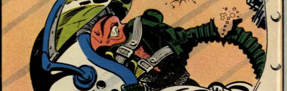
23) House of Secrets #92
July, 1971 -- Berni Wrightson

This wonderfully rendered Wrightson cover is notable for a few reasons. Firstly, just on an artistic level, the composition is interesting, as we get a large, central image of the girl at the mirror, with the monster relatively small in the back of the scene. It's a bit unusual, but strangely effective. Of course, this is also the first appearance of Swamp Thing, which has given this cover added significance over the years. And then there's the story behind the story, which is that the girl in this famous image was one Louise Jones. At the time, she was the wife of painter Jeff Jones (who is about to reappear on the list in just two spots); Wrightson, to hear him tell the story, had a crush on her despite her marriage to his friend, hence his decision to draw her on this cover. of course, this didn't work out well in the end for either Jeff Jones or Berni Wrightson, because Louise ended up later becoming married to third comic book artist -- Walt Simonson. Yep, that's good ol' Weezy Simonson herself on the cover. And that... is the rest of the story.


22) Detective Comics #69
November, 1942 -- Jerry Robinson

Arguably the iconic image of the Golden Age Joker, this great cover from Robinson doesn't really need a lot said about it. Like most of the others on this list, it's black; and like many Joker covers, he's more symbolic than literal. As an aside, this genie-in-a-bottle design is very suggestive of a number of Spectre covers during Jim Aparo's acclaimed revival in Adventure Comics during the 1970's. It's no surprise other artists were inspired by this cover -- it's just damn cool.


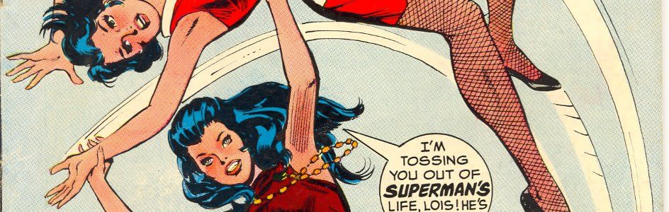
21) Wonder Woman #199
April, 1972 -- Jeff Jones

And we're back with the second of the gothic horror themed bondage covers Jeff Jones painted for Wonder Woman. Or should I say the first, as this one appeared before the cover we spotlighted earlier on the list. I'm not sure whether or not I like the choice of background colors, but the image of that hooded executioner looming over Diana's chained figure is chilling and compelling. And, as I've said before, this is my favorite Wonder Woman logo during my favorite design era, so those are bonus points as well (though again, it's maybe just a slight bit crowded up there). As for the artist, we've already hard about some of his private life in our story about entry 24 on the list; the rest of the rest of the story is that he has since had a sex change operation and is now a woman. You hear that, Frank Miller? You're next, buddy!


Tomorrow: The top 20! Be there!


Bookmark and Share