Game Review: Diablo 3

Diablo 3 is out. But is it a game? Or is it the most brilliant money making scam in internet history?

Movie Review: The Avengers

Okay, okay, I posted my Avengers review. Get off my back already, geez.

The Most Important Comic Book You've Never Heard Of

Action Comics #1. Detective Comics #27. Why is All-American Men of War #89 as important as these great comics -- and why have you never heard of it?.

Tales From the Vault: Lois Lane #93

If you thought Superman was a total tool before, you ain't seen nothing yet.

Mass Effect 3: The Official Review

Mass Effect 3 isn't the end of the world, it just portrays it.

Wednesday, November 11, 2009

Veterans Day Special: Top Ten Sgt. Fury Covers

Today we in America celebrate Veterans Day and honor the men and women who serve and have served in our armed forces. For most of the rest of the world, this is also Armistice Day, which commemorates the end of World War I at 11:11 AM on 11/11, 1918. In honor of our veterans, then, we at The Vault thought it would be appropriate to take a look at some of the many fine war comics that have graced shelves over the years. So without further ado, here's our list of the Top Ten Sgt. Fury Covers of all time.


10) Sgt. Fury #50

This cover from regular Sgt. Fury art team Dick Ayers and John Severin is one of the most iconic Sgt. Fury images ever; during the 60's, Marvel used it for promotion and turned it into a poster.


9) Sgt. Fury #9

Jack Kirby based much of his work in this series on his own experiences as a veteran of World War II. He didn't get to capture Hitler, but like the characters in Inglorious Basterds, he certainly would have liked to.


8) Sgt. Fury #100

In this star-studded anniversary special, Stan Lee emcees a post-war Howlers reunion that is interrupted when a sniper tries to assassinate Reb Ralston because of his work as a Senator in favor of civil rights.


7) Sgt. Fury #24

This gripping effort from Kirby is unusual in the sketchiness of the inking, which adds some pathos to this image of a worn down Fury facing a host of unseen adversaries.


6) Sgt. Fury #96

Published during the Vietnam War, this effort show the influence of contemporary concern in its depiction of a Japanese civilian caught in the crossfire. It doesn't take much to imagine that artist Gil Kane is instead depicting Vietnamese or Cambodian refugees.


5) Sgt. Fury #74

The inimitable John Severin returns with this classic solo effort.


4) Sgt. Fury #38

A great and evocative cover of Fury and the Howlers involved in a dangerous night drop behind enemy lines. I think this cover is from Dick Ayers, but I'm not entirely sure.


3) Sgt. Fury #16

Perhaps no war artist ever captured the exhaustion of the average soldier on the front lines as well as Kirby in this effort.


2) Sgt. Fury #13

Of course, this is a bit of a ringer, since it has Captain America on it; but as a character defined by World War II, it's somehow fitting that he star on this classic Kirby effort from the Silver Age.


1) Sgt. Fury #67

Again, Severin comes through, this time with an American Flag cover that is only matched by the unique color-coded panel and page layouts inside the comics. Seriously, it has to be seen to be believed.


Bookmark and Share

Tuesday, November 10, 2009

Breaking News: Pam Grier is Amanda Waller

Okay, so I have to admit I don't watch Smallville, though I've seen a couple episodes (i.e. ones with Black Canary in them). But considering the unofficial theme of women in comics that seems to have developed over the past couple days at The Vault, this bit of news caught my eye: Pam Grier has been cast as Amanda Waller for an upcoming arc.

You can read the whole article here on the AOL TV blog, but the part you need to know (not just for this article to make sense but for life in general) is that Pam Grier is the blaxploitation queen behind such in-your-face classics as Coffy and Foxy Brown. As such, she's certainly got the chops to pull off the baddest, most powerful woman in the DC Universe.

My first reaction, I have to admit, was a slight bit of puzzlement, since Waller is a rather big boned lady and Pam Grier is a renowned hottie of epic proportions. However, I forgot that this isn't 1974, and in the intervening decades Grier has matured into a full figured, handsome woman.

Not that her resemblance to the character is the most important thing, of course, as Jack Nicholson proved when he played the Joker. No, what's important here is that Grier is probably uniquely suited to the role of Waller due to her acting background and action chops. It's almost a genius enough bit of casting to make me watch the show, especially since she first appears in a multi-part storyline dealing with the Justice Society. Of course, that normally would frighten me as I worried about how badly they were going to botch the JSA, but in light of this casting move, perhaps Smallville is on the right track now.

Because if Pam Grier as Amanda Waller is any indication, things on Smallville are going to get real intense, real quickly. It's about time.


Bookmark and Share

Monday, November 9, 2009

The Best Price Font Ever

Over the past few months I have tackled a number of hot button issues, such as the depiction of women in comics and the self destructive tendencies within comic fandom. I've talked about some of my favorite comics, interviewed legends and commented on the art history of Marvel. But now, finally, I'm ready to tackle perhaps the most important issue ever, as I discuss... The Best Price Font EVER.

Now, I know what you're thinking: dude, ever is a long-ass time. And this is true. It's also equally true that with the millions of comics published over the past 75 years, many of them with hand-lettered and therefore unique covers, there's no real way that I could actually have viewed every single price font in the history of the medium. But in my efforts to study comics and the design of comics I have had the chance to look at many fonts in may different price points, from 10 cents all the way up to $6.95 or more. And after careful consideration, I am now prepared to render judgment upon this topic.

So, here it is: the Marvel Comics font for their 20 cent price point is officially declared The Vault's Best Price Font Ever.


Now, there was some serious competition for this honor, not just from other price points, but from within the 20 cent bracket itself. DC's boldly huge 20 cent font is one that has aged like a fine wine; aggressive to the point of being obnoxious when it first came out, over the years it has gained a certain patina of strength that has caused it to become a bit of a cult favorite:


And, of course, branching outside the 20 cent era, Marvel has also fielded a number of beautiful fonts, most notable perhaps being the price within a circle design used in the period of transition between 10 cent and 12 cent price points:


And indeed, the final 12 cent price font is very close to the one used for their 20 cent era:


Yet, while the two fonts share certain characteristics, such as serifs, the more elongated 12 cent style lends the font a certain old fashioned quality when compared to the more compact and stylish 20 cent iteration. And that newer, fresher look was perfectly suited, of course, to the new regime in place at Marvel when the price point debuted in 1971: with Roy Thomas as Editor-in-Chief, and a new group of creators like Len Wein, Steve Englehart, Mike Ploog and Gerry Conway coming in, the era was ripe for a new design, a new aesthetic and, yes... even a new font.

How much of the 20 cent font's allure is due to its association with that heady era of experimentation is difficult to say; it's a bit like the chicken and the egg, trying to figure out whether the font is considered great because of the comics or whether the comics are considered great because of the font that graced their covers. But whichever side of the debate you fall on, everyone can agree on one central truth: that is a damn fine price font.

A price font that on this day, has finally earned the recognition it has so long deserved.


Bookmark and Share

Sunday, November 8, 2009

New Comic Cavalcade

Hey kids! Comics! yes, it's time for another batch of new comics reviews. By now you're probably all familiar with my pull list, but while I'd love to present you with reviews of all sorts of new and different titles every month, my finances prevent that from happening. However, there's a simple solution for that: comp copies. You listening, Marvel and DC? How about you, Dark Horse and Image? Well, maybe not Image, but if anyone else out there wants to send me some free comics to review, let me know and I'm sure we can work something out.

Until that happens, though, here are some reviews of titles you've no doubt grown to love, with one special surprise:


MODELS, INC. #1

Paul Tobin writing, Vicenc Villagrasa and Terry Paillot art

Yes, it's MODELS, INC. #1. Technically this came out a little while ago, but if you're that offended, you can always ask for your money back. Oh, that's right, this site is free. So suck it!

I mean, thanks for reading. And if you have been reading awhile, you may recall a rant I did a little while ago about the way women are portrayed in comics and how one of the lamentable side effects of this is that there are very few comics actually aimed at bringing in new female readers. Well, MODELS, INC. is the exception: it's a collection of Marvel's most famous romance and teen comic characters from back in the 50's (such as Patsy and Hedy, Millie the Model and Chili), revived in a new series that mixes modeling with drama.

So how is it? Well, it's no Night Nurse, but it's not terrible either. There's some pre-requisite action (our gals stopping some petty thieves, which isn't hard considering Patsy Walker is a member of the Avengers) and some melodrama when the fashion photog gets show and one of the models is set up as the killer. Some of the dialogue and setup seemed a little forced, but overall it wasn't bad. Plus, of course, this issue features a backup story where Tim Gunn from Project Runway dons a suit of Iron Man armor to defeat a platoon of AIM agents trying to pilfer superhero costumes from a Janet Van Dyne fashion retrospective. Now that's awesome.

My Grades: The main story gets a B; the potential is there, which outweighs the awkwardness. The backup story gets an A+, of course. And the cover and general design of the series, which emulates fashion magazines, gets an A as well.


Jonah Hex #49

Justin Gray and Jimmy Palmiotti writing, Cristiano Cucina art

Okay, back to our regularly scheduled comics, which means DC cult books that nobody else on the planet seems to be buying. Which is fine as long as they keep publishing them anyway. Somehow Jonah Hex has managed to hang on for 49 issues despite selling roughly 12k copies a month, which is a miracle. What could possibly be keeping the series afloat?

Well, it might be because they are expecting a boost from the upcoming Jonah Hex movie next year, but it might also be because the series continues to be well written and well drawn, garnering it critical acclaim. Of course, acclaim doesn't put food on the table, but it does lead to stories like the "Six Gun Wa"r arc that concludes in this issue; the first extended storyline in the current series, "Six Gun War" features a who's who of guest stars and hangers on, bringing together pretty much every character not just from the first four years of this volume, but also from the original Jonah Hex series. That means the return of Hex's arch-enemies, Quentin Turnbull and El Papagayo, and help from Hex friends such as Bat Lash, Tallulah Black and El Diablo.

Yes, for hardcore Hex fans like me, this has been a great, fun read. Unfortunately, the very end is a bit of a letdown, as Gray & Palmiotti decided to keep their options open for future stories at the expense of giving this arc the kind of epic closure it probably deserved. The fact that they felt this was necessary, however, is a good sign, because otherwise this would have been a perfect way to close out the series if such a thing had been called for. So that, at least, was one bright spot in what otherwise might have been just a tiny bit of a letdown.

My Grades: The arc as a whole gets a B+; the pacing was just a bit rambling in places and the legion of super-assassins sent after Hex had more potential than they ended up displaying. But it was still a fun read anyway. This issue gets a B; it would have been an A if not for the unsatisfying conclusion.


Warlord #8

Mike Grell story and art

So, for the last few months, I have been lamenting the fact that nobody has been reading or buying Warlord, a situation that I am convinced was caused because creator Mike Grell was only writing the series instead of also drawing it. Well, this issue (and last) Grell actually does pick up his pencil and draws Warlord as well. So, hurray for that.

However, as great as Grell's art is (and I think he gets better and better as time goes by) I'm still worried that this might be a case of too little, too late. The series should have led off with Grell art to get people on board to begin with; bringing him on for issue 7 is just playing to an empty house. And unfortunately, the story still isn't hitting on all cylinders. This two-parter involves a mysterious woman, some memory loss and some hazy philosophizing, but sadly it doesn't feature Shado, so similarities end there. Instead, this is a vignette that discusses the nature of Warlord's character (familiar ground for Grell) and does so with some unusually choppy storytelling (the jump from present to flashback midway though page two is jarring at best).

Mr. Grell, I'm begging you: please, please get this up to speed before DC and the reading public gives up on this book completely.

My Grade: The art gets a big fat A+. I can only give the final product, however, a B at best, and that's entirely on the strength of the art; the story lets it and the reader down.


Bookmark and Share

Friday, November 6, 2009

A Second Look: Gerry Conway

Recently it’s come to my attention that legendary Marvel writer and former EIC Gerry Conway has been the target of some online vitriol. For instance, one writer said that seeing Conway’s name in the credits “makes me want to burn my whole comic collection”. Then, this same person commented that another story “makes so little sense I suspect it was written by Gerry Conway.” Well, enough is enough. I decided to find out just who this online assassin is so I could confront him about these unwarranted attacks.

Now, at last, this person’s identity can be revealed: okay, it was me.

In the spirit of fairness, however, I’ve decided it’s only right to come to Mr. Conway’s defense and present a list of detailed reasons showing that Conway not only was a good writer but that I actually have been a fan of his all along and just didn’t know it. Who knows, maybe you’re a Conway fan too and didn’t know it either.

Before we get into the reasons behind Conway’s recent resurgence (that is, in my own mind) we should probably examine the reasons why I thought I disliked Conway to begin with, because upon closer inspection they don’t necessarily make sense, a common criticism of my thought process to be sure. And most of it has to do with the mighty Avengers.

Now, I’m not the biggest Steve Englehart fan in the world (I know plenty of people that think he’s like a cross between Jesus and Elvis) but I respect his work on Avengers. He gave us classic stuff like the Avengers-Defenders War, the Celestial Madonna saga and the Serpent Crown affair. All great stories. And then he was unceremoniously dumped from the book; the way I always heard it told, Englehart was removed because Conway thought the EIC should write a flagship book so he kicked Englehart off to give Avengers to himself. Which sounds just a wee bit douchey, especially since he left the book less than a year later without having the time to really justify the move from a story perspective.

Recently, though, I’ve heard that this change was in fact prompted in large part due to production delays and missed deadlines. Now, I don’t know the truth, but you know, what difference does it make. That’s their business. The only effect it’s really had on me is that those Conway issues (which I was never a huge fan of) and the apocryphal story behind them became the sole basis for my opinion of Conway. And that pretty much guaranteed it was a low opinion.

Here’s the crazy thing, though: some of my favorite comics growing up were by Conway, only I never realized it. Recently when going through my back issues, I realized again and again that Conway, who I had been unfairly maligning, was actually responsible for a lot of really cool stuff. And while it doesn’t all float my boat – anyone that was writing as many titles as Conway was is sure to have some misses – I’ve certainly developed a better appreciation of him. And then there’s this fact: a lot of the stuff that I don’t like from Conway was written before his 21st birthday. I mean, I popped open an issue of Astonishing Tales the other day and there was a Conway Ka-Zar story that he wrote when he was 17. 17! I think that that age I was still doodling the Human Torch on my notebook in math class. Hell, he was only 20 when he wrote the classic Death of Gwen Stacy storyline in Amazing Spider-man.

So while I’m still not quite ready to join the Official Conway Fan Club, I’m now at least willing to admit that such an organization would be justified in existing. I have to admit, the guy had chops. Plus, I recently added him on facebook and he looks like your neighbor’s dad, the one who paid you ten bucks to rake his yard so you could save up for that Huffy. And how can you hate on that guy?

And so, without further ado, here are my Three Reasons to Appreciate Gerry Conway:

3) Thor. Recently I’ve been putting together a collection of Thor back issues and I’ve learned that, while Thor has had several solid runs it has also had very few truly classic eras after Lee and Kirby. Because of this, the series sometimes tends to get overlooked, which means that entertaining, fun work from people like Conway gets forgotten. During his tenure on the book, Thor had a few truly memorable moments, such as the introduction of Firelord during a nice Galactus story. More importantly, Conway did a lot of work on and with Thor’s supporting cast to the point where it almost seemed like a team book. Whether it was the Warriors Three, Recorder, Tana Nile or Hercules, someone was always around to play off Thor and help him out in a pinch. The buddy book feel of the Hercules era was particularly memorable, basically saving the character from obscurity, and it’s interesting that much of the later DeFalco run (prior to the introduction of Thunderstrike) is almost an homage to the Gerry Conway era. Conway also did some interesting stuff with Sif (merging her with Jane Foster) and Odin (having him renounce his godhood to learn about humanity). The only downside really is that some stories that should have been all-time classics, such as Loki invading Earth with an army of Asgardians, fell a little flat. But overall it was a very nice and sadly underappreciated run.

2) Atari Force. Speaking of underappreciated, Atari Force is a fantastic sci-fi series that never seems to have gotten its due. Yes, the main bad guy, Baron Garza – er, I mean Dark Destroyer – sometimes had a bit of a resemblance to Darth Vader (like seemingly all sci-fi villains for the two decades following Star Wars). But the cast and character work in Atari Force is fantastic. This is a series that I loved as a kid, yet somehow I never realized until a recent re-read that it was Gerry Conway who was providing all the joy. Oh, to think of the years of anti-Conway misunderstanding that could have been avoided if only I had known this at the time.

1) Foom. You know, sometimes I’m not sure just what they were doing in Foom. Despite the fact that they were advertising the fan club to all comers, it really seemed to be aimed at a more mature sub-section of the reading public than to the masses of kids buying comics at that time. For instance, in Foom #6 there’s a cartoon showing a superhero leaving a whorehouse, while in Foom #7 there’s a long discussion about whether Vision has functioning junk, which seems to be some sort of obsession with some people (*cough *John Byrne *cough*); this article even includes a suggestion that Ultron had secretly stolen sperm from Jarvis and stocked Vision with it. Um… WTF?

Taking the cake, though, is a brilliant article in Foom #8 where, in place of the usual coming attractions, the staff of Foom went around and interviewed members of the Marvel bullpen asking them what they had in store. It’s one of the coolest glimpses into the world of Marvel I’ve ever read and a brilliant snapshot on the personalities of the era (which I will explore in more detail in an upcoming post). All of the other interviews pale in comparison to the brief encounter with Gerry Conway, however. In the space of just a few short lines Conway manages to trash both Foom and his own bosses (who are standing right there) as well as by implication Stan Lee himself. It’s an all time classic. Take a look:


And there you have it, three great reasons to appreciate Gerry Conway. And after all this, if you still don’t like him, well, I think Mr. Conway said it best: “you can (expletive deleted).”


Bookmark and Share

Thursday, November 5, 2009

November Zuda Reviews part 2

Hey folks, welcome back to our overview of this month's Zuda competition. Yesterday we brought you reviews for the first five contestants, including Big Ups: A Space Adventure, Brother of Bronze Hammer, Children of the Sewer, In Maps & Legends and Little Earth People. Today, it's part two, where we round out the field by looking at the other five entries: Model Student, Molly and the Amazing Door Tree, Peabody & D'Gorath, Slam McCracken and Witch Phase.

But enough jibber jabber. Let's get right down to it.


Model Student
Joe Bowen

Okay, it's time for me to make an admission: I am getting older. Of course, this applies to everyone on Earth, but usually I don't notice it until I read something like Model Student. When I was a kid, I myself had a bit of a temper and I probably would have identified with the main character, a high school kid who can't keep from flying off the handle and using his mad fighting skills to clobber anyone who crosses him. Now, however, I'm more likely to think about the fact that a kid who is willing to put three people in the hospital because they make a joke about his hairstyle is a kid that needs therapy, maturity and possibly some time in Juvie. I mean, honestly, kid, don't be such a prick.

This feeling, however, is not the fault of creator Joe Bowen. Model Student is well drawn and well written and the premise -- which features the main character becoming an undercover agent for the principal in a sort of 21 Jump Street kind of way -- is intriguing (and also bears some similarity to a project I have been developing for Zuda, which is too bad for me, but that's how the business works). So overall, I have to say this is one of the strongest submissions of the month; I'm just not that into violent anti-heroes these days. Guys: have some tea, put on some Enya and just relax, okay?

My Grade: A-. I'd give it an A if I didn't want the main character to spend the next six years in detention reflecting on the fact that being violently anti-social doesn't make you cool, it just makes you a jerk.


Molly and the Amazing Door Tree
Mark Murphy

This is a comic that I wanted to read as soon as I saw the title. That's a good title, because it pretty much gives you the whole feel for the series before you even look at one page. Not only do you get an idea for the premise -- there's a tree that acts as a door, it's amazing and there's probably a young girl investigating it (since Molly is a name associated with youth) -- but you get a sense of the lighthearted tone as well. It sounds like Pan's Labyrinth minus the realistic ultra-violence.

So how was the actual story? It was fine. The art was cute and the plot was okay, if a bit safe -- it's pretty much just a vignette that introduces the premise and sets up the actual story. Cute but not compelling. I didn't get much sense of what the actual plot was going to be per se -- we know she's going to investigate the other side, but what is she going to do there? Is there a menace? Is it a travelogue? -- but I am interested to see what Molly finds.

It's also interesting to note that this bears some smiliarity in concept to In Maps & Legends, which also features a female protagonist opening a doorway to another world. But they are different enough in tone that hopefully they won't cancel each other out.

My Grade: B+. A nice enough read, but it could have been punched up a little more either in terms of more humor or more plot. Even though this is pleasant, I'm not sure it grabs readers enough to get them to vote for it.


Peabody & D'Gorath
Mark D. Penman

Peadbody & D'Gorath is another solid entry this month. Coming from Mark Penman, this is the story of two guys, one of whom is apparently some sort of demon while the other is, I think, a Jack Skellington marionette. They are hunting some kind of mystical artifact and end up coming face to face with a giant demon dude; all hell breaks loose, no pun intended.

I enjoyed this strip; the writing was lighthearted and moved along nicely, while the art was well done and suited the story to a T. It wasn't quite perfect; a couple lines of dialogue here and there were just a bit stilted, while the art was so stylized that in a couple panels I had some trouble determining easily what was going on due to the line quality and coloring. But overall, I enjoyed this read. It might be a little esoteric for the average reader, but I think it will get some support this month.

My Grade: We'll go with B+. I have a feeling that this could develop into a solid A over time if the creator gets more space to work out the minor kinks.


Slam McCracken
Greg Woronchak

Of all the titles debuting this month, Slam McCracken is probably the most fully realized. The art and writing mesh well, the concept is clear and the execution of the project is professional. While some Zuda entries occasionally feel as though they aren't quite finished or weren't quite developed enough before production began, Slam McCracken feels like it's all there.

Whether or not you'll like it, of course, is a different story. Personally, I enjoyed the story, which is a crime noir parody where all the characters are household items like food or appliances; Slam is an egg, his informant is a tomato, the femme fatale is a toothbrush, etc. It's cute and entertaining, though I had the nagging feeling that I've seen this sort of thing before; noir is a genre ripe for parody and the talking fruit and whatnot seemed a bit reminiscent of the recent trend to recast fables and kid's stories in alternate forms (see: Shrek, Fables, etc.). So if you like that sort of thing, chances are you'll enjoy Slam McCracken; if not, it may be a bit too precious for your taste.

My Grade: A very solid entry in a month of solid if unspectacular entries. A-.


Witch Phase
Bryan Golden

This is an interesting case study. Witch Phase is essentially a manga story, done in traditional manga style art and using anime and mange tropes, such as the character shouting out the name of their moves before they do anything (which, come to think of it, Dr. Strange also does). Considering the popularity of manga over the past few years, you might expect this entry to be pretty popular, but so far the comments on the Witch Phase page seem somewhat negative. Why is that?

Well, it's likely because of two factors. Firstly, while there are a lot of manga fans, they aren't necessarily the people who will be reading or voting on Zuda; for traditional comic readers, there can be a backlash against manga in some circles. More importantly here, though, the entry itself is just a bit too much style over substance. The first page is a nicely executed title page, but then the second page is pretty much the same thing -- a full splash. That's a quarter of the comic devoted to two pictures of the main character, which leaves little room for plot, most of which is contained only in the synopsis on the side which many readers never bother to read. Instead, there's just space for one fight sequence, which does introduce some plot elements but which also proves to be a bit too frenetic -- primary colors in chaotic page layouts leads to a bit of overload.

The artist here definitely has some talent, and the synopsis shows there's some ideas going on here as well, but overall Witch Phase suffers from a lack of focus. If the elements here were harnessed and tightened, this could be a fun read, but as it stands it's a little too hard to get into.

My Grade: C. The art has a lot of promise, it just needs a firmer editorial hand.


Bookmark and Share

Wednesday, November 4, 2009

November Zuda Reviews part 1

Hide the kids and save your Grandma, because it's time for some November Zuda reviews. Yes, it's another month and that means that Zuda Comics has posted another batch of ten new titles for your reading -- and voting -- pleasure. Last month the winner was Pluck. Who will win this month? And who should you vote for? Luckily, I am here to help you form an opinion. Don't worry, you can thank me later.


Big Ups: A Space Adventure
Christina Boyce

Big Ups is a cute little strip that follows the adventures of what appears to be a martian teletubby as he battles space worms on a desert planet. Written and drawn by Christina Boyce, a.k.a. fence, the strip has a certain rough-hewn charm to it, right down to the apparently hand-made word balloons and lettering. In an age where computers and robots seem to polish every comic submission to a fine, sterilized sameness, Big Ups stands out as being authentic.

Having said that, it didn't entirely succeed for me, in part because of the pacing; the end in particular seemed to be a little abrupt and probably could have used a bit more of a cliffhanger or tease to draw us in to future stories. As it is, I wouldn't mind reading more of this, but I'm not sure it's a compelling enough read to get anyone to spend the effort to vote for it.

My Grade: I'll give it a B, though a part of me feels like it should probably get a B-. But I kind of liked it.


Brother of Bronze Hammer
Andrew Alexander

Brother of Bronze Hammer features some very idiosyncratic art from Alexander, a sort of Manga-meets-Mignola vibe done in sketches (with erase lines still left visible) overlaid by a sort of sepia-toned ambiance. The result is something visually different, which meshes well with the premise of Goldilocks and the Three Bears retold as some sort of post-apocalyptic revenge fable set in Mos Eisley.

At least, that's what the premise seems to be for the first few pages; I'm not sure it can maintain a whole story, though, and I suspect that the sudden appearance of a new character int he last panel is an indication of things to come, possibly other fairy tales woven in. Which is fine I suppose. The only problem I had with the story, other than a couple bits of slightly stilted writing, was the fact that I wasn't sure I really liked the protagonist that much. Maybe it is the grim-faced character design, but I found myself routing for the three bears at the end. And that's not necessarily a good sign.

My Grade: I liked the art more than I expected, but the story less. Something about this felt like it was trying a little too hard. B-.


Children of the Sewer
Benito Gallego

Fans of classic comic storytelling can rejoice, because amid all the post-modern manga cartoons often featured on Zuda, Benito Gallego has crafted a story with art straight out of the 70's. Children of the Sewer, which follows a serial killer as he hunts his prey and then is unexpectedly waylaid by weirdoes who live in a secret sewer city, is drawn with strong, obvious and expertly executed influence from master artist John Buscema. The influence, which Gallego indicated in his comments was intentional, is apparent right from the first page, as Buscema-style figures dominate the story. Indeed, the face on the final panel of page 5, part of which was used here as the story's thumbnail, is almost indistinguishable from Buscema's work itself.

The only part of this that was a letdown for me was the story. It's actually written pretty well, and though some readers were thrown by the use of yellow lettering in some of the captions, that didn't bother me. What bothered me was the fact that the main character is a serial killer. I'm just not interested in reading about this character, nor about the sewer dudes who themselves seem just one step removed from murder. Fans of dark horror or crime may get into this, but it left me wishing that Gallego had chosen a different subject for his Buscema homage.

My Grade: The execution of this forces me to give it an A-. But for personal pleasure, I can't give it more than a B, and that's entirely because I love John Buscema.


In Maps & Legends
Niki Smith and Michael Jasper

Yesterday I mentioned that some stories just grab you right from the front page with their thumbnail and title. For me, In Maps & Legends was the one that jumped out at me the most before reading; I love maps and the title along with the little picture of the main character looking off into space piqued my interest. So half of the battle had already been won.

The other half, though, is still undecided. I liked the first few pages well enough, and I enjoyed the main character, her voiceover and the mysterious maps she was drawing on her walls without seeming to know why. All that was cool. I wasn't as big a fan of the running subplot along the bottom, especially when it finally intersected with the main story and introduced some d-bag named Jeremy into the tale. For some reason, the transition was a little jarring -- the panels where Jeremy comes in to the room to talk to Kat just seemed disjointed. Page 6 in particular was a bit hard for me to follow as it didn't flow from one panel to the next well, and it also didn't flow well into page 7. I also was a bit underwhelmed by the sudden appearance of mystery man and his weird landscape on the last page, though this is more because of character design and lettering choices than because of the storytelling decisions.

If this criticism seems a bit specific and picky compared to the other reviews, it's probably because I wanted to like this more than the others. And I did like it mostly, which made the letdowns even bigger. There's potential here, but I would like to see it cleaned up a little if it goes forward.

My Grades: The first five pages of the main story get an A- from me. The rest, not so much; final grade is only a B-. But hopefully this will improve as the story goes along.


Little Earth People
Christopher Lewis and Joe Pekar

And then there's this. Let's start off with the good part: the art in this is very nicely rendered; it's got almost a painterly quality that is somehow mixed with what almost looks like Mad Magazine style drawing. Not that the characters become caricatures, but they easily could and somehow this works for the story.

On the downside, I couldn't figure out what was going on with this story. The first four pages set up the unusual main character, a boy who can't see his own body; this segues into a segment that shows some of his dreams which border on virtual reality and may or may not be real in some sense. So far, so good. But then the story takes a 900 degree turn when the door opens on the last page and instead of the character we're expecting to see based on the set-up, there's... a random talking ferret wearing some priest's robes from the set of Dune or something. In other words, say what?

For me, this was too all over the place. The story seemed to be going one way and abruptly ended with a complete non-sequitor. The individual segments were okay, but when put together they just left me scratching my head. I think there's something interesting here, but the way it was structured made me leery about reading any more of this.

My Grade: Started off okay, but the unearned switcheroo at the end wasn't a cliffhanger so much as a nuclear meltdown. C.


Tomorrow: Part two of our November reviews! Model Student! Molly and the Amazing Door Tree! Peabody & D'Gorath! Slam McKraken! Witch Phase! Be there, home slices!


Bookmark and Share

Tuesday, November 3, 2009

October Zuda Wrap Up

Last month, we thrilled and delighted you with our look at Zuda comics, highlighting the October entries, reviewing some of the past winners and theorizing on what makes a successful entry. So it's only fair that we follow up with some post-competition commentary to see what we were right about and what other people were wrong about now that the October competition is over. Because Zuda has announced the results for October, and the winner is...

Pluck!

Yes, Pluck, the somewhat sarcastic, slightly post-modern black-and-white fantasy epic by Gabe White and John Amor, ended up winning the competition and is therefore the recipient of a long-term deal to continue providing content for Zuda.

So, just what can we take away from this result? Well, the first thing that jumps out about this win is the number of hits each entry received. Over the first few days of the competition, Pluck received a little over four thousand hits. By comparison, Where Evils Dare received over 24 thousand views, while Doc Monster reeled in a whopping 27 thousand views. So the first and most obvious lesson to be learned here is that views do not equal votes. There are two reasons for this. The first and most obvious is that people might read the entry and not like it as much as another. However, since only a small fraction of the people who read Doc Monster also read Pluck, the second explanation is more likely: they just weren't motivated enough to vote at all. In order to vote in the competition, viewers have to register with Zuda and while Doc Monster was my personal favorite story of the month, was well structured, featured nice art and was a super-hero comic and therefore theoretically more attractive to the comics viewing populace at large, it didn't seem to grab the readers enough to make them want to spend the three minutes to register and cast a vote for it.

Pluck, on the other hand, was able to motivate a much higher percentage of a much smaller viewer base in order to grab the lead, which it held for the entire month. Which brings us to the second lesson from last month, which is that the early leader has the big advantage. This is partially because most of the regular readers, who are most likely to vote, read the entries during the first week, but it's also due to another factor: front-runner syndrome. There is a portion of the reading audience who only reads those entries that are winning. Whether this is because they don't have the time to read them all or because they want to vote for a contender, more than one commenter on the Zuda forums has said that they are influenced by the rankings. And the figures bear this out to a degree: after that first week, first place entry Pluck more than tripled its view count, from 4k after one week to 14k by the end of the month. Conversely, third place Doc Monster, which started strong at 27k, ended with just 31k after a full month.

Of course, this isn't a hard and fast rule; the second place entry, Where Evils Dare, started with 24k and continued strong throughout the month, finishing with an impressive 47k views. Part of this can be attributed to the fact that Where Evils Dare was done by a professional team who perhaps had access to more a more developed fan network in order to hype their entry. But overall, it seems that once Pluck took the lead in the first week, it snowballed, suggesting that grabbing the early lead perhaps foreshadows the final results.

Beyond the numbers, the other major lesson learned from the victory by Pluck is that black-and-white is not necessarily the major negative that it has been described as. If you read the forums or the comments on the site, there seems to be a consensus that black and white titles have an inherent weakness in the competition. This may be true, but in the case of Pluck, the fact it was in black-and-white did not seem to have a negative effect, as the title led the voting wire to wire, proving that color or lack of color, while perhaps important to some readers, is not the determining factor. I also have a totally unfounded idea that this may be in part because of the specific nature of Pluck's art, which featured fine linework as opposed to solids, meaning it was much more white than black and thus had a lighter feel to it which may have been more attractive to readers than many heavier black-and-white entries.

So, lessons aside, what do I think of the results? Well, I voted for Doc Monster, so I am a little disappointed that I won't be able to read more of that story. The win by Pluck doesn't bother me, though. I thought it was both well written and well drawn and the structure was okay as well, ending with a nice tease. The characters left me a bit cold, however, so I have to admit I probably won't be reading more of this story unless I have a lot of free time on my hands. Obviously a lot of people liked it, but it's just not to my taste. I originally gave it a B+, which is probably about right, but in my memory it's faded to more like a B- as far as my personal enjoyment.


One final thought now that the new entries are up. I touched on a lot of factors that go into crafting a successful Zuda entry, but one area I didn't discuss was presentation. When you go to the Zuda front page, it displays ten thumbnails such as the ones I used here, one for each of the current competitors. Below each is the name of the title. As we have seen, many people will only read one or two entries, which means that this brief intro often serves as the only chance you have to grab the attention of the reader and get them to check out your story. I talked earlier about how important it is to grab the reader on the first two pages of your entry, but in fact you have to try to get them first on this front page, using just one tiny thumbnail image and the title of your story. This seems like a nearly impossible task and probably random to boot, based entirely on the whims of the viewer, but I actually think there is a little bit of craft involved.

The title itself is important. When you only have the title and one picture to create an impression with, it's key that you have a title that is both memorable and representative of the story. Last month, some of the titles just didn't work for me, in many cases because of the length. Whether it's comics or television shows or movies, a shorter title such as Evil Ain't Easy or Impure Blood is going to be more effective than longer, convoluted titles like Fly Me From the Moon or Old Cthulhu's On the Rise. Even something like Where Evils Dare, while relatively short, isn't as precise as it could be; sure, it's a fairly nice pun on the classic war movie Where Eagles Dare, but that is probably lost on a lot of the audience. Creator Tony Lee referred to this property in some of the promotional stuff as being about Hitler's evil SS group Platoon 666, and I think Platoon 666 may have been a better title for the strip.

Pluck is an interesting example to look at because even though I personally don't like the word pluck -- it resonates too closely with "perky" for me, meaning I find someone with "pluck" to be annoying, plus it's an unattractive sounding word -- it fits perfectly with the image chosen to represent it. The face of the main character, looking slightly upward with an optimistic and somewhat surprised expression fairly screams "pluck". That's a plucky looking guy. You get a good sense right off what the character is going to be like and by extension what the feel of the comic is going to be, all from one word and one image. It sets in your mind a (perhaps minor, but nonetheless important and present) expectation of what you are about to read that must then carry over into the reading experience.

I really noticed that effect this week when I gave the titles a once over before beginning my reading. I planned all along to read all ten, so this was not going to be a determining factor in those terms, and I also already had in mind a reading order (good old boring left to right, top row first), but I found that just from glancing at the titles and thumbnails, I was looking forward to some of them more than others. Of course, some of the ones I was looking forward to ended up being a letdown, but the fact that I was looking forward to them at all from such a small sample indicates to me that there is importance to this presentation that may determine for many readers what they read at all, if not whether they end up liking it.


Tomorrow: People seemed to enjoy the Zuda reviews last time, so we'll be making it a regular feature. Not a whole week of Zuda stuff, mind you, but we'll take two days a month to review the new entries when they come out. Tomorrow, then, we'll be presenting our first batch of reviews: Big Ups: A Space Adventure, Brother of Bronze Hammer, Children of the Sewer, In Maps & Legends and Little Earth People. See you then.

Monday, November 2, 2009

Tales From the Vault: AMAZING ADVENTURES #10

It's another gray, dreary Monday in late autumn. The leaves are dead on the ground, frost is on your window and its dark when you leave for work and dark when you return. There's only one thing that can perk you up on a day like this: reading a vintage comic. And since you may not be able to drag your collection with you down to the office, we've taken the time to help you out by reading the comics for you and reporting what we see in this, another edition of... Tales From the Vault!

Today's offering: Amazing Adventures #10, featuring Black Bolt and the Inhumans. So what are we waiting for/ Let's get right to it!


Details: January of 1972 brings us this timeless epic from Gerry Conway with art from Mike Sekowsky and Frank Giacoia. What a perfect creative team this is. For, you know, a 1963 issue of Justice League of America. Sorry, I should wait to actually read the issue before trashing it I guess.

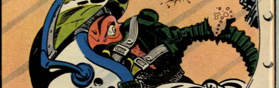
Synopsis: Well, I’m not really sure why this comic is in my possession, but since it is I might as well do something with it. The issue begins right in the middle of the action, no doubt continued from last issue: Magneto has defeated the Inhumans and captured the royal family. Execute them, Magneto!!! But, I guess not. No, Magneto has other plans: he uses some sort of machine to turn one of his minions into a giant ape monster with a huge brain, and then the monster uses its newly developed psychic powers to mentally control Black Bolt.

Well, sure. Why the hell not.

With Black Bolt now enslaved, Magneto scoops him up and flies to... San Francisco. Must be a Big Brother and the Holding Company show they need to get to fast. While this is going on, the rest of the royal family (minus the only cool character in the entire group, Triton) remain behind and mope around in their cage, lamenting their total lack of personalities. Medusa, though, has a cunning plan. Or so she says.

We cut away from this engrossing scene to a subplot where a supporting character from previous issues, a human, gets sucked into space by something called the Trikon. This seems to be setting up a future storyline, but since this is the last issue... hmm (more on this later).

Meanwhile, Magneto has apparently decided to skip San Fran and has instead gone to an underground base in Washington state, where he and his minions (who, by the way, are all twisted little monster people -- mutates, apparently, that he altered with his weird machine) attack in order to get "a new source of cosmic energy". Black Bolt uses his shouts to knock out the defenses, then twists a dial and voila, Magneto has "the power of the UNIVERSE". And that’s the end of Marvel.

Or, no, wait. No it isn’t. Back with the others, Medusa has sprung her cunning plan, though what exactly it entailed I don't know, because by the time they go back to her, she's basically gotten the guard wrapped up in her hair. I guess she used her feminine wiles to distract the guard while her hair went to town. Sound like a crappy plan, but, okay. It works, of course, and they free themselves, then start fighting the guards. They defeat them just in time to see Magneto's plane returning, so they hide in ambush.

Magneto, though, sees them in waiting and he orders Black Bolt to strike. Bolt does so -- by punching Magneto in the head. Wait, what? Doesn't Magneto have a personal magnetic force field? In fact, isn't he wearing a metal helmet that would pretty much protect him from some guy just punching him? Yet for some reason the plane crashes and we get the explanation that Black Bolt was faking all along because he didn't want to risk the safety of his family, but since they are free, he can attack.

"You pretended you were what you weren't -- just as you pretended to destroy those government men" and just as this plot pretended to make sense. Black Bolt didn't pretend to destroy those government men at the mountain base -- he did. He smashed the whole place and trashed all the guards and allowed Magneto to get the power source. None of that was pretense. The fact that he did all this on purpose while “pretending” to be in Magneto’s thrall actually makes it worse than if he really had been in Magneto’s thrall. Seriously, rationalize much, bro?

Anyway, Magneto's apeman attacks, and Black Bolt zaps him with a word. Magento tries to run off with his power supply, but Karnak clocks him with a couple karate moves and knocks him out. Not once does Magneto even attempt to use any of his magnetic powers. In fact, in this entire issue, the only thing he's done with them is levitate his plane, and I'm not entirely sure he was doing that either, it might just have been a regular plane. So much for having the power of the Universe; he apparently didn’t even have the power of Magneto.

Um. Yeah, so Black Bolt is still fighting the ape monster for some reason, and again he says something and blows up the room. Karnak goes to town on Magento's machine, wrecking it, but Magneto still can escape by... running out the door. Again, no powers. But his energy source suddenly blows up for no apparent reason, obliterating the room.

And then... that's it. Magneto is mysteriously gone and the royal family gathers themselves up to head back to Inhumanland so Black Bolt can regain the throne from Maximus. And that story... is in Avengers #95. Oh yeah, that's why I bought these issues. I had blissfully forgotten.

THE END!


Extras: On the list of other details about this issue I had forgotten: just how absolutely terrible the story is. Holy cow. The rest of this issue is a reprint of the origin of the Inhumans. I'm not sure where it's from, but any material from Stan and Jack should be ashamed to appear in the same magazine as this crap. In fairness, though, I should say that this was pretty early in Conway's career -- he was only 19 when this was published -- and he went on to much better things. He's admitted in interviews that he often wasn't sure what he was doing on some of these early efforts, and it shows here; I'm literally not sure he knew what Magneto's powers were, based on the story. Of course, I guess it's possible Magneto really didn't have powers during this story, but it's not mentioned anywhere and I'm pretty sure he has powers when he appears next in Avengers #110. So... yeah.

That dangling plotline about the Trikon, by the way, was left dangling for almost 20 years before a mini-series and a Quasar story in 1991 finally revealed what happened. I'm guessing that Mark Gruenwald was about the only person on Earth who cared, based on how awful this issue was, but that’s what made Gru so awesome.

It's interesting to note how successful/unsuccessful this series was. Black Widow was dumped after #8, however that same month she began co-starring in Daredevil, getting her name in the logo and everything, where she lasted for... I dunno, like 25 issues. The Inhumans, meanwhile, got their own series which lasted all of two issues before they were put on ice for the duration.

Bullpen Bulletins, in fact, announces this issue that they are turning the book over to the Inhumans, which is a little odd considering the lettercolumn and the story itself both tell the reader that the series is canceled, continued in Avengers and being replaced next issue. Another interesting note in BB is that Iron Man has "returned to a bi-monthly schedule" and that "rumors of its cancellation were greatly exaggerated". I hadn't heard that Iron Man was in danger of being canceled at this time, but it doesn't surprise me; the storyline in those issues (#45 came out at the same time as this) are some of the crappiest things I've ever read, and I’m a guy who just read Amazing Adventures #10, so I know my crappy.

The BB also mentions that they had planned (and announced) a price increase from 15 cents to 25 cents, with the issues being double sized, but changed their minds due to unexpected changes in the financial situation. Yeah, they realized that DC was doing the same thing and that they could crush them by dropping the price to 20 cents. Hence there was only one month when all the Marvel books were double sized 25 cent issues -- the November, 1971 issue, which also featured the first frame cover design, all of which was in celebration of Marvel's 10th anniversary. And sure enough, Marvel's 20 cent books ran roughshod over DC's 25 cent comics in one of the biggest missteps in DC's long publishing history.


My grade: B+ for the Gil Kane frame cover with the cool Black Bolt logo, D- for being one of the worst Marvels of the era and the single lamest Magneto appearance ever. Sorry, Gerry!


Bookmark and Share