Game Review: Diablo 3

Diablo 3 is out. But is it a game? Or is it the most brilliant money making scam in internet history?

Movie Review: The Avengers

Okay, okay, I posted my Avengers review. Get off my back already, geez.

The Most Important Comic Book You've Never Heard Of

Action Comics #1. Detective Comics #27. Why is All-American Men of War #89 as important as these great comics -- and why have you never heard of it?.

Tales From the Vault: Lois Lane #93

If you thought Superman was a total tool before, you ain't seen nothing yet.

Mass Effect 3: The Official Review

Mass Effect 3 isn't the end of the world, it just portrays it.

Showing posts with label Carmine Infantino. Show all posts

Monday, August 23, 2010

The Top 150 DC Covers of All Time: #20-11

Welcome back to the Top 150 DC Covers of All Time countdown. If you have any questions about what criteria was used to select the covers, you can read the ground rules here in the countdown Prologue. For a complete listing of selections, check out the Top 150 DC Covers Master List. And as always, I strongly recommend clicking on the covers to see larger, better and more detailed versions of these classic covers.

Let's get on with the top twenty!


20) All-Star Squadron #1
September, 1981 -- Rich Buckler and Dick Giordano

This is a cover that's kind of crept up on people over the years. It's not as splashy as some of the other choices on the list, but when you ask people what their favorite covers are, it comes up surprisingly often. As a result, it's been homaged several times over the years. On a personal note, I think Hawkman looks particularly cool on this cover for some reason. Maybe it's just because you don't normally see him, you know, thinking about stuff, but for whatever reason this is just a memorable, fun image.


19) Showcase #34
October, 1961 -- Gil Kane and Murphy Anderson

As we've seen, Gil Kane turned out great covers for decades, but while he has some earlier entries on our list, to me this is the earliest prototypical Kane cover. The Anderson inks do add a different feel from the later stuff that he inked himself -- the guy trapped in the bottle seems lankier than usual, almost Kubert-esque -- but overall it's just a really fine example of Kane's striking figure work. It's also the first appearance of the Silver Age Atom and for decades has been considered by fans to be one of the best covers of the Silver Age.


18) More Fun Comics #54
April, 1940 -- Bernard Baily

Our final cover to feature the Spectre is the standard by which all other Spectre covers are judged. It has most of the elements that would later be used in other great Spectre books -- the mysterious look, the symbolically (?) gigantic form -- though it doesn't have the black background so many others would use. But this one still stands out above the rest just for sheer epicness, with the biplanes flying at him and the mass of soldiers at his feet. I particularly like the plane he's clutching in his right hand. He just looks like a truly frightening, unearthly power.


17) Strange Adventures #110
November, 1959 -- Gil Kane and Jack Adler

A personal favorite, this cover was actually one of a number of "giant hand" covers DC put out during the 50's across their genre books. but none of the others have the sheer visceral whallop of this cover, thanks in part to the coloring and inking job done by Adler. On a personal note, you know those guys at comic shows who have giant poster versions of famous covers for sale, so you can frame them as art and hang them in your den or office? Of all the covers on this (or the Marvel) list, this is the one I would most like to have a framed print of. It transcends comics for me to become a wonderful artifact of a whole era's aesthetic. Just awesome.


16) Batman #11
July, 1942 -- Fred Ray and Jerry Robinson

For the eleventy-billionth day in a row, we have our requisite Joker cover and as usual, it's backed by a nice black background. At least, what little you can see of it. Most of the cover, obviously -- and most of the reason this cover is so awesome -- is covered in playing cards, the high point of which is, of course, the fact that Robin, Batman and Joker are the face cards and Batman is punching Joker so hard he's knocking him clear off the Joker card. Obviously not the last time we'd see the card motif used for Joker covers -- we've already seen another famous example earlier in the countdown -- but the first and still the best use of this simple but visually arresting concept. Just about perfectly done here.


15) Flash #123
September, 1961 -- Carmine Infantino and Murphy Anderson

One of the most famous covers in comics history, Flash #123 re-introduced the Golden Age Flash to the world of comics after a 12 year absence and in the process revived the entire stable of Golden Age DC character by introducing the concept of Earth-2. Having alternate universes ended up being problematical in the long run, but the idea was never so simply explained as here, thanks to Infantino's depiction of the hapless construction worker calling for help to two different Flashes at the same time. This classic cover has been homaged too many times to count.


14) Batman #404
February, 1987 -- David Mazzucchelli

It's a shame that Mazzuchelli didn't produce more mainstream comics work, because he's arguably one of the best comic artists of the past thirty years. And though his output was small, just about everything he worked on has come to be regarded as a classic of the artform, including this simple but haunting cover, which kicked off Batman: Year One and the post-Crisis Batman reboot. This pretty much gives you the whole origin story in one striking image.


13) Superman #199
August, 1967 -- Carmine Infantino and Murphy Anderson

Speaking of covers that have been homages multiple times, this latest collaboration between Infantino and Anderson is one of the most popular covers (and stories) in DC history. The action really plays to Infantino's strengths, as he goes an excellent job of depicting the two in motion, something he had perfected in his years of working on Flash. The black background, classic Superman logo and "Who is the Fastest Man Alive" text combine to provide energy that just about explodes right off the cover.


12) Batman: The Dark Knight #1
1986 -- Frank Miller

Earlier on the countdown we saw the fourth issue of Miller's acclaimed mini-series and here was are, back again with the first issue. Like the cover for issue 4, this is a testament to design and iconography, as Miller relies on the reader to pretty much know who the silhouette is and what the imagery means without actually spelling it out. It's also hard to look at this cover without almost hearing in your mind the crack of thunder with this lightning bolt, which is an interesting sensation for a purely visual medium; I have to say it's maybe the only cover on this list that made me think in terms of sound as well as sight.


11) Batman #227
December, 1970 -- Neal Adams

You guys have no idea how hard it was for me to keep this out of the top ten. From a pure artistic stand point, this may be Neal Adams' best cover for DC, and it is certainly one of his most famous. It was covers like this that helped return Batman to his dark roots after the years of TV show camp had damaged the character. This cover is also an homage to Detective #31, which appeared earlier on the list. It was a hard decision trying to figure out whether an homage should actually rank higher than the original, but I felt that the iconic status of Detective #31 was based in no small part to how popular and awesome this cover from Adams is. Based on that and just the sheer sweetness of this cover (which includes what I think is the best Batman logo ever) I had to rank this cover higher. One of the best.


Tomorrow: At last, the Top Ten!


Bookmark and Share

Friday, August 20, 2010

The Top 150 DC Covers of All Time: #30-21

Welcome back to the Top 150 DC Covers of All Time countdown. If you have any questions about what criteria was used to select the covers, you can read the ground rules here in the countdown Prologue. For a complete listing of selections, check out the Top 150 DC Covers Master List. And as always, I strongly recommend clicking on the covers to see larger, better and more detailed versions of these classic covers.

We're getting close to the top now!


30) The Shadow #1
November, 1973 -- Michael Kaluta

Pretty much every one of Kaluta's gorgeously rendered covers for this short-lived Shadow series could have ended up on the countdown. The fact that this series didn't succeed says to me that the character is played out, because the presentation was just unbeatable. Of the lot, though, this first issue re-introduction is my favorite. if this couldn't sell comics, then it might be time to pack it in.


29) Flash #163
August, 1966 -- Carmine Infantino and Joe Giella

Over the last few days we've talked quite a bit about effective word balloons, as well as to a lesser extent text in general on a cover. But this one, which combines word balloons with graphic design to create an unforgettable combination, takes the cake. Quick question: can anyone think of cover dialogue from a Marvel book that is as memorable as the DC balloons from the last few days? I can come up with one or two examples maybe, but that's about it.


28) New Gods #1
March, 1971 -- Jack Kirby and Don Heck

Kirby's DC stuff may not have ever really caught on with the fans, and his writing is debatable, but he still knew how to knock his first issue covers out of the park. Everything about this cover seems to come from a different time period from anything else on the stands in 1971. From the font to just the sheer size of the logo, the way the blurbs are laid out along the top, the photo style background -- this was just beyond modern and even now looks like it comes, not from our past, but from some alternate comics publishing world that was never quite realized. One of the best examples of how DC was pushing the envelope design-wise during that time.


27) House of Mystery #174
June, 1968 -- Nick Cardy

In 1968, DC decided to suddenly revive -- or create out of thin air -- their entire line of horror comics. I'm not entirely sure what this was in response to -- perhaps a loosening of the comics code restrictions? -- but as a result, they relaunched both House of Secrets and House of Mystery as horror books. This cover from Nick Cardy marks the first issue of this new horror era, complete with a great new logo and the memorable tag line above the logo. I usually love half-frame covers like this, though this is one instance where we debatably lose something by not seeing the top of the door. Maybe that's just me. But, anyway, top of door or not, this is an awesomely evocative image that provides the perfect graphic representation of the way DC was inviting kids to try their new horror books starting with this issue. Perfect concept, perfectly executed.


26) Showcase #79
December, 1968 -- Jay Scott Pike

Less, as they say, is more, and this almost minimalist effort from Jay Scott Pike is a perfect example. This is just an artist beautifully drawing a figure and letting that speak for itself; the little frogmen on the bottom half and the bubbles in the top help balance things a bit, but even the editor's realized this is all about Dolphin and as a result they ever came up with a cool, simple, small logo to accompany the picture. They didn't want anything to detract from Dolphin and, on the contrary, everything compliments her form perfectly. Sublime.


25) Bat Lash #2
January, 1969 -- Nick Cardy

Nick Cardy is back once again, this time with perhaps his greatest creation, the pseudo-pacifist, ladies-man gunslinger Bat Lash. Each of his Bat Lash covers is worth tracking down, but of them, this is undoubtedly his masterpiece, with the white frame perfectly blending in with the white of the snow; the sharp logo; the frame again helping emphasize the native American by allowing his head to break up through it into the logo space; and most of all, the crouching figure of Lash cradling the little girl as they crouch. The tension of the figures is only matched by the snowy beauty of the scene they are stuck in. And again, another great example of a cover telling a whole story in one image.


24) Green Lantern #49
February, 1994 -- Darryl Banks and Romeo Tanghal

One of the most memorable covers of the decade, even if you aren't a fan of the story. And despite the fact that the events of this issue have since been overturned, the image still packs a visceral whallop. I mean, Hall Jordan just looks legitimately deranged on this cover, and the way he holds of the trophies from his slain brethren is disturbing at best. A cover to stack up against anything the Joker has to offer.


23) House of Secrets #92
July, 1971 -- Berni Wrightson

This wonderfully rendered Wrightson cover is notable for a few reasons. Firstly, just on an artistic level, the composition is interesting, as we get a large, central image of the girl at the mirror, with the monster relatively small in the back of the scene. It's a bit unusual, but strangely effective. Of course, this is also the first appearance of Swamp Thing, which has given this cover added significance over the years. And then there's the story behind the story, which is that the girl in this famous image was one Louise Jones. At the time, she was the wife of painter Jeff Jones (who is about to reappear on the list in just two spots); Wrightson, to hear him tell the story, had a crush on her despite her marriage to his friend, hence his decision to draw her on this cover. of course, this didn't work out well in the end for either Jeff Jones or Berni Wrightson, because Louise ended up later becoming married to third comic book artist -- Walt Simonson. Yep, that's good ol' Weezy Simonson herself on the cover. And that... is the rest of the story.


22) Detective Comics #69
November, 1942 -- Jerry Robinson

Arguably the iconic image of the Golden Age Joker, this great cover from Robinson doesn't really need a lot said about it. Like most of the others on this list, it's black; and like many Joker covers, he's more symbolic than literal. As an aside, this genie-in-a-bottle design is very suggestive of a number of Spectre covers during Jim Aparo's acclaimed revival in Adventure Comics during the 1970's. It's no surprise other artists were inspired by this cover -- it's just damn cool.


21) Wonder Woman #199
April, 1972 -- Jeff Jones

And we're back with the second of the gothic horror themed bondage covers Jeff Jones painted for Wonder Woman. Or should I say the first, as this one appeared before the cover we spotlighted earlier on the list. I'm not sure whether or not I like the choice of background colors, but the image of that hooded executioner looming over Diana's chained figure is chilling and compelling. And, as I've said before, this is my favorite Wonder Woman logo during my favorite design era, so those are bonus points as well (though again, it's maybe just a slight bit crowded up there). As for the artist, we've already hard about some of his private life in our story about entry 24 on the list; the rest of the rest of the story is that he has since had a sex change operation and is now a woman. You hear that, Frank Miller? You're next, buddy!


Tomorrow: The top 20! Be there!


Bookmark and Share

Tuesday, August 17, 2010

The Top 150 DC Covers of All Time: #70-61

Welcome back to the Top 150 DC Covers of All Time countdown. If you have any questions about what criteria was used to select the covers, you can read the ground rules here in the countdown Prologue. For a complete listing of selections, check out the Top 150 DC Covers Master List. And as always, I strongly recommend clicking on the covers to see larger, better and more detailed versions of these classic covers.

And now, the top 70. This is getting serious guys -- the big guns are really starting to come out. Case in point:


70) Superman Annual #1
August, 1960 -- Curt Swan and Stan Kaye

Classic Silver Age Superman artist Curt Swan provides this iconic image and layout for the first Superman annual. This is also, as it happens, the first DC annual, and the layout for this cover was used for basically the next decade on all the DC annuals and many of the 80 Page Giants as well; central image surrounded by small boxes containing scenes from other stories. This isn't the only -- or best known -- image of Superman breaking chains but it's one of the earliest and best. A Silver Age classic.


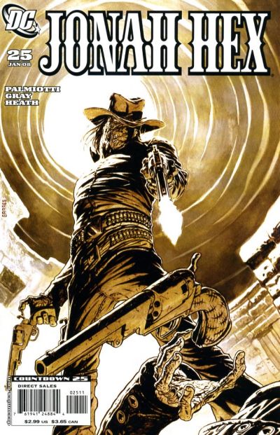
69) Jonah Hex #25
January, 2008 -- Rafael Garres

Okay, this is obviously a personal choice. I already discussed at some length some of the reasons there are very few covers from the last decade on my countdown, but this cover illustrates another reason: the fractured reading community. With so many titles being published and so few people reading these days, it's very difficult for a cover to be widely known enough to become iconic. Over the course of researching this list, I discovered entire titles that I never even knew were being published by DC over the past decade. Obviously, no matter how awesome the covers on those comics were, I wasn't familiar with them and this fact is further exacerbated by all the variant covers being pumped out by the industry. This Jonah Hex cover from two years ago isn't a variant, but considering only 11k people read Jonah Hex, chances are you probably have never seen it. Which is too bad, because as a Hex fan, I believe this is the best cover in the character's 40 year history. It also blew away the people I showed it to at the comic store when I bought it -- people who otherwise would never have seen it due to today's comic book realities.


68) Batman #1
Spring, 1940 -- Bob Nake and Jerry Robinson

Hey look, kids, it's Batman #1! Yes, this probably seems kind of low on the countdown, but bear with me. As I've mentioned previously, the competition for spots on this list was especially fierce for Batman titles, because the series and character have just had so many awesome covers over the year. This is undoubtedly an iconic cover, but so are basically all of the other Batman covers above it on the list, and each of those I felt was superior artistically. I will say that this cover does have a certain joie de vivre, I like the yellow background (obviously) and the almost art deco spareness of the silhouetted cityscape is sharp as well. But this is as high as the cover could make it for me.


67) Swamp Thing #7
December, 1973 -- Berni Wrightson

Wrightson didn't do a lot of superhero covers, which is too bad because we can see from this brief glimpse of batman that he probably would have killed them just as he killed everything else he drew. I love the lighting on this cover and the awesomely detailed city in the background. Plus, I always like a semi-frame cover design like this where the logo and other graphics are kept separate from the picture; it just looks clean and in this case it's complimented by a nice color choice. Very cool cover.


66) The Spectre #33
September, 1995 -- Doug Beekman

Another personal choice. The 90's were an interesting time in that the decade produced more crap than any other comic decade but also had a number of really sharp alternative series going on. One of these was Spectre, which regularly featured excellent painted covers, my favorite of which is this image from Doug Beekman. I hadn't realized Beekman did this cover until I looked up the credits just now, but it is a bit funny, as once upon a time I knew Beekman as Uncle Doug. He and my aunt have been divorced for a long time now, but when I was a kid I had the chance to see him work on a number of awesome comic covers, mostly for Savage Sword of Conan (my favorite of which is this gem from 1986). Family politics suggest I should have taken this choice off my list, but you have to give props where props are due: this is one sweet cover. Blow it up for a look at Spectre's creepy side (as opposed to his giant, looming side, which he seems to display on almost all of his other covers on this list).


65) Batman: The Dark Knight Returns #4
June, 1986 -- Frank Miller

Like Batman #1, I'm going to guess some people will think this should have ranked higher, but hey: them's the breaks. Though this silhouette of Batman fighting Superman is memorable and undoubtedly a classic, it's not even the most famous cover from this four issue mini-series. I do appreciate the iconography with the illuminated logo on Superman's chest pretty much eliminating the need for any other details or colors. But I just couldn't justify it going any higher than this on the list.


64) Mystery in Space #90
March, 1964 -- Carmine Infantino and Murphy Anderson

Don't look now, but it's another Mystery in Space cover from Carmine Infantino and Murphy Anderson. Earlier we looked at a cover that helped define the character's dilemma of being torn between two worlds; but while that cover was cool and had a giant magnifying glass and everything, this is the true Adam Strange classic as he struggles to keep those worlds from actually colliding. It's just a great, epic visual.


63) Action Comics #583
September, 1986 -- Ed Hannigan, Curt Swan and Murphy Anderson

Despite the fact that this is signed "Swanderson" -- meaning it was done by the team of Swan and Anderson -- the comics database says that Ed Hannigan actually did the layouts. Okay, why not. But there's no doubt that it's Swan who takes center stage here; this classic cover, which fronted the equally classic story "What Ever Happened to the Man of Tomorrow?" by Alan Moore, is the perfect send-off for the Silver Age Superman that Swan did more to define than any other artist. A perfectly fitting end.


62) Batman: Harley Quinn
October, 1999 -- Alex Ross

Alex Ross is one of the most popular and famous comic artists of the past 20 years and covers like this illustrate why. The Joker, like The Spectre, lends himself to dramatic covers because his white coloring pops off the page, especially when contrasted with black backgrounds and he so often is. This finely rendered painting of Joker with Harley Quinn showcases Ross's photorealistic technique and has become one of the best known Joker images of the past two decades.


61) Adventure Comics #40
July, 1939 -- Creig Flessel

The first appearance of Sandman was also the first issue of Adventure that featured a superhero instead of, well, adventure stories. And the cover reflects that, as it really belongs more to the pulp tradition than to the emerging superhero school. And this is a big plus, because while superhero books (and artists) may have had an abundance of energy, they weren't the kind of craftsman that the pulp artists, with their decade plus of experience, were. A memorable and exceedingly well drawn DC milestone.


Tomorrow: #60-51 brings you horror! Romance! Superheroics! And more Alex Ross too! Be there!


Bookmark and Share

The Top 150 DC Covers of All Time: #80-71

Welcome back to the Top 150 DC Covers of All Time countdown. If you have any questions about what criteria was used to select the covers, you can read the ground rules here in the countdown Prologue. For a complete listing of selections, check out the Top 150 DC Covers Master List. And as always, I strongly recommend clicking on the covers to see larger, better and more detailed versions of these classic covers.

Take a look at today's picks:

80) Lois Lane #80
January, 1968 -- Curt Swan and Neal Adams

Well, here's a coincidence -- two covers in a row that have characters ripping through the cover to show the interior of the comic. I particularly like this effort from the unusual team of Curt Swan and Neal Adams, as Lois tears the "Superman's Girlfriend" part of her logo off to show she's a modern woman. In fact, this isuse (and to a lesser extent the one that preceded it) is kind of the first time Lois appears modern rather than a throwback to the early 50's. In fact, let's face it, she looks really hot here, to the point where her new look has the unintended effect of making Swan's Superman look old fashioned. A clever, fun cover that also is visual evidence of DC finally reacting to changing times.


79) House of Secrets #88
November, 1970 -- Neal Adams

Another Gothic classic from Neal Adams, who seems to have enjoyed painting these covers almost as much as I enjoy looking at them. This one is pretty much a prototype for a Gothic romance/horror cover, what with the frightened and mysterious girl in white fleeing from the moon-shrouded, shadowy mansion. This cover sets and captures the mood perfectly.


78) Superman #24
October, 1943 -- Jack Burnley

One of the great early Superman covers, this patriotic effort from Superman came, as you might expect, during World War II. The black is nice, as is the fact that the entire cover isn't black; I like the (presumed) sunrise on the horizon backlighting both Superman and the modern and literally shining American city. A legitimate classic of the medium.


77) Sea Devils #2
December, 1961 -- Russ Heath and Jack Adler

Speaking of classic, Sea Devils has long been renowned among collectors almost entirely due to the series of beautifully rendered covers from Russ Heath and Jack Adler. Honestly, from my limited reading experience with Sea Devils, I have to think that these covers pretty much kept the series afloat as the stories were nothing to get excited about. But this, the best of the Sea Devils covers, is something to get excited about, as Adler uses all of his inking and coloring skills to turn Heath's always-detailed and precise pencils into something approaching photographic quality.


76) Detective Comics #476
April, 1978 -- Marshall Rogers and Terry Austin

I know what you've been thinking: where are all the Joker covers?! Well, they're finally here, starting with a cover that proves the Joker is so awesome he doesn't even need to be on the cover to make it great. The first of many Joker covers to come, this cover also has one of the best known and most effective uses of cover text on a superhero cover. Just seeing the name "Joker" written large against the backdrop of those grinning corpses is enough to give readers a shiver.


75) Mystery in Space #75
May, 1962 -- Carmine Infantino and Murphy Anderson

Here's yet another classic Mystery in Space cover from the team of Infantino and Anderson, this time from the famous crossover between Adam Strange and the Justice League of America. By now you've probably all realized that I like covers with strong geometric design elements, especially ones that also utilize color to emphasize that design, so naturally I had to select this cool image for the countdown. I'm not sure why Roy Orbison is trying to conquer Rann, but I love the effect of the sonic waves radiating from his gong. Cool stuff.


74) All-American Comics #16
July, 1940 -- Sheldon Moldoff

Sheldon Moldoff lands his second cover in as many days, this time for the first appearance of the original Green Lantern, Alan Scott. It's a testament to Shelly that he was chosen for such high profile assignments (you may recall from a few days ago that he also did the cover for Flash Comics #1, with the first appearances of both Flash and Hawkman on it). Though this isn't the only or the best golden age Green Lantern cover on our list (spoilers!) it's an iconic image that is also a very strong cover in its own right.


73) Batman #244
September, 1972 -- Neal Adams

Three words: Shirtless. Desert. Duel.


72) Detective Comics #457
March, 1976 -- Dick Giordano

This is truly one of the greatest images of Batman ever drawn. Giordano brilliantly places the flashback to batman's origin and the murder of his parents symbolically inside Batman's head as a perfect way of setting the stage for the classic retelling of that timeless story. Really, a cover that deserves to be top twenty. Except, everything about the cover other than the drawing itself is an utter disaster. The little line across the top probably seemed like a good idea when they designed it, but they basically jammed it with superfluous and useless text and junk. Then there's the horrible decision to shrink the Detective logo and jam a Batman logo in next to it, which is not only visually disastrous but also completely unnecessary; every cover of Detective has a giant drawing of Batman on it so it's obvious that this is "Batman's" comic. I mean, if you don't recognize Batman on the cover, then the Batman logo will be meaningless to you anyway, right? They could not have bollixed the design of this cover worse if they wanted to. No justice for brilliant art.


71) The Brave and the Bold #71
May, 1965 -- Gil Kane

What was that I was saying about designs emphasizing geometric shapes and color usage? Oh yeah. Well, here's another cover from Gil Kane, who is usually better known for his dynamic figure work. This time, though, he designs the living hell out of this cover, turning what could have been a pretty boring concept into something really sweet through the use of color and shape. Top notch. I also approve of the decision to let Green Lantern's logo go across the whole cover, as usually they bunch the logos up next to each other and it looks crowded and subpar. This style works a lot better for me, at least in this instance.


Tomorrow: #70-61 brings you excitement like you've never known. Batman! Superman! And believe it or not, a cover from the last ten years! Get psyched, you comics-loving fools!


Bookmark and Share

Sunday, August 15, 2010

The Top 150 DC Covers of All Time: #100-91

Welcome back to the Top 150 DC Covers of All Time countdown. If you have any questions about what criteria was used to select the covers, you can read the ground rules here in the countdown Prologue. For a complete listing of selections, check out the Top 150 DC Covers Master List. And as always, I strongly recommend clicking on the covers to see larger, better and more detailed versions of these classic covers.

Let's kick off the top 100 in style with...


100) Limited Collectors' Edition C-51
August, 1977 -- Neal Adams

Considering this title was basically a bunch of glorified reprints, the series had a surprisingly high concentration of classic original Batman covers; besides this cover and yesterday's example (also from neal Adams), this one from Jim Aparo nearly made the list as well. In the end, though, this famous version of the battle with Ra's al Ghul ended up at the top of the Batman Limited Collectors' Edition heap. I couldn't justify placing it any higher overall, though, despite the image's popularity with those limited collectors. That's because it is a reprint -- of a comic with an even more famous cover. When the cover isn't even the most iconic version of a specific story, it's really lucky to even make a list like this in the first place.


99) House of Secrets #105
February, 1973 -- Jack Sparling

I pretty much love everything about this cover. The composition, with the tranquil scene of kids fishing in the background contrasted with the skull in the foreground, is great and is perfectly served by the muted coloring. That, in turn, contrasts with the bold red banner at the top, which is punctuated by the "double bullet" design style during the very brief time when it wasn't being screwed up by extra blurbs all over the masthead and the issue number jammed into the price point circle. Just an excellent cover all around.


98) The Flash #203
February, 1971 -- Neal Adams

This is one of the more atypical Neal Adams covers on the list, which is part of why it works so well. Usually I have a pretty strong dislike for photo covers, but the concept behind this one works great, partially because on the Flash's world Adams draws with his usual photo-realistic style (deftly colored by Jack Adler to add to the effect) and partially because the alien world is one of the few instances where Adams isn't obviously being Adams. Instead he seems to be purposely channeling Steve Ditko, whose style is about as different from Adams as possible. It adds up to a clever concept expertly executed.


97) The Spectre #9
April, 1969 -- Nick Cardy

Ah, Nick Cardy is just so damn awesome, isn't he? Here's The Spectre, making one of several appearances on this list. The Spectre is interesting because, like The Joker, his snow-white skin not only gives him an inherently dramatic appearance but also leads to a lot of black covers to better contrast with him. Plus, they both get a lot of symbolic covers as well -- except, with the Spectre, being gigantic isn't necessarily symbolic because he actually does that sometimes. This cover is a beautiful example of Cardy and Spectre at their best; I love the book of judgment with all the presumed sinners swarming over it to escape Spectre's giant hand. And I also love the fact that they contoured the logo to fit like a puzzle piece with the artwork. Classic.


96) Justice League of America #10
March, 1962 -- Murphy Anderson

We kicked off our countdown with one of the many classic Justice League gimmick covers from the first few years of that book's existence. This, though, has to be tops on the chart -- the infamous Fingers of Felix Faust cover from Murphy Anderson. Beyond the flat-out bizarre nature of this striking image, it also happens to be a yellow cover, which as you all know is my favorite, so this is a winner all around.


95) Superboy #160
October, 1969 -- Neal Adams

You're probably pretty tired of me talking about Neal Adams by now, so I'll just say that I really like both the dejected and morose pose for Superboy in the foreground and, especially, the giant Earth hovering in the background. It really drives home the isolation Superboy is expressing and also reminds us just how alien he is. Cool idea.


94) Mystery in Space #82
March, 1963 -- Carmine Infantino and Murphy Anderson

Here's another classic from the team of Carmine Infantino and Murphy Anderson, who combined on a number of epic Adam Strange covers over the years. Of all the cool work they did on Mystery in Space (more of which is still to come), this one probably best illustrates the central dilemma of Strange, the man of two worlds, as he has to decide between his home planet and his adopted planet, each of which is given a different dramatic death as well as its own color scheme. Throw in a giant magnifying glass burning Rann's citizens like so many ants and you have a Silver Age classic.


93) Justice League of America #75
November, 1969 -- Carmine Infantino and Murphy Anderson

Six years later, Infantino and Anderson were still churning out hits as evidenced by this great Justice League cover. The black background helps, but what really sets this apart is the unique composition, where we just get a good long look at Black Canary's signature fishnet stockings as she looms right off the top of the cover over her defeated Justice League teammates. Now that's the way to make an entrance.


92) Detective Comics #590
September, 1988 -- Norm Breyfogle

When new Batman flans flocked to comic stores in the summer of 1989 they were in luck, because it just so happened that Norm Breyfogle was in the middle of a great run as artist on Detective Comics. And the best of the bunch, from a year earlier, is this awesome image of Batman summoning his flock of bats in a decidedly unusual location -- London, rather than Gotham. A terrific mood piece.


91) All-New Collectors' Edition C-62
1978 -- Neal Adams

Holy jeez, guys, four Neal Adams covers in one day. But before you demand that I remove my lips from Neal's ass, I suggest you blame DC for assigning him this project. You see, this was originally done by Joe Kubert, but someone decided it looked a little too lean and somber, which is kind of like saying you don't like Picasso's stuff because it's too cubist. So they took his layout and had Adams redraw it, adding in a number of famous celebrities from the time period. The result is a cultural touchstone that is even more impressive if you look at the entire gatefold cover rather than just the front, which is all that is usually reproduced.


Tomorrow:It's #90-81 with Jimmy Olsen! Tarzan! Deadman! And the shocker of the century: the senator's been shot!!!


Bookmark and Share