Game Review: Diablo 3

Diablo 3 is out. But is it a game? Or is it the most brilliant money making scam in internet history?

Movie Review: The Avengers

Okay, okay, I posted my Avengers review. Get off my back already, geez.

The Most Important Comic Book You've Never Heard Of

Action Comics #1. Detective Comics #27. Why is All-American Men of War #89 as important as these great comics -- and why have you never heard of it?.

Tales From the Vault: Lois Lane #93

If you thought Superman was a total tool before, you ain't seen nothing yet.

Mass Effect 3: The Official Review

Mass Effect 3 isn't the end of the world, it just portrays it.

Showing posts with label Joe Kubert. Show all posts

Sunday, August 12, 2012

Breaking News: Joe Kubert Dead at 85

In recent years we've seen a lot of the great comic creators from the golden age pass into legend, but today's news hits particularly hard, as multiple sources are reporting that Joe Kubert has passed away.

He was 85.

Trying to sum up the career of Kubert is basically impossible, but suffice it to say that he began working in the 1940s and continued as a mainstay of the comic book industry right up until his passing. Best known for his great war comics, including Sgt. Rock and Enemy Ace, Kubert also turned in fantastic work on Hawkman, both in the Golden Age and the Silver Age, as well as titles like Tarzan and literally too many others to mention.

Beyond his unequaled production as a artist and writer, however, his most enduring legacy may be as a teacher and inspiration thanks to The Kubert School, which began training comic books artists and cartoonists beginning in the 1970's. Dozens if not hundreds of pros passed through his courses.

And Kubert's art legacy was also passed down in a much more literal fashion through his sons, Andy and Adam Kubert, who are considered by many fans to be two of the top comic book artists of the past quarter century.

On a personal note, Kubert's death saddens me as I missed his final visit to Boston in 2010 due to a scheduling conflict. I very much wanted to attend so I could speak with him about his work at Lev Gleason alongside Charles Biro and Norman Maurer on Boy Comics. Kubert is the only artist other than Biro to draw a cover for Boy Comics and I wanted to ask him how that came about. Sadly for me, that opportunity is now lost forever.

And sadly for comics, one of the five greatest artists in the history of the medium is gone forever as well.


Wednesday, August 18, 2010

The Top 150 DC Covers of All Time: #50-41

Welcome back to the Top 150 DC Covers of All Time countdown. If you have any questions about what criteria was used to select the covers, you can read the ground rules here in the countdown Prologue. For a complete listing of selections, check out the Top 150 DC Covers Master List. And as always, I strongly recommend clicking on the covers to see larger, better and more detailed versions of these classic covers.

And now, the top 50!


50) Doom Patrol #121
October, 1968 -- Joe Orlando

One of the most shocking issues of the Silver Age came packaged with one of its sharpest covers, as the ghostly figures of the Doom Patrol rising from their own graves is appropriately creepy. It's also set off by the presence of the blindingly yellow masthead, which bleeds in a lightning bolt down to the surprising "You Decide!" blurb. The only nit-pick I have with the cover really is that the masthead seems just slightly empty -- not that I want it cluttered like some of the other DC covers we've seen, but maybe they could have filled a little bit of that empty space with a bigger logo. But overall, a great cover.


49) Showcase #57
August, 1965 -- Joe Kubert

Enemy Ace was one of the more unique concepts in War comics and Kubert arguably turned in his best artwork on the title, which, considering Kubert, is really saying something. This cover, for the character's first solo appearance, is excellent but it's also a prototype of sorts; the concept of the sketch of Enemy Ace on a black background with the dogfight in the foreground would prove to be so successful here that Kubert would return to it again once Enemy Ace had his own series, and to even better results.


48) Kamandi #1
November, 1972 -- Jack Kirby and Mike Royer

Yes, this series is obviously a Planet of the Apes ripoff, but it's also done by Jack Kirby, so one thing is certain: the covers are going to be big, bold and usually interesting. This is one of the best he turned out during his years at DC -- one look at it and you get the whole concept whether you've seen Apes or not. And, I might add, the composition is excellent.


47) Flash #174
November, 1967 -- Carmine Infantino and Murphy Anderson

I always love it when the design people play around with the logo and this is one of the greatest examples ever. The Rogues Gallery looking down on the conquered Flash is cool, but it's obviously the amazingly gigantic logo for the issue that really sets this cover apart. Infantino and friends were really ahead of the curve with some of their innovations on Flash.


46) Adventure Comics #73
April, 1942 -- Jack Kirby and Joe Simon

And here's some Golden Age Kirby to go with his Bronze Age work. The symbolic giant has been a staple of comics imagery right from the start, but rarely has it been done as impressively as here; there's something almost 3-D about the way Kirby has Manhunter (in his first appearance) striding into the city. Plus, I love the guy at the bottom running so hard he's completely left his feet in a complete panic. How could you not buy this comic if you saw it on the stands?


45) The Killing Joke
1988 -- Brian Bolland

We've had some discussions over the course of the countdown about the effectiveness of word and thought balloons on covers. Enter exhibit A in the defense of word balloons. Not only is the one word "Smile" probably the most famous word balloon in the history of comics, for me it really makes the entire cover. yes, it's a cool image of Joker and the significance of him with the camera makes more sense once you've read the story, but that one word gives the cover all of its considerable impact. As a side note, I might add that this is yet another black Joker cover, and not the last by half. Some things were just meant to be.


44) Suicide Squad #1
May, 1987 -- Howard Chaykin

And right up next is another example of the impact good text can have on the cover. I love the layout here, but again, it's really the text -- which the cover is designed around -- that makes this cover. I do with that final exclamation point had been a simple period instead, but otherwise, this is a perfectly executed cover worthy of the best Hollywood advertising.


43) Superman #1
Summer, 1939 -- Joe Shuster

Simple, elegant and classic. I like the pose and the frame and, of course, the yellow background, not to mention that this is the first appearance of the famous Superman logo, which Shuster hand-drew on each cover for several issues before someone told him just to make a template. Note there's no issue number; I guess they didn't need one yet.


42) Young Romance #150
November, 1967 -- Jay Scott Pike

There have been dozens of great "reflections in glasses" type covers over the history of comics, but few have them have been as perfectly effective as this effort from Jay Scott Pike. The whole story is here, from the tears to the hand raised to the lips to the couple kissing in the reflection. Just perfect.


41) New Teen Titans #13
November, 1981 -- George Perez

We started the day with the Doom Patrol's death and we're going to end it there as well. I invite you to blow this one up to really see the detail work that Perez, as always, has put into this darkly evocative cover. The flashlight and the overgrown jungle really give this a creepy, mysterious air that is topped off by the chilling image of Robotman's body left hanging as a warning. Due to Perez's detailed style, it doesn't really shrink down well, so it loses a bit at this size, but at full size, it's a masterpiece.


Tomorrow: #40-31 brings you some true classics courtesy of... Bill Sienkiewicz! Bob Kane! Howard Chaykin! And more!


Bookmark and Share

Monday, August 16, 2010

The Top 150 DC Covers of All Time: #90-81

Welcome back to the Top 150 DC Covers of All Time countdown. If you have any questions about what criteria was used to select the covers, you can read the ground rules here in the countdown Prologue. For a complete listing of selections, check out the Top 150 DC Covers Master List. And as always, I strongly recommend clicking on the covers to see larger, better and more detailed versions of these classic covers.

Here's the next soul-crunching batch of awesomeness:


90) Our Fighting Forces #71
October, 1962 -- Jerry Grandenetti and Jack Adler

This unusual cover was actually part of a mini-trend that Grandenetti and Adler put together during their years working on DC's war books; G.I. Combat #69 and #83 are two other examples. But as atmospheric and interesting as those two covers are, this one really takes the cake, due to two tweaks; first, the addition of some color to the jungle canopy gives the image an interesting three dimensionality and second, unlike the other covers, this one features two soldiers instead of one. Two soldiers and, of course, their dog Pooch. Together their worried gazes form the intersection where realism and surrealism meet -- which is exactly where most of the best comics from the Silver Age resided.


89) More Fun Comics #60
October, 1940 -- Bernard Baily

Here's another symbolic (?) image of a giant Spectre looming over some hapless sinners, this one from the character's early days. I really like the tiny figure of the gangster blasting uselessly with his Tommy gun, but the real key to this cover is the big yellow circle behind Spectre, which really helps his frightening form pop from the background.


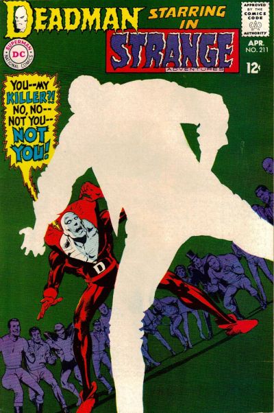
88) Strange Adventures #211
April, 1968 -- Neal Adams

The central mystery of the original Deadman series in Strange Adventures revolved around Boston Brand's search for his own killer. In this issue, he finally finds his killer, but in order to preserve the mystery, Adams (or someone in art editorial) decided to completely blank out the details of the killer on the cover, instead simply depicting him as an expanse of negative space. I can only imagine how much this cover jumped out off the newsstand compared to the rest of the regular stuff from April of 1968. This cover still seems modern even today; for example, here's a very similar design from 2005 that was lauded as one of the best covers of the year when it came out.


87) Tarzan #222
August, 1973 -- Joe Kubert

This cover is interesting for a couple reasons beyond just the usual Kubert excellence. The main thing that's cool about this cover is the way he uses color -- in this case skin tone -- to make both Tarzan and the priestess pop out of the cluttered mass of characters. In that respect it's actually very reminiscent of this infamous Barry Windsor Smith cover from Conan #24, which appeared on my Marvel top cover list. Both of these came out in 1973. I doubt Kubert was influenced by Smith, but it's interesting to think about what kind of shared influences might have been floating around at that time.


86) Jimmy Olsen #53
June, 1961 -- Curt Swan and Stan Kaye

Hey look, it's Jimmy Olsen, only he's been turned into a giant turtle monster that seems to be... eating... a bridge? Plus it has a nice yellow background. I kind of don't think this one needs much further explanation.


85) Brave and the Bold #85
September, 1969 -- Neal Adams

This is a key turning point for both Adams and Green Arrow, as it marks the first issue where Adams debuted the new, revamped Green Arrow that he developed alongside Bob Haney and Denny O'Neil. Out goes the bland green onesie, in comes the Robin Hood inspired ensemble complete with new goatee. Fittingly, Adams features Green Arrow front and center in a dramatic pose to show off the new direction. Some elements of this cover aren't perfect for me -- they appear to be standing on some sort of random grid straight out of Tron and Batman's comparatively bright costume cand cape distract from the central green Arrow figure -- but it's an arresting cover. I also want to give props to the very, very brief design period this came from, which featured the little white band across the top of the cover with the series title. I wish they had played with that more because I really like it.


84) Warlord #27
November, 1979 -- Mike Grell

Our second Grell cover comes from his breakout series, Warlord. Everyone pretty much knows what a huge Warlord fan I am and it was difficult for me to keep from stuffing this list with awesome Grell covers, because seriously, his run of Warlord covers is pretty much unparalleled for me. Instead, we'll have to settle for this example, which deserves to be blown up in order to get a good look at the detail work. This features a dynamic rendition of Warlord himself alongside a finely rendered -- and currently exploding -- background scene. And a bit of Warlord trivia for you: at the time this cover came out, Warlord was reportedly DC's top selling book. Now you can see why.


83) Justice League of America #138
January, 1977 -- Neal Adams

This is an interesting variation on a theme of sorts for Adams; for a few other high profile covers on this list (such as Wonder Woman #179 from a couple days ago), DC employed this reddish sunburst effect to dramatize the cover. Here Adams uses this technique again, only this time he goes with blue instead. One of the most famous Adam Strange covers ever and another example of how this second stringer had far more than his fair share of memorable covers.


82) Flash Comics #37
January, 1943 -- Sheldon Moldoff

Sheldon Moldoff was one of the most detailed artists working during the Golden Age, and this is one of his masterpieces. Yes, there are a couple of curious things about it -- for instance, Hawkman and Hawkgirl appear to be running even though they are in midair, while Modloff always drew their wings to look more like hair than feathers -- but this picture of the Hawks flying amidst a massive swarm of birds is just a great cover. It's too bad I don't have a scan of a better condition copy with sharper colors, but you should really blow this up to take a better look at it.


81) The Atom #36
May, 1968 -- Gil Kane

Kane returns to the list after a brief absence and he does it in a big way, no pun intended. Kane's Atom covers were renowned at the time for their inventiveness and sense of motion and this is arguably the best. It not only features some absolutely prototypical Kane figure work, it also has the cool meta-conceit of one Atom punching the other literally through the cover of the comic to reveal the pages beneath. Which all adds to one thing: it looks cool as hell. Even though I do have to admit I'm not a fan of the lettering work in the word balloon; that could have been done better.


Tomorrow: #80-71 brings you excitement like you've never known. Adam Strange! The Teen Titans! And... the Sea Devils! Be there!


Bookmark and Share

Friday, August 13, 2010

The Top 150 DC Covers of All Time: #110-101

Welcome back to the Top 150 DC Covers of All Time countdown. If you have any questions about what criteria was used to select the covers, you can read the ground rules here in the countdown Prologue. For a complete listing of selections, check out the Top 150 DC Covers Master List. And as always, I strongly recommend clicking on the covers to see larger, better and more detailed versions of these classic covers.

Let's see what books round out the first fifty selections.


110) Green Arrow #1
February, 1988 -- Mike Grell

Full disclosure: I love Mike Grell. I could easily do a whole Mike Grell Top 50 Covers list without even breaking a sweat. Between his long runs as cover artist on Warlord and Green Arrow, Grell was probably the most consistently excellent cover artist ever. Unfortunately, I didn't have room to fit in nearly as many of his covers as I would like, but one that did make the cut is this symbolic painting of Green Arrow towering over his new home, Seattle, where he would remain for the rest of Grell's 80 issues on the title. A strong start to a great series.


109) Tomahawk #116
June, 1968 -- Neal Adams and Jack Adler

It's Adams again, this time where you least expect him -- on a western (though, technically, Tomahawk wasn't actually a western either... it's complicated). Aided immeasurably by the inks and color work of Jack Adler, this almost impressionistic image of a Native American bearing down for the kill sets an awesome mood.


108) Girls' Romances #108
April, 1965 -- Gene Colan

This is a solid if typical design from Gene Colan -- weeping woman in foreground, brooding love interest in the background and a nicely placed thought balloon filling some empty space. A fine if unspectacular cover. Except, somebody had the brilliant idea of just coloring the entire thing bright pink. This was perfectly in keeping with the pop art sensibilities of 1965, but wildly innovative for the usually conservative DC romance line. As a result, by being modern, this cover ended up looking well ahead of its time. A striking, memorable cover.


107) G. I. Combat #88
July, 1961 -- Joe Kubert and Jack Adler

This is an interesting example of the effects of text on cover design, which we've been discussing in the comments over the course of this countdown. There's no question that the image is perfectly powerful without any text and would work just fine -- and arguably better -- without the words. However, in this case, the text isn't added to provide information but rather to set a mood. Kubert was very into the ironies of war -- many of his stories were based entirely on this concept -- and while it's unlikely that any soldier would write "Danger Sniper!" on his helmet in giant white letters, the idea that someone with that would then be blasted through the head with what appears to be a 7 million caliber bullet is perfectly in keeping with Kubert's sensibilities. I think because of this, the cover works better with the text, but you could argue it either way.


106) The Witching Hour #1
March, 1969 -- Nick Cardy

Another great cover from the criminally underappreciated Nick Cardy, who still has several more covers to come. I love the mood of this, the composition and the awesome logo; what a great way to launch a new title. However, I did have to drop this significantly down the list for thwo reasons. The first is really just a tiny nitpick; I think they could have colored the figure of the witch on the tower in the foreground just a little more subtly in order to make her pop from the shadows more. The second is a major wtf: if you look to the left edge of the cover, you'll see what appears to be a pillar of buildings going up the side of the cover. I've studied this cover at great length and just have no idea what's going on there, it's completely incongruous with what's happening in the rest of the picture. I mean, M.C. Escher wants to know what's happening here. If I'm missing something obvious, let me know, but this one has me stumped. Luckily, the composition draws your eye away from this and towards the moon, so it's not a fatal flaw, but someone messed something up or else this might be a top 50 cover. As it is, it's still ridiculously cool despite these issues.


105) Supergirl #1
September, 1996 -- Gary Frank and Cam Smith

This cover gets props for a couple reasons, the first and most obvious being that it provides and instant and dramatic introduction to an all-new, modern Supergirl that readers can see at one glance is wildly different from the versions that have come before. it's really a very effective image. From a design perspective, though, it's almost more impressive considering that the logo for the comic, such as it is, appears only as a tiny, half-obscured sticker on Supergirl's skateboard. it's a bold decision, but it only emphasizes how powerful the image is; with just one look at the cover you know exactly who the character is and what the tone of the series will be, making this perhaps one of the strongest first issue covers in DC history.


104) Limited Collectors' Edition C-25
1974 -- Neal Adams

There's not a whole lot to say about this one other than the fact that it's a very simple design -- Batman running across a big red background -- that is executed well enough that this depiction of Batman has become iconic through posters and lunchboxes and whatever. It's just a sharp, cool looking cover.


103) Wonder Woman #1
February, 1987 -- George Perez

You're going to want to blow this one up to really appreciate the intricate Perez detail work on this cover. Plus, most of the time, when this is referenced you only get to the the front panel and not the montage on the back cover as well. This, of course, represented a major overhaul of the entire Wonder Woman mythos, from her history right down to the new logo. One of the best known images of Wonder Woman ever drawn, by one of comics most accomplished artists.


102) Legion of Super-Heroes #294
December, 1982 -- Keith Giffen and Larry Mahlstedt

Fans of the Legion swear by the cover that preceded this one, but for my money, this Giffen image of the Legion bowing in subservience to the giant floating visage of Darkseid is the real classic. This storyline re-introduced Darkseid as a major league villain in the DCU and the swirling vortex of crimson Kirby crackles behind his head really help this cover pop.


101) DC Special #3
June, 1969 -- Neal Adams and Nick Cardy

Here's a great and unusually art pairing: Neal Adams with inking by Nick Cardy, for our second Supergirl cover of the day. The results, as you might expect, are sweet, as DC decides to embrace modernism and feminism and promote its female superheroes for basically the first time ever. The looks on the male superheroes' faces are priceless, as though they can't believe a bunch of skirts are taking over their book, but the real draw is the exuberant Adams Supergirl in the middle. I have to admit that even though I don't like the character or, really, any of her stories, I still have put together a decent collection of bronze age Supergirl comics; there's just something about a well drawn Supergirl cover that works every single time regardless of context or content. A classic as well as a personal choice.


Tomorrow: It's #100-91, featuring Superboy! Norm Breyfogle! And... Muhammad Ali? Buckle in!


Bookmark and Share

Tuesday, August 10, 2010

The Top 150 DC Covers of All Time: #130-121

Welcome back to the Top 150 DC Covers of All Time countdown. If you have any questions about what criteria was used to select the covers, you can read the ground rules here in the countdown Prologue. For a complete listing of selections, check out the Top 150 DC Covers Master List. And as always, I strongly recommend clicking on the covers to see larger, better and more detailed versions of these classic covers.

Without further ado, here's your selections for Day Three:


130) My Greatest Adventure #17
October, 1957 -- Ruben Moreira and Jack Adler

The pencils here were done by Moreira, but it's Adler who needs to be singled out, as he perfected the Grey Tone effect used to make this cover such a standout. Over at the Comics Should Be Good page, their regular feature "Scott's Classic Corner" (no relation) ran a series highlighting Adler's work (which I recommend not reading until I'm done with my list otherwise you're going to be spoiled for several upcoming covers). Adler's Grey Tone covers are some of the most striking images of the 50's and 60's and really pop compared to the regular coloring techniques of the time. I suggest enlarging this one to really see the details.


129) Falling in Love #99
May, 1968 -- Ric Estrada

If any genre was ripe for an overhaul in the late 60's, it was romance, which provided the perfect place for enterprising comic artists to explore the pyschedelic movement. Unfortunately, editorial at both Marvel and DC seemed a little hidebound, as few of these examples actually made it to press, but one of the more innovative among those that did is this Estrada cover. And it's nice that someone at DC finally found a good use for those go-go checks.


128) Animal Man #5
Winter, 1988 -- Brian Bolland

Brian Bolland makes his second appearance on our chart with this classic from Animal Man. It's not quite as meta as the famous "Aparo drawing Brave and the Bold" cover (which just missed making the list), but it nicely set the tone for what was undoubtedly the most meta ongoing series in comics history.


127) Star Spangled War Stories #151
July, 1970 -- Joe Kubert

Kubert's war books were really pushing the design envelope, as we already saw back on day one of the countdown, and Star Spangled War Stories was no exception. Rather than incorporate the logo into the drawing, though, here Kubert was playing around with composition, as he changed the logo's shape, size and location nearly every issue to fit it in to whatever picture he had in mind. Besides being interesting from a design perspective, this moody and evocative cover also marks the first appearance of the Unknown Soldier.


126) Sensation #1
January, 1942 -- Harry G. Peter and Jon L. Blummer

Considering this is the first appearance of Wonder Woman, one of the most iconic superheroes in the world, you'd think this cover would be better known than it is. And actually, it's a pretty cool cover; I like the big circle behind Wonder Woman and it's certainly an action packed cover (weirdly, the figure of Wonder Woman was drawn by one artist and the rest of the cover by another). All things considered, I'm not really sure why this isn't as well known as other major milestone first appearances like Detective #27 or Action #1, but it's too bad because this is a comic that deserves to be better appreciated.


125) The Saga of the Swamp Thing #34
March, 1985 -- John Totleben

Okay, so I mentioned in my intro that titles that later became Vertigo series weren't included in my countdown, but technically this issue doesn't fall into that category because they changed the title of this series after #37. So that's the reason for that. But beyond that detail that probably nobody cares about, this cover is widely known thanks to the fact that this is the famous Swamp Thing sex issue, where he and his honey-pie ingest some kind of dope and make psychic brain love to each other. It also happens to feature a really nice cover from John Totleben; those two factors combined are enough to land this on the list despite my complete and total apathy towards Swamp Thing.


124) Adventure Comics #312
September, 1963 -- Kurt Swan, George Klein and John Forte

In a story that has been referenced and homaged numerous times, the Legion of Superheroes in this issue drew straws (well, really tiny lightning rods anyway) to determine which of them would sacrifice their life in order to resurrect Lightning Lad. The impact of this milestone story was emphasized by the bold black background shot through with lightning. It's an unusually bold cover during an otherwise boring period for covers on Adventure and at DC in general.


123) Our Army at War #196
August, 1968 -- Joe Kubert

The legendary Kubert gets his second cover of the day with this unusual Sgt. Rock design. I just love the disorienting effect that the alternating blue and white squares create behind Rock's central figure, along with the slightly skewed, forced perspective. This is also one of those few times when I think the word balloon actually adds to the image as well. Overall, this cover -- which came out in 1968, at the height of the Vietnam War -- presents readers with a very different look at Sgt. Rock, one that I think is eye-catching and effective. In other words: cool cover.


122) New Teen Titans #39
February, 1984 -- George Perez

This cover from Perez is an interesting case because it seems to be an homage to a well-known cover from the first volume of Teen Titans, this April, 1970 effort from Nick Cardy. That cover just missed making the final cut for our list, but the homage, which is now the more famous of the two covers, didn't. In fact, though, while Perez himself has admitted that this cover is an homage, it's not to Teen Titans #26 at all -- but rather to Amazing Spider-man #50. We'll be seeing a couple more instances of famous homages later on the list, including one case where both the homage and the original made the cut, but in this case I felt that in addition to the Perez version being better known than Cardy's pseudo-inspiration it was also the stronger composition with the all-white background and the removal of the weird robot pentacle thing in the background. The clothing hanging from the logo is a sweet touch as well.


121) DC 100 Page Super Spectacular #6
1971 -- Neal Adams

And hey, speaking of homages, it's our second in a row. To be honest, I nearly left this cover off the list entirely, because for my money the original (All-Star Comics #16) is better than the copy. I appreciate the fact that Adams has the Golden Age characters on the back cover and the Silver Age versions on the front, and the black background is nice and everything, but to me, it's kind of just a bunch of heroes standing there. Still, I've seen this cover cited numerous times by older DC fans as being a top cover; apparently it was a big deal at the time. Because of this consensus of opinion I included this cover on my list. Not my favorite, though.


Tomorrow: #120-111: Love, 1971! Rex the Wonder Dog! And The Secret House of Sinister Love? WTF is going on?!


Bookmark and Share