Game Review: Diablo 3

Diablo 3 is out. But is it a game? Or is it the most brilliant money making scam in internet history?

Movie Review: The Avengers

Okay, okay, I posted my Avengers review. Get off my back already, geez.

The Most Important Comic Book You've Never Heard Of

Action Comics #1. Detective Comics #27. Why is All-American Men of War #89 as important as these great comics -- and why have you never heard of it?.

Tales From the Vault: Lois Lane #93

If you thought Superman was a total tool before, you ain't seen nothing yet.

Mass Effect 3: The Official Review

Mass Effect 3 isn't the end of the world, it just portrays it.

Showing posts with label Gil Kane. Show all posts

Monday, August 23, 2010

The Top 150 DC Covers of All Time: #20-11

Welcome back to the Top 150 DC Covers of All Time countdown. If you have any questions about what criteria was used to select the covers, you can read the ground rules here in the countdown Prologue. For a complete listing of selections, check out the Top 150 DC Covers Master List. And as always, I strongly recommend clicking on the covers to see larger, better and more detailed versions of these classic covers.

Let's get on with the top twenty!


20) All-Star Squadron #1
September, 1981 -- Rich Buckler and Dick Giordano

This is a cover that's kind of crept up on people over the years. It's not as splashy as some of the other choices on the list, but when you ask people what their favorite covers are, it comes up surprisingly often. As a result, it's been homaged several times over the years. On a personal note, I think Hawkman looks particularly cool on this cover for some reason. Maybe it's just because you don't normally see him, you know, thinking about stuff, but for whatever reason this is just a memorable, fun image.


19) Showcase #34
October, 1961 -- Gil Kane and Murphy Anderson

As we've seen, Gil Kane turned out great covers for decades, but while he has some earlier entries on our list, to me this is the earliest prototypical Kane cover. The Anderson inks do add a different feel from the later stuff that he inked himself -- the guy trapped in the bottle seems lankier than usual, almost Kubert-esque -- but overall it's just a really fine example of Kane's striking figure work. It's also the first appearance of the Silver Age Atom and for decades has been considered by fans to be one of the best covers of the Silver Age.


18) More Fun Comics #54
April, 1940 -- Bernard Baily

Our final cover to feature the Spectre is the standard by which all other Spectre covers are judged. It has most of the elements that would later be used in other great Spectre books -- the mysterious look, the symbolically (?) gigantic form -- though it doesn't have the black background so many others would use. But this one still stands out above the rest just for sheer epicness, with the biplanes flying at him and the mass of soldiers at his feet. I particularly like the plane he's clutching in his right hand. He just looks like a truly frightening, unearthly power.


17) Strange Adventures #110
November, 1959 -- Gil Kane and Jack Adler

A personal favorite, this cover was actually one of a number of "giant hand" covers DC put out during the 50's across their genre books. but none of the others have the sheer visceral whallop of this cover, thanks in part to the coloring and inking job done by Adler. On a personal note, you know those guys at comic shows who have giant poster versions of famous covers for sale, so you can frame them as art and hang them in your den or office? Of all the covers on this (or the Marvel) list, this is the one I would most like to have a framed print of. It transcends comics for me to become a wonderful artifact of a whole era's aesthetic. Just awesome.


16) Batman #11
July, 1942 -- Fred Ray and Jerry Robinson

For the eleventy-billionth day in a row, we have our requisite Joker cover and as usual, it's backed by a nice black background. At least, what little you can see of it. Most of the cover, obviously -- and most of the reason this cover is so awesome -- is covered in playing cards, the high point of which is, of course, the fact that Robin, Batman and Joker are the face cards and Batman is punching Joker so hard he's knocking him clear off the Joker card. Obviously not the last time we'd see the card motif used for Joker covers -- we've already seen another famous example earlier in the countdown -- but the first and still the best use of this simple but visually arresting concept. Just about perfectly done here.


15) Flash #123
September, 1961 -- Carmine Infantino and Murphy Anderson

One of the most famous covers in comics history, Flash #123 re-introduced the Golden Age Flash to the world of comics after a 12 year absence and in the process revived the entire stable of Golden Age DC character by introducing the concept of Earth-2. Having alternate universes ended up being problematical in the long run, but the idea was never so simply explained as here, thanks to Infantino's depiction of the hapless construction worker calling for help to two different Flashes at the same time. This classic cover has been homaged too many times to count.


14) Batman #404
February, 1987 -- David Mazzucchelli

It's a shame that Mazzuchelli didn't produce more mainstream comics work, because he's arguably one of the best comic artists of the past thirty years. And though his output was small, just about everything he worked on has come to be regarded as a classic of the artform, including this simple but haunting cover, which kicked off Batman: Year One and the post-Crisis Batman reboot. This pretty much gives you the whole origin story in one striking image.


13) Superman #199
August, 1967 -- Carmine Infantino and Murphy Anderson

Speaking of covers that have been homages multiple times, this latest collaboration between Infantino and Anderson is one of the most popular covers (and stories) in DC history. The action really plays to Infantino's strengths, as he goes an excellent job of depicting the two in motion, something he had perfected in his years of working on Flash. The black background, classic Superman logo and "Who is the Fastest Man Alive" text combine to provide energy that just about explodes right off the cover.


12) Batman: The Dark Knight #1
1986 -- Frank Miller

Earlier on the countdown we saw the fourth issue of Miller's acclaimed mini-series and here was are, back again with the first issue. Like the cover for issue 4, this is a testament to design and iconography, as Miller relies on the reader to pretty much know who the silhouette is and what the imagery means without actually spelling it out. It's also hard to look at this cover without almost hearing in your mind the crack of thunder with this lightning bolt, which is an interesting sensation for a purely visual medium; I have to say it's maybe the only cover on this list that made me think in terms of sound as well as sight.


11) Batman #227
December, 1970 -- Neal Adams

You guys have no idea how hard it was for me to keep this out of the top ten. From a pure artistic stand point, this may be Neal Adams' best cover for DC, and it is certainly one of his most famous. It was covers like this that helped return Batman to his dark roots after the years of TV show camp had damaged the character. This cover is also an homage to Detective #31, which appeared earlier on the list. It was a hard decision trying to figure out whether an homage should actually rank higher than the original, but I felt that the iconic status of Detective #31 was based in no small part to how popular and awesome this cover from Adams is. Based on that and just the sheer sweetness of this cover (which includes what I think is the best Batman logo ever) I had to rank this cover higher. One of the best.


Tomorrow: At last, the Top Ten!


Bookmark and Share

Tuesday, August 17, 2010

The Top 150 DC Covers of All Time: #80-71

Welcome back to the Top 150 DC Covers of All Time countdown. If you have any questions about what criteria was used to select the covers, you can read the ground rules here in the countdown Prologue. For a complete listing of selections, check out the Top 150 DC Covers Master List. And as always, I strongly recommend clicking on the covers to see larger, better and more detailed versions of these classic covers.

Take a look at today's picks:

80) Lois Lane #80
January, 1968 -- Curt Swan and Neal Adams

Well, here's a coincidence -- two covers in a row that have characters ripping through the cover to show the interior of the comic. I particularly like this effort from the unusual team of Curt Swan and Neal Adams, as Lois tears the "Superman's Girlfriend" part of her logo off to show she's a modern woman. In fact, this isuse (and to a lesser extent the one that preceded it) is kind of the first time Lois appears modern rather than a throwback to the early 50's. In fact, let's face it, she looks really hot here, to the point where her new look has the unintended effect of making Swan's Superman look old fashioned. A clever, fun cover that also is visual evidence of DC finally reacting to changing times.


79) House of Secrets #88
November, 1970 -- Neal Adams

Another Gothic classic from Neal Adams, who seems to have enjoyed painting these covers almost as much as I enjoy looking at them. This one is pretty much a prototype for a Gothic romance/horror cover, what with the frightened and mysterious girl in white fleeing from the moon-shrouded, shadowy mansion. This cover sets and captures the mood perfectly.


78) Superman #24
October, 1943 -- Jack Burnley

One of the great early Superman covers, this patriotic effort from Superman came, as you might expect, during World War II. The black is nice, as is the fact that the entire cover isn't black; I like the (presumed) sunrise on the horizon backlighting both Superman and the modern and literally shining American city. A legitimate classic of the medium.


77) Sea Devils #2
December, 1961 -- Russ Heath and Jack Adler

Speaking of classic, Sea Devils has long been renowned among collectors almost entirely due to the series of beautifully rendered covers from Russ Heath and Jack Adler. Honestly, from my limited reading experience with Sea Devils, I have to think that these covers pretty much kept the series afloat as the stories were nothing to get excited about. But this, the best of the Sea Devils covers, is something to get excited about, as Adler uses all of his inking and coloring skills to turn Heath's always-detailed and precise pencils into something approaching photographic quality.


76) Detective Comics #476
April, 1978 -- Marshall Rogers and Terry Austin

I know what you've been thinking: where are all the Joker covers?! Well, they're finally here, starting with a cover that proves the Joker is so awesome he doesn't even need to be on the cover to make it great. The first of many Joker covers to come, this cover also has one of the best known and most effective uses of cover text on a superhero cover. Just seeing the name "Joker" written large against the backdrop of those grinning corpses is enough to give readers a shiver.


75) Mystery in Space #75
May, 1962 -- Carmine Infantino and Murphy Anderson

Here's yet another classic Mystery in Space cover from the team of Infantino and Anderson, this time from the famous crossover between Adam Strange and the Justice League of America. By now you've probably all realized that I like covers with strong geometric design elements, especially ones that also utilize color to emphasize that design, so naturally I had to select this cool image for the countdown. I'm not sure why Roy Orbison is trying to conquer Rann, but I love the effect of the sonic waves radiating from his gong. Cool stuff.


74) All-American Comics #16
July, 1940 -- Sheldon Moldoff

Sheldon Moldoff lands his second cover in as many days, this time for the first appearance of the original Green Lantern, Alan Scott. It's a testament to Shelly that he was chosen for such high profile assignments (you may recall from a few days ago that he also did the cover for Flash Comics #1, with the first appearances of both Flash and Hawkman on it). Though this isn't the only or the best golden age Green Lantern cover on our list (spoilers!) it's an iconic image that is also a very strong cover in its own right.


73) Batman #244
September, 1972 -- Neal Adams

Three words: Shirtless. Desert. Duel.


72) Detective Comics #457
March, 1976 -- Dick Giordano

This is truly one of the greatest images of Batman ever drawn. Giordano brilliantly places the flashback to batman's origin and the murder of his parents symbolically inside Batman's head as a perfect way of setting the stage for the classic retelling of that timeless story. Really, a cover that deserves to be top twenty. Except, everything about the cover other than the drawing itself is an utter disaster. The little line across the top probably seemed like a good idea when they designed it, but they basically jammed it with superfluous and useless text and junk. Then there's the horrible decision to shrink the Detective logo and jam a Batman logo in next to it, which is not only visually disastrous but also completely unnecessary; every cover of Detective has a giant drawing of Batman on it so it's obvious that this is "Batman's" comic. I mean, if you don't recognize Batman on the cover, then the Batman logo will be meaningless to you anyway, right? They could not have bollixed the design of this cover worse if they wanted to. No justice for brilliant art.


71) The Brave and the Bold #71
May, 1965 -- Gil Kane

What was that I was saying about designs emphasizing geometric shapes and color usage? Oh yeah. Well, here's another cover from Gil Kane, who is usually better known for his dynamic figure work. This time, though, he designs the living hell out of this cover, turning what could have been a pretty boring concept into something really sweet through the use of color and shape. Top notch. I also approve of the decision to let Green Lantern's logo go across the whole cover, as usually they bunch the logos up next to each other and it looks crowded and subpar. This style works a lot better for me, at least in this instance.


Tomorrow: #70-61 brings you excitement like you've never known. Batman! Superman! And believe it or not, a cover from the last ten years! Get psyched, you comics-loving fools!


Bookmark and Share

Monday, August 16, 2010

The Top 150 DC Covers of All Time: #90-81

Welcome back to the Top 150 DC Covers of All Time countdown. If you have any questions about what criteria was used to select the covers, you can read the ground rules here in the countdown Prologue. For a complete listing of selections, check out the Top 150 DC Covers Master List. And as always, I strongly recommend clicking on the covers to see larger, better and more detailed versions of these classic covers.

Here's the next soul-crunching batch of awesomeness:


90) Our Fighting Forces #71
October, 1962 -- Jerry Grandenetti and Jack Adler

This unusual cover was actually part of a mini-trend that Grandenetti and Adler put together during their years working on DC's war books; G.I. Combat #69 and #83 are two other examples. But as atmospheric and interesting as those two covers are, this one really takes the cake, due to two tweaks; first, the addition of some color to the jungle canopy gives the image an interesting three dimensionality and second, unlike the other covers, this one features two soldiers instead of one. Two soldiers and, of course, their dog Pooch. Together their worried gazes form the intersection where realism and surrealism meet -- which is exactly where most of the best comics from the Silver Age resided.


89) More Fun Comics #60
October, 1940 -- Bernard Baily

Here's another symbolic (?) image of a giant Spectre looming over some hapless sinners, this one from the character's early days. I really like the tiny figure of the gangster blasting uselessly with his Tommy gun, but the real key to this cover is the big yellow circle behind Spectre, which really helps his frightening form pop from the background.


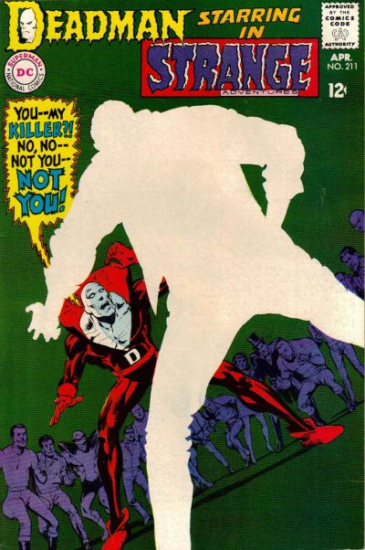
88) Strange Adventures #211
April, 1968 -- Neal Adams

The central mystery of the original Deadman series in Strange Adventures revolved around Boston Brand's search for his own killer. In this issue, he finally finds his killer, but in order to preserve the mystery, Adams (or someone in art editorial) decided to completely blank out the details of the killer on the cover, instead simply depicting him as an expanse of negative space. I can only imagine how much this cover jumped out off the newsstand compared to the rest of the regular stuff from April of 1968. This cover still seems modern even today; for example, here's a very similar design from 2005 that was lauded as one of the best covers of the year when it came out.


87) Tarzan #222
August, 1973 -- Joe Kubert

This cover is interesting for a couple reasons beyond just the usual Kubert excellence. The main thing that's cool about this cover is the way he uses color -- in this case skin tone -- to make both Tarzan and the priestess pop out of the cluttered mass of characters. In that respect it's actually very reminiscent of this infamous Barry Windsor Smith cover from Conan #24, which appeared on my Marvel top cover list. Both of these came out in 1973. I doubt Kubert was influenced by Smith, but it's interesting to think about what kind of shared influences might have been floating around at that time.


86) Jimmy Olsen #53
June, 1961 -- Curt Swan and Stan Kaye

Hey look, it's Jimmy Olsen, only he's been turned into a giant turtle monster that seems to be... eating... a bridge? Plus it has a nice yellow background. I kind of don't think this one needs much further explanation.


85) Brave and the Bold #85
September, 1969 -- Neal Adams

This is a key turning point for both Adams and Green Arrow, as it marks the first issue where Adams debuted the new, revamped Green Arrow that he developed alongside Bob Haney and Denny O'Neil. Out goes the bland green onesie, in comes the Robin Hood inspired ensemble complete with new goatee. Fittingly, Adams features Green Arrow front and center in a dramatic pose to show off the new direction. Some elements of this cover aren't perfect for me -- they appear to be standing on some sort of random grid straight out of Tron and Batman's comparatively bright costume cand cape distract from the central green Arrow figure -- but it's an arresting cover. I also want to give props to the very, very brief design period this came from, which featured the little white band across the top of the cover with the series title. I wish they had played with that more because I really like it.


84) Warlord #27
November, 1979 -- Mike Grell

Our second Grell cover comes from his breakout series, Warlord. Everyone pretty much knows what a huge Warlord fan I am and it was difficult for me to keep from stuffing this list with awesome Grell covers, because seriously, his run of Warlord covers is pretty much unparalleled for me. Instead, we'll have to settle for this example, which deserves to be blown up in order to get a good look at the detail work. This features a dynamic rendition of Warlord himself alongside a finely rendered -- and currently exploding -- background scene. And a bit of Warlord trivia for you: at the time this cover came out, Warlord was reportedly DC's top selling book. Now you can see why.


83) Justice League of America #138
January, 1977 -- Neal Adams

This is an interesting variation on a theme of sorts for Adams; for a few other high profile covers on this list (such as Wonder Woman #179 from a couple days ago), DC employed this reddish sunburst effect to dramatize the cover. Here Adams uses this technique again, only this time he goes with blue instead. One of the most famous Adam Strange covers ever and another example of how this second stringer had far more than his fair share of memorable covers.


82) Flash Comics #37
January, 1943 -- Sheldon Moldoff

Sheldon Moldoff was one of the most detailed artists working during the Golden Age, and this is one of his masterpieces. Yes, there are a couple of curious things about it -- for instance, Hawkman and Hawkgirl appear to be running even though they are in midair, while Modloff always drew their wings to look more like hair than feathers -- but this picture of the Hawks flying amidst a massive swarm of birds is just a great cover. It's too bad I don't have a scan of a better condition copy with sharper colors, but you should really blow this up to take a better look at it.


81) The Atom #36
May, 1968 -- Gil Kane

Kane returns to the list after a brief absence and he does it in a big way, no pun intended. Kane's Atom covers were renowned at the time for their inventiveness and sense of motion and this is arguably the best. It not only features some absolutely prototypical Kane figure work, it also has the cool meta-conceit of one Atom punching the other literally through the cover of the comic to reveal the pages beneath. Which all adds to one thing: it looks cool as hell. Even though I do have to admit I'm not a fan of the lettering work in the word balloon; that could have been done better.


Tomorrow: #80-71 brings you excitement like you've never known. Adam Strange! The Teen Titans! And... the Sea Devils! Be there!


Bookmark and Share

Thursday, August 12, 2010

The Top 150 DC Covers of All Time: #120-111

Welcome back to the Top 150 DC Covers of All Time countdown. If you have any questions about what criteria was used to select the covers, you can read the ground rules here in the countdown Prologue. For a complete listing of selections, check out the Top 150 DC Covers Master List. And as always, I strongly recommend clicking on the covers to see larger, better and more detailed versions of these classic covers.

Onward!


120) The Sinister House of Secret Love #1
November, 1971 -- Victor Kalin

And the award for best title goes to...

DC really jumped head first into the gothic horror / gothic romance craze in the very early 70's, putting out a bunch of gothic themed comics and covers. This is the first but not nearly the last of these you'll be seeing. But one thing this has going for it beyond the great painting from Kalin and the awesomely weird title of the comic is the design; I love how they made the comic look just like a romance novel from the time period. Later issues of this short lived series would look even more like romance novels, with the art appearing in little ovals and the font choices emulating paperbacks of the day, but this first issue puts everything together perfectly.


119) Rex the Wonder Dog #11
October, 1953 -- Gil Kane and Sy Barry

Kane strikes again, but this time with something you probably weren't expecting: a hyper intelligent dog attacking a giant purple T-Rex in front of a nuclear explosion. By all rights this should be number one on every list regardless of topic. This is what comics are all about.


118) Showcase #17
December, 1958 -- Gil Kane

Back to back efforts from Gil Kane (with plenty more to come), this time featuring Adam Strange instead of Rex the Wonder Dog. Hey, you can't win them all. Considering that Adam Strange has never been more than a second tier character at best, it's really amazing how many awesome, iconic covers he had during his brief run as a series lead. In fact, there were too many to fit onto the list, but you'll be seeing more than one in the days to come.


117) Showcase #4
October, 1956 -- Carmine Infantino and Joe Kubert

The unofficial start of the Silver Age and one of the most famous and iconic covers ever. So why isn't it higher on my list? Honestly, it's just never really worked for me; something about the reel of film and the color palette just are kind of boring. Frankly, the cover to Showcase #3, featuring the Frogmen, is much more interesting visually. Still, this is one of the most recognizable images in comics and certainly needs to be included on any countdown of top DC covers.


116) Aquaman #42
December, 1968 -- Nick Cardy

Nick Cardy returns to the list with this great Aquaman cover. Mock Aquaman if you must -- and let's face it, you must -- but his original series back in the 60's had a lot of really cool covers. This is the best of them, thanks to the dramatic angle of the action and the awesome use of the logo as a sea-floor pedestal for Black Manta to stand on for his triumphant moment. So cool.


115) Super DC Giant #21
February 1971 -- Charlie Armentano

Better known as Love, 1971 -- among the, you know, eight people who know about this comic at all -- this cover was done by Charlie Armentano. But if you haven't heard of him, don't worry, there's a good reason for that: other than one page in DC 100-Page Super Spectacular #5, this cover is the only comics work Armentano ever did. Judging by this one cover, that's a huge shame.


114) All-American Men of War #110
August, 1965 -- Russ Heath

Russ Heath returns with another classic war cover, this time from All-American Men of War. Like the Our Army at War cover we spotlighted two days ago, this cover uses dramatic lighting to create a contrast between the black background and a bomber -- this time from the outside instead of from the inside. I do think the streak of fire from the crashing fighter could have been executed a little better, but that's a small quibble with what is otherwise a great cover.


113) The Witching Hour #13
March, 1971 -- Neal Adams

I'm not entirely sure who the inker is here -- the comics database suggests it might be Dick Giordano, though based on the cool coloring effects it might be jack Adler -- but whatevs. The point is, this cover is frikkin creepy as all hell. I don't think anything more really needs to be said. You'll want to click on this one to get an up close look at that weird skull-headed spider-thing.


112) Phantom Stranger #10
December, 1970 -- Neal Adams

Another horror cover, another forgotten Neal Adams classic. Adams really seemed to dig the whole gothic girl on a staircase / in front of a mansion thing; this is just the first of multiple Adams covers with this motif to make our list and there were several more than I had to leave out. Two things I particularly like about this one are the way they archway forms both a frame for the art and a natural place for the logo to reside as well as how the beckoning hand in the foreground is echoed by the tiny figure of Phantom Stranger in the logo box.


111) Green Lantern #52
April, 1967 -- Gil Kane and Murphy Anderson

Holy smokes, it's our third Kane cover today alone. But that's why Kane was renowned as a great cover artist. There's nothing he can do about the unfortunate go-go checks, but this mirror image confrontation between Hal Jordan and his archenemy Sinestro is a classic of color and design.


Tomorrow: #110-101 presents... Mike Grell! Frank Miller! Gene Colan! And more! Don't miss it!


Bookmark and Share

Tuesday, August 10, 2010

The Top 150 DC Covers of All Time: #140-131

Welcome back to the Top 150 DC Covers of All Time countdown. If you have any questions about what criteria was used to select the covers, you can read the ground rules here in the countdown Prologue. For a complete listing of selections, check out the Top 150 DC Covers Master List. And as always, I strongly recommend clicking on the covers to see larger, better and more detailed versions of these classic covers.

Now, let's see what Day Two has in store for us:


140) Our Army at War #15
October, 1953 -- Irv Novick

This gem from the early days of DC's Big Five war books features typical guns-blazing action with some very atypical -- and shockingly bold -- coloring and inking. The dramatic fire on board this bomber gives Novick a chance to really play with the lighting and he does it to great effect; the fact that you can see the gunner behind him still firing at attacking fighters just adds to the tension. You almost feel like you might crash the plane yourself if you set down the comic.


139) Batman Family #17
May, 1978 -- Michael Kaluta

"Stalk the night shrouded streets with The Batman Family... if you dare!" Well, DC, when you put it that way, I think I'll just hide under my bedcovers instead, thank you very much. Luckily, Kaluta was able to contain his own fear long enough to provide this (literally) all-star look at the members of said Batman Family. Even the somewhat blah barbell masthead for the $1 comic line doesn't detract too much from this well-designed effort.


138) Wonder Woman #179
December, 1968 -- Mike Sekowsky and Dick Giordano

In an attempt to jump start some of their more hidebound heroes to counteract marvel's surging sales, DC revamped several icons in the late 60's including Wonder Woman. The cover for the first new issue, #178, is a fairly boring affair, but the real revamp is seen in full effect on this great cover from Sekowsky and Giordano.
The great new era logo, which replaced one of the least interesting logos in DC history, really sends this effort over the top.


137) Justice League of America #62
May, 1968 -- Mike Sekowsky and Jack Abel

Speaking of Sekowsky, here's one of his best and most unusual covers. it's like the end of Seven, except you yourself are the severed head in the box. It's disturbing. And I love the expressions on the Justice Leaguer's faces. The whole thing is creepy and disorienting. How could you not buy this comic if you saw it on the stands?


136) Green Lantern #40
October, 1965 -- Gil Kane and Murphy Anderson

Kane returns with his second Green Lantern cover so far (but not his last), this time also featuring the golden age Green Lantern, Alan Scott. This is a key issue, not just for the meeting of the two Green Lanterns, but also because it reveals the origins of the Guardians of the Universe for the first time. That might be enough by itself to land the comic on our list, but luckily, it's graced by some typically smooth and fluid figure work by Kane, who drew some of the most limber and graceful heroes in comics history.


135) G. I. Combat #130
July, 1965 -- Russ Heath

Surprisingly enough, this well known cover from the Haunted Tank strip in G. I. Combat wasn't done by the usual suspect, Joe Kubert, but instead by longtime pro Russ Heath. The colorist here wisely decided to go with a monotone hue to make the giant, ghostly image of Attila the Hun seem almost translucent against the red background. A striking image made even more striking by its total incongruity (which, by the way, I addressed in an earlier edition of Ask the Vault if anyone is interested).


134) Teen Titans #23
October, 1969 -- Nick Cardy

Less than a year after Wonder Woman got the reboot treatment, Wonder Girl followed suit with this cover from Nick Cardy. Donna Troy's new design was as modern and forward as the design of the Teen Titans book in general at the time; while not as dramatic an overhaul as the new kung fu Wonder Woman, this hip and fresh take Wonder Girl made her significantly more relevant to teens of the day (and as a result, this new version was quite a bit more successful overall than Wonder Woman's revamp). I also like the nod to DC history of having Donna jumping through a poster of herself, which echoes the tradition of having new characters leap through a paper hoop like circus animals. Very nice.


133) Superman #307
January, 1977 -- Neal Adams

Don't look now, but here's the first of our slew of covers from Neal Adams. By the time Adams did this cover in 1977 he was no longer a regular cover artist for DC, but he clearly didn't miss a beat over the years. The design of this cover, with Supergirl so far in the foreground that most of her body is off the page, helps frame the shocking image of Kandor being smashed to hell and Superman's horrified reaction in the background. Excellent composition.


132) All-Star Comics #3
Winter 1940-41 -- Everett E. Hibbard

DC's version of the knights of the round table gather here for the first time to form the first superhero team in comics history. I like the nod to the concept of having them sit around an actual round table, and the classic All-Star Comics logo in front of the bright yellow background is great. The figures may just be sitting there, but they also seem like they're ready for business as they stare out at the reader. And I don't even mind the big text box roll call at the bottom either, though you have to feel bad for Johnny Thunder, as he made the list but not the team or the cover. And thus was fated to be a second banana forever. Poor sap.


131) Weird War Tales #8
November, 1972 -- Neal Adams

Another Neal Adams effort and one of many covers I decided to include before I realized they were actually drawn by Adams. What I like best about this Weird War cover is the design decision to drop the logo down from the top of the book so that the giant golem thing is peering out over the top of it. This really emphasizes his height and makes him a lot scarier than if they had redrawn the cover to allow the cover to stay at its usual place up at the top of the cover. Honestly, it makes the whole thing and turns this from just a cool image into a true top notch cover.


Tomorrow: #130-121! Romance! Horror! War! And more Neal Adams! Plus: the death of a hero! Be there!


Bookmark and Share