Game Review: Diablo 3

Diablo 3 is out. But is it a game? Or is it the most brilliant money making scam in internet history?

Movie Review: The Avengers

Okay, okay, I posted my Avengers review. Get off my back already, geez.

The Most Important Comic Book You've Never Heard Of

Action Comics #1. Detective Comics #27. Why is All-American Men of War #89 as important as these great comics -- and why have you never heard of it?.

Tales From the Vault: Lois Lane #93

If you thought Superman was a total tool before, you ain't seen nothing yet.

Mass Effect 3: The Official Review

Mass Effect 3 isn't the end of the world, it just portrays it.

Showing posts with label Mike Grell. Show all posts

Monday, August 16, 2010

The Top 150 DC Covers of All Time: #90-81

Welcome back to the Top 150 DC Covers of All Time countdown. If you have any questions about what criteria was used to select the covers, you can read the ground rules here in the countdown Prologue. For a complete listing of selections, check out the Top 150 DC Covers Master List. And as always, I strongly recommend clicking on the covers to see larger, better and more detailed versions of these classic covers.

Here's the next soul-crunching batch of awesomeness:


90) Our Fighting Forces #71
October, 1962 -- Jerry Grandenetti and Jack Adler

This unusual cover was actually part of a mini-trend that Grandenetti and Adler put together during their years working on DC's war books; G.I. Combat #69 and #83 are two other examples. But as atmospheric and interesting as those two covers are, this one really takes the cake, due to two tweaks; first, the addition of some color to the jungle canopy gives the image an interesting three dimensionality and second, unlike the other covers, this one features two soldiers instead of one. Two soldiers and, of course, their dog Pooch. Together their worried gazes form the intersection where realism and surrealism meet -- which is exactly where most of the best comics from the Silver Age resided.


89) More Fun Comics #60
October, 1940 -- Bernard Baily

Here's another symbolic (?) image of a giant Spectre looming over some hapless sinners, this one from the character's early days. I really like the tiny figure of the gangster blasting uselessly with his Tommy gun, but the real key to this cover is the big yellow circle behind Spectre, which really helps his frightening form pop from the background.
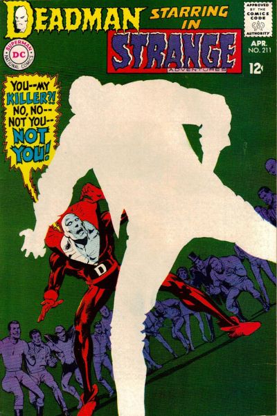


88) Strange Adventures #211
April, 1968 -- Neal Adams

The central mystery of the original Deadman series in Strange Adventures revolved around Boston Brand's search for his own killer. In this issue, he finally finds his killer, but in order to preserve the mystery, Adams (or someone in art editorial) decided to completely blank out the details of the killer on the cover, instead simply depicting him as an expanse of negative space. I can only imagine how much this cover jumped out off the newsstand compared to the rest of the regular stuff from April of 1968. This cover still seems modern even today; for example, here's a very similar design from 2005 that was lauded as one of the best covers of the year when it came out.


87) Tarzan #222
August, 1973 -- Joe Kubert

This cover is interesting for a couple reasons beyond just the usual Kubert excellence. The main thing that's cool about this cover is the way he uses color -- in this case skin tone -- to make both Tarzan and the priestess pop out of the cluttered mass of characters. In that respect it's actually very reminiscent of this infamous Barry Windsor Smith cover from Conan #24, which appeared on my Marvel top cover list. Both of these came out in 1973. I doubt Kubert was influenced by Smith, but it's interesting to think about what kind of shared influences might have been floating around at that time.


86) Jimmy Olsen #53
June, 1961 -- Curt Swan and Stan Kaye

Hey look, it's Jimmy Olsen, only he's been turned into a giant turtle monster that seems to be... eating... a bridge? Plus it has a nice yellow background. I kind of don't think this one needs much further explanation.


85) Brave and the Bold #85
September, 1969 -- Neal Adams

This is a key turning point for both Adams and Green Arrow, as it marks the first issue where Adams debuted the new, revamped Green Arrow that he developed alongside Bob Haney and Denny O'Neil. Out goes the bland green onesie, in comes the Robin Hood inspired ensemble complete with new goatee. Fittingly, Adams features Green Arrow front and center in a dramatic pose to show off the new direction. Some elements of this cover aren't perfect for me -- they appear to be standing on some sort of random grid straight out of Tron and Batman's comparatively bright costume cand cape distract from the central green Arrow figure -- but it's an arresting cover. I also want to give props to the very, very brief design period this came from, which featured the little white band across the top of the cover with the series title. I wish they had played with that more because I really like it.


84) Warlord #27
November, 1979 -- Mike Grell

Our second Grell cover comes from his breakout series, Warlord. Everyone pretty much knows what a huge Warlord fan I am and it was difficult for me to keep from stuffing this list with awesome Grell covers, because seriously, his run of Warlord covers is pretty much unparalleled for me. Instead, we'll have to settle for this example, which deserves to be blown up in order to get a good look at the detail work. This features a dynamic rendition of Warlord himself alongside a finely rendered -- and currently exploding -- background scene. And a bit of Warlord trivia for you: at the time this cover came out, Warlord was reportedly DC's top selling book. Now you can see why.


83) Justice League of America #138
January, 1977 -- Neal Adams

This is an interesting variation on a theme of sorts for Adams; for a few other high profile covers on this list (such as Wonder Woman #179 from a couple days ago), DC employed this reddish sunburst effect to dramatize the cover. Here Adams uses this technique again, only this time he goes with blue instead. One of the most famous Adam Strange covers ever and another example of how this second stringer had far more than his fair share of memorable covers.


82) Flash Comics #37
January, 1943 -- Sheldon Moldoff

Sheldon Moldoff was one of the most detailed artists working during the Golden Age, and this is one of his masterpieces. Yes, there are a couple of curious things about it -- for instance, Hawkman and Hawkgirl appear to be running even though they are in midair, while Modloff always drew their wings to look more like hair than feathers -- but this picture of the Hawks flying amidst a massive swarm of birds is just a great cover. It's too bad I don't have a scan of a better condition copy with sharper colors, but you should really blow this up to take a better look at it.


81) The Atom #36
May, 1968 -- Gil Kane

Kane returns to the list after a brief absence and he does it in a big way, no pun intended. Kane's Atom covers were renowned at the time for their inventiveness and sense of motion and this is arguably the best. It not only features some absolutely prototypical Kane figure work, it also has the cool meta-conceit of one Atom punching the other literally through the cover of the comic to reveal the pages beneath. Which all adds to one thing: it looks cool as hell. Even though I do have to admit I'm not a fan of the lettering work in the word balloon; that could have been done better.


Tomorrow: #80-71 brings you excitement like you've never known. Adam Strange! The Teen Titans! And... the Sea Devils! Be there!


Bookmark and Share

Friday, August 13, 2010

The Top 150 DC Covers of All Time: #110-101

Welcome back to the Top 150 DC Covers of All Time countdown. If you have any questions about what criteria was used to select the covers, you can read the ground rules here in the countdown Prologue. For a complete listing of selections, check out the Top 150 DC Covers Master List. And as always, I strongly recommend clicking on the covers to see larger, better and more detailed versions of these classic covers.

Let's see what books round out the first fifty selections.


110) Green Arrow #1
February, 1988 -- Mike Grell

Full disclosure: I love Mike Grell. I could easily do a whole Mike Grell Top 50 Covers list without even breaking a sweat. Between his long runs as cover artist on Warlord and Green Arrow, Grell was probably the most consistently excellent cover artist ever. Unfortunately, I didn't have room to fit in nearly as many of his covers as I would like, but one that did make the cut is this symbolic painting of Green Arrow towering over his new home, Seattle, where he would remain for the rest of Grell's 80 issues on the title. A strong start to a great series.


109) Tomahawk #116
June, 1968 -- Neal Adams and Jack Adler

It's Adams again, this time where you least expect him -- on a western (though, technically, Tomahawk wasn't actually a western either... it's complicated). Aided immeasurably by the inks and color work of Jack Adler, this almost impressionistic image of a Native American bearing down for the kill sets an awesome mood.


108) Girls' Romances #108
April, 1965 -- Gene Colan

This is a solid if typical design from Gene Colan -- weeping woman in foreground, brooding love interest in the background and a nicely placed thought balloon filling some empty space. A fine if unspectacular cover. Except, somebody had the brilliant idea of just coloring the entire thing bright pink. This was perfectly in keeping with the pop art sensibilities of 1965, but wildly innovative for the usually conservative DC romance line. As a result, by being modern, this cover ended up looking well ahead of its time. A striking, memorable cover.


107) G. I. Combat #88
July, 1961 -- Joe Kubert and Jack Adler

This is an interesting example of the effects of text on cover design, which we've been discussing in the comments over the course of this countdown. There's no question that the image is perfectly powerful without any text and would work just fine -- and arguably better -- without the words. However, in this case, the text isn't added to provide information but rather to set a mood. Kubert was very into the ironies of war -- many of his stories were based entirely on this concept -- and while it's unlikely that any soldier would write "Danger Sniper!" on his helmet in giant white letters, the idea that someone with that would then be blasted through the head with what appears to be a 7 million caliber bullet is perfectly in keeping with Kubert's sensibilities. I think because of this, the cover works better with the text, but you could argue it either way.


106) The Witching Hour #1
March, 1969 -- Nick Cardy

Another great cover from the criminally underappreciated Nick Cardy, who still has several more covers to come. I love the mood of this, the composition and the awesome logo; what a great way to launch a new title. However, I did have to drop this significantly down the list for thwo reasons. The first is really just a tiny nitpick; I think they could have colored the figure of the witch on the tower in the foreground just a little more subtly in order to make her pop from the shadows more. The second is a major wtf: if you look to the left edge of the cover, you'll see what appears to be a pillar of buildings going up the side of the cover. I've studied this cover at great length and just have no idea what's going on there, it's completely incongruous with what's happening in the rest of the picture. I mean, M.C. Escher wants to know what's happening here. If I'm missing something obvious, let me know, but this one has me stumped. Luckily, the composition draws your eye away from this and towards the moon, so it's not a fatal flaw, but someone messed something up or else this might be a top 50 cover. As it is, it's still ridiculously cool despite these issues.


105) Supergirl #1
September, 1996 -- Gary Frank and Cam Smith

This cover gets props for a couple reasons, the first and most obvious being that it provides and instant and dramatic introduction to an all-new, modern Supergirl that readers can see at one glance is wildly different from the versions that have come before. it's really a very effective image. From a design perspective, though, it's almost more impressive considering that the logo for the comic, such as it is, appears only as a tiny, half-obscured sticker on Supergirl's skateboard. it's a bold decision, but it only emphasizes how powerful the image is; with just one look at the cover you know exactly who the character is and what the tone of the series will be, making this perhaps one of the strongest first issue covers in DC history.


104) Limited Collectors' Edition C-25
1974 -- Neal Adams

There's not a whole lot to say about this one other than the fact that it's a very simple design -- Batman running across a big red background -- that is executed well enough that this depiction of Batman has become iconic through posters and lunchboxes and whatever. It's just a sharp, cool looking cover.


103) Wonder Woman #1
February, 1987 -- George Perez

You're going to want to blow this one up to really appreciate the intricate Perez detail work on this cover. Plus, most of the time, when this is referenced you only get to the the front panel and not the montage on the back cover as well. This, of course, represented a major overhaul of the entire Wonder Woman mythos, from her history right down to the new logo. One of the best known images of Wonder Woman ever drawn, by one of comics most accomplished artists.


102) Legion of Super-Heroes #294
December, 1982 -- Keith Giffen and Larry Mahlstedt

Fans of the Legion swear by the cover that preceded this one, but for my money, this Giffen image of the Legion bowing in subservience to the giant floating visage of Darkseid is the real classic. This storyline re-introduced Darkseid as a major league villain in the DCU and the swirling vortex of crimson Kirby crackles behind his head really help this cover pop.


101) DC Special #3
June, 1969 -- Neal Adams and Nick Cardy

Here's a great and unusually art pairing: Neal Adams with inking by Nick Cardy, for our second Supergirl cover of the day. The results, as you might expect, are sweet, as DC decides to embrace modernism and feminism and promote its female superheroes for basically the first time ever. The looks on the male superheroes' faces are priceless, as though they can't believe a bunch of skirts are taking over their book, but the real draw is the exuberant Adams Supergirl in the middle. I have to admit that even though I don't like the character or, really, any of her stories, I still have put together a decent collection of bronze age Supergirl comics; there's just something about a well drawn Supergirl cover that works every single time regardless of context or content. A classic as well as a personal choice.


Tomorrow: It's #100-91, featuring Superboy! Norm Breyfogle! And... Muhammad Ali? Buckle in!


Bookmark and Share

Monday, August 9, 2010

The Top 150 DC Covers of All Time: Prologue

Aaaaaand we're back. Yes, a year after rocking the internet world with The Real Top 70 Marvel Covers countdown, The Vault (which means, you know, me) is back with an exponentially larger feature: The Top 150 DC Covers of All Time. Yes, 150 isn't technically exponentially more than 70 -- that would be, like 4900 covers or something -- but the task itself was vastly more difficult, given the fact that DC has been the nation's number one comics publisher for decades and as a result has vastly more covers to go through than Marvel.

But that's exactly why I wanted to take a shot at ranking DC's incredible output. Because, let's face it, DC has put out some of the greatest comic book art of all time and not just in superheroes, but in every possible genre, from mystery to fantasy to romance, from westerns to war to teen humor. It's really an incredible output covering the entire history of comics, featuring art from the greatest artists of all time.

For the next fifteen long-ass days, then, we'll be counting down the Top 150 Covers in DC history as determined by a panel of experts: me, myself and I. Like last time, I did my best to incorporate the views of others in order to make this as fair and balanced a list as possible. In particular, the folks at the Comics Should Be Good blog and the CBR forums deserve recognition, as I've been informed and enlightened by their opinions and expertise on DC comics over the past year while this list has been fulminating. Having said that, unlike my Marvel list, there doesn't seem to be nearly as much consensus or discussion regarding DC covers, meaning that this list is by necessity going to reflect my personal opinions even more than the Marvel list did.

So what makes up a "Top" cover as opposed to a "Best" or "Most Iconic" cover? "Top" is a nicely nebulous term that for my purposes encompasses both of these factors and more, as in some ways I'm comparing apples to oranges when trying to weigh the merits of a superhero cover from 1940 against a sci-fi cover from 1955, a romance cover from 1964 and a horror cover from 1971.

Here, then, are the basic criteria I used for this list, tweaked slightly from when I did the Marvel countdown:

1) Iconography. Some covers have transcended the actual image on the cover or the importance of the story within the comic to become iconic images. This can happen for several reasons – the first appearance of a major characters, the story within the comic, the issue’s collectability or just the beauty of the art itself – but the result is that the cover has become iconic not just to readers of that book, but to comic fans in general and in some instances to the public at large. If I felt a cover was iconic, I gave it more consideration than other covers of similar design or attractiveness that are not as well known.

2) Importance. This ties in to the first criteria, but some stories are so important for one reason or another that the cover image becomes ends up becoming iconic as a result regardless of artistic merit. When researching the choices, there were some covers that I personally didn’t feel were particularly great images or designs but which other comic fans cited over and over again as being a top cover primarily due to the importance of the events in the comic. Many first issues, first appearances or character deaths fall into this category.

3) Popularity. No, it's not the end all and be all, but how popular a cover is directly ties in to some of the other factors here. What makes a cover iconic or memorable, after all, is mainly the visceral response it (and the story inside the book) provokes in the reader. So while I don’t personally love all the covers on the list, I did try to incorporate other opinions and spent a good deal of time reading different messages boards and studying other people's lists (to the limited extent that I could) to see just which covers really are widely popular with the greater fanbase.

4) Art and Design. Some covers aren’t necessarily important or iconic but are so beautifully drawn that they merit inclusion on the strength of the art and design alone (though it should also be noted that some covers have also become iconic solely because of their artistic merit). Of all the criteria for my list, this is the most subjective and there are a handful of covers on my list that are basically personal preference. I tried to be as objective as possible when compiling this list, but art defies objectivity, so this cannot and perhaps should not be avoided. Whenever a cover made it on to my list solely through personal preference it will be noted in my comments. Though this is the last of the four major criteria I'm listing, it's actually the most important to me personally.

In addition, before we get started, there are a few notes specific to this DC list I'd like to mention. Firstly, as I was compiling the list, it became apparent to me that, as I suspected, DC has generally been much more bold and experimental with its designs than Marvel. Part of this, of course, is as a result of Marvel's competition; it should come as no surprise that the two periods with the most creativity in terms of cover design were the early Golden Age, when DC was still competing with a wide array of other publishers for industry dominance, and the Bronze Age -- roughly 1967-1974 -- when DC had to react to Marvel's sudden market surge. As a result, those two periods, particularly the latter, have much greater representation than other, more stagnant design eras (particularly the period from 1946-1967 when DC, safe at the top, locked into an extremely stagnant and boring design aesthetic).

One side effect of this imbalance is the unmistakable dominance of one artist, Neal Adams. Adams has two major things going for him. Firstly, he's justly revered as one of the greatest comic book artists -- particularly in cover design and execution -- ever. And secondly, the period of his greatest output coincided with Carmine Infantino being named art director in 1967. This meant that Adams (and the other artists) essentially had free reign to experiment with design elements, and Adams in particularly was massively prolific, providing dozens of covers for every genre DC was publishing, many with envelope pushing designs. So you'll be seeing a lot of him for those reasons.

On the flip side, there are three things you won't be seeing much of -- or any of -- on this list. The first is modern comics. The main strike against putting them on a list like this (though there are a few that snuck in and I did review most of them) is simply that they are, by definition, new, meaning that it's too early to say just which covers will end up being memorable or iconic once enough time has passed to judge such things, which I generally think takes a good 10-15 years at minimum. This is further complicated in my opinion by modern coloring techniques. While classic four color comic books may have been simplistic compared to today's excellent coloring, those simpler colors also provided the side effect of strengthening and highlighting the composition and design of a cover, whereas today's more subtle coloring techniques do just the opposite, often obscuring and muddying composition in service of muted tones and gradients. The result is that many modern covers, while individually beautiful and expertly rendered, are not particularly memorable; they tend to blend together. Good? Yes. Memorable? Not necessarily.

This actually is not quite as true for DC as it is for Marvel, thanks to the fact that DC is much more experimental with their design work. But that is mostly thanks to their groundbreaking Vertigo imprint, which brings me to the second thing you won't be seeing on this list: Vertigo Comics. I had originally intended to include them; however, after studying their output, I came to the conclusion that Vertigo's aesthetic was so inherently different from almost everything else DC has done that it needed to be considered separately. Comparing apples to oranges is one thing, but this would be like comparing apples to dominoes. At some point I hope to do a separate top cover list for Vertigo so we can look at some of the awesome covers they have been doing over the past 20 years, but for this list, I had to leave them off. [This also caused some issues in terms of titles like Hellblazer and Swamp Thing, which started at DC and switched to Vertigo. it's a little complicated but essentially I decided to leave those titles off the list entirely and treat them as Vertigo in their entirety]

And for similar reasons, I also left off DC's pre-hero covers. While some people seem to be under the impression that early Golden Age art is sub-par, the opposite is true; DC's mid-30's, pre-hero covers feature impeccable art from some of the best magazine illustrators of the time. But they also are completely different in style, tone and substance than anything DC did once superheros came into existence, so I decided to leave them out and look at them closer another day.

But, anyways. That's a whole ton of talk with not nearly as much action. Or Action. And after reviewing 10,000+ covers, I'm ready to actually show some of them now. So without further ado, let's stop the chit-chat and get to it: The Top 150 DC Covers of All Time.


Tomorrow: #150-141. The Justice League of America! Wonder Woman! Zatanna! And more! Be There!

And you can check out The Top 150 DC Covers of All Time Master List here.


Bookmark and Share

Friday, November 13, 2009

Great Moments in Comics: The Jon Sable Dance-Off

Welcome to another Great Moment in Comics, where we examine some of the unique and amazing stories that have made the medium what it is. Last time, you may recall, we presented you with the dramatic and moving story behind The Strange Death of Dr. Synne, which surely ranks up with the Galactus Trilogy as one of the seminal moments in Marvel Comics history. Today, though, we have managed to top even that masterpiece, so read on as The Vault proudly presents The Jon Sable Dance-Off.

For those of you who aren't familiar with the story, Jon Sable was a creator owned series from acclaimed writer/artist Mike Grell. Launched in the early 80's at First Comics, during the heyday of independent publishing, the series was a critical and commercial success, lasting 56 issues before Grell left, at which time it rebooted and continued for another 27 issues. 83 issues of an independent comic is nothing to sneeze at and it's a tribute not just to Grell but also to the draw of the eponymous main character, a mercenary with a code of ethics that always saw him on the right side of the fight.

Jon Sable was also groundbreaking in another arena, as it featured one of the earliest (and still one of the only) openly gay characters in comics in the form of Broadway performer Grey Adler. While the aggressively heterosexual Sable was at first uneasy around Adler, he quickly overcame his prejudices, leading to a friendship between the two men that was interesting and unique for the time.

Even more unique, however, was the event that sealed their friendship: The Jon Sable Dance-Off.

Taking place at the beginning of Jon Sable #15 (from August, 1984), the story begins with Gray and Job leaving a ballet performance on Broadway, which leads to a brief discussion about Jon's original uneasiness with Gray's orientation, a conversation highlighted when one of Gray's gay friends mistakes them for a couple.

This semi-humorous moment, however, becomes deadly serious just moments later when the two round the corner and walk right into one the middle of one of New York's legendary street gangs, which were especially prevalent and dangerous in the early 80's. Just like Gray's friend, these boom-box toting thugs mistake Gray and Jon for a couple, which can lead to only one thing: bloodshed.


Of course, the readers know that Jon Sable is a world renowned mercenary and no street gang is going to give him issues, even if there are five of them. Sighing that he had just begun healing from his last fight, Sable wearily took a step forward, ready to defend them both. Except, Gray has a better idea, and pushing Sable aside he takes charge, even finding the time to indulge in a little Superman-esque tie removal first:


That's right, suckers! It's time to settle this like real men do: with a dance-off! Is it on? Oh, it's beyond on, son: it's already been broughten.

No words are necessary for the grandeur that takes place next, something even Grell himself realized at the time, because he chose the perfect style to show the action: a silent montage.

Take it away, Gray!


The result of this showdown? Well, when men dance with passion there can be no losers -- only winners. And so, the former adversaries instead shake hands, having found common ground. Because when the groove moves you, there can be no gay or straight, no black or white, no rich or poor. There can only be the universal language: the power... of dance.


Truly, one of the Greatest Moments in Comics history.


Bookmark and Share

Sunday, November 8, 2009

New Comic Cavalcade

Hey kids! Comics! yes, it's time for another batch of new comics reviews. By now you're probably all familiar with my pull list, but while I'd love to present you with reviews of all sorts of new and different titles every month, my finances prevent that from happening. However, there's a simple solution for that: comp copies. You listening, Marvel and DC? How about you, Dark Horse and Image? Well, maybe not Image, but if anyone else out there wants to send me some free comics to review, let me know and I'm sure we can work something out.

Until that happens, though, here are some reviews of titles you've no doubt grown to love, with one special surprise:


MODELS, INC. #1

Paul Tobin writing, Vicenc Villagrasa and Terry Paillot art

Yes, it's MODELS, INC. #1. Technically this came out a little while ago, but if you're that offended, you can always ask for your money back. Oh, that's right, this site is free. So suck it!

I mean, thanks for reading. And if you have been reading awhile, you may recall a rant I did a little while ago about the way women are portrayed in comics and how one of the lamentable side effects of this is that there are very few comics actually aimed at bringing in new female readers. Well, MODELS, INC. is the exception: it's a collection of Marvel's most famous romance and teen comic characters from back in the 50's (such as Patsy and Hedy, Millie the Model and Chili), revived in a new series that mixes modeling with drama.

So how is it? Well, it's no Night Nurse, but it's not terrible either. There's some pre-requisite action (our gals stopping some petty thieves, which isn't hard considering Patsy Walker is a member of the Avengers) and some melodrama when the fashion photog gets show and one of the models is set up as the killer. Some of the dialogue and setup seemed a little forced, but overall it wasn't bad. Plus, of course, this issue features a backup story where Tim Gunn from Project Runway dons a suit of Iron Man armor to defeat a platoon of AIM agents trying to pilfer superhero costumes from a Janet Van Dyne fashion retrospective. Now that's awesome.

My Grades: The main story gets a B; the potential is there, which outweighs the awkwardness. The backup story gets an A+, of course. And the cover and general design of the series, which emulates fashion magazines, gets an A as well.


Jonah Hex #49

Justin Gray and Jimmy Palmiotti writing, Cristiano Cucina art

Okay, back to our regularly scheduled comics, which means DC cult books that nobody else on the planet seems to be buying. Which is fine as long as they keep publishing them anyway. Somehow Jonah Hex has managed to hang on for 49 issues despite selling roughly 12k copies a month, which is a miracle. What could possibly be keeping the series afloat?

Well, it might be because they are expecting a boost from the upcoming Jonah Hex movie next year, but it might also be because the series continues to be well written and well drawn, garnering it critical acclaim. Of course, acclaim doesn't put food on the table, but it does lead to stories like the "Six Gun Wa"r arc that concludes in this issue; the first extended storyline in the current series, "Six Gun War" features a who's who of guest stars and hangers on, bringing together pretty much every character not just from the first four years of this volume, but also from the original Jonah Hex series. That means the return of Hex's arch-enemies, Quentin Turnbull and El Papagayo, and help from Hex friends such as Bat Lash, Tallulah Black and El Diablo.

Yes, for hardcore Hex fans like me, this has been a great, fun read. Unfortunately, the very end is a bit of a letdown, as Gray & Palmiotti decided to keep their options open for future stories at the expense of giving this arc the kind of epic closure it probably deserved. The fact that they felt this was necessary, however, is a good sign, because otherwise this would have been a perfect way to close out the series if such a thing had been called for. So that, at least, was one bright spot in what otherwise might have been just a tiny bit of a letdown.

My Grades: The arc as a whole gets a B+; the pacing was just a bit rambling in places and the legion of super-assassins sent after Hex had more potential than they ended up displaying. But it was still a fun read anyway. This issue gets a B; it would have been an A if not for the unsatisfying conclusion.


Warlord #8

Mike Grell story and art

So, for the last few months, I have been lamenting the fact that nobody has been reading or buying Warlord, a situation that I am convinced was caused because creator Mike Grell was only writing the series instead of also drawing it. Well, this issue (and last) Grell actually does pick up his pencil and draws Warlord as well. So, hurray for that.

However, as great as Grell's art is (and I think he gets better and better as time goes by) I'm still worried that this might be a case of too little, too late. The series should have led off with Grell art to get people on board to begin with; bringing him on for issue 7 is just playing to an empty house. And unfortunately, the story still isn't hitting on all cylinders. This two-parter involves a mysterious woman, some memory loss and some hazy philosophizing, but sadly it doesn't feature Shado, so similarities end there. Instead, this is a vignette that discusses the nature of Warlord's character (familiar ground for Grell) and does so with some unusually choppy storytelling (the jump from present to flashback midway though page two is jarring at best).

Mr. Grell, I'm begging you: please, please get this up to speed before DC and the reading public gives up on this book completely.

My Grade: The art gets a big fat A+. I can only give the final product, however, a B at best, and that's entirely on the strength of the art; the story lets it and the reader down.


Bookmark and Share

Friday, September 18, 2009

New Comic Cavalcade

Today in New Comic Cavalcade, we review a batch of shiny comics, hot off the presses, including Thor Annual #1 and Warlord #6. But first, we'll start off with something a little different from my usual reading list... Wonder Woman!


Wonder Woman #35
Gail Simone and Aaron Lopresti

Confession time: in my two and a half decades of reading comics, I've never actually purchased a new issue of Wonder Woman. Hard to believe considering some of the other random crap I've bought over the years (yes, I did buy a copy of Youngblood #1, but it was for snark purposes only, okay?), but sadly true. I like the character well enough in theory, but in practice when I look through her comics there just doesn't seem to be any there there, if you know what I mean.

Well, after a critically reviled new launch, the current series of Wonder Woman has been handed over to arguably the most prominent female writer in comics, Gail Simone. With this in mind, I decided to actually give Wonder Woman a try and read #35. My verdict: it's okay.

That may seem a bit tepid, but it's not meant as a slight. The comic was okay. It wasn't bad. I didn't dislike it. In fact, I might be interested enough to read the next issue. There were a few strikes against me going into this issue, of course, the main one being that it's the second part of a two-parter so I had no idea what was going on (and I haven't read an issue of Wonder Woman published after 1975, so I really have no idea what's going on). Simone handles this okay, though; while there were a few points I was confused at, most of it wasn't major enough to detract from the book. I did have a couple issues with the story -- for instance, a pretty big deal is made of her using her lasso to free one character from mind control, only to have that character basically vanish until the last couple pages which made me wonder what the big deal was. Also, the story set-up kind of didn't have a lot to do with the climax; part way through a Fight Club type competition, this goddess shows up and shunts Diana to this island somewhere and the two fight/talk it out there, with basically no connection to the preceding events. In other words, I was just getting into the framework of the story only to find out that the important stuff had almost nothing to do with the set-up. That was a bit of a bummer.

On the other hand, I really liked the relationship between Wonder Woman and Black Canary. Yes, I'm a sucker for Black Canary anyway, but this was really nicely done and I'd like to see more of it. And even though I didn't know what they were talking about and was a little miffed about the whole Fight Club frame story being ignored, I was intrigued by the developments between Diana and Pele.

Overall, then, I have to say the book was okay. It almost seemed like this should have been a longer story, maybe three issues, something I never thought I would say in this day and age; if the battle with Pele was the middle part and they had come back to a full issue of Fight Club, Dr. Psycho and Sarge Steel, with Black Canary battling hordes of villains and whatnot, it would have felt like the set-up was a more important and more organic element. As it was, the ending seemed a bit rushed, like two stories had been grafted together at the last second. So while it was pretty good, it could have been better.

But that's a good thing. I read a lot of comics these days that seem like there's basically no hope. For my first issue of Wonder Woman, then, the fact that it has potential is a pretty big positive.

My Grade: I'm going to give it a B instead of a B-. There wasn't anything really actively bad in this issue, it just didn't live up to its full potential.


Thor Annual #1
Peter Milligan, Mico Suayan, Tom Grindberg and Stefano Gaudiano

Another month, another issue of Thor that's not actually an issue of Thor. Granted, at least this is an annual, which suggests it's part of the actual Thor storyline, but it also would be cool if Marvel could put out a monthly Thor comic without having to resort to untold dozens of one-shots and side projects. Back in my day, we called those fill-in issues, and putting lipstick on a pig doesn't make it a prom queen.

Of course, the weird truth is that most of those fill-ins were actually better than the main comic. That's not the case with this Annual though, and you can take that for whatever you want. Yes, this story does tie in directly with the main storyline going on in Thor. It's a perfectly serviceable modern comic, which is to say that the writing is fine, the art is fine, a bunch of red shirts and casually murdered to give the story impact and everything that happens is set-up for some future story. Sometimes those future stories actually deliver on this promise and then sometimes you publish five years of New Avengers.

If I seem overly harsh on this comic, well, it's not really that bad of course. The comic is fine. It does have a couple good parts, namely the return of one of Thor's arch-enemies, the Egyptian death god Seth. And it moves the story of Thor along from a character standpoint, as he is able to put behind him his unintentional killing of his grandfather Bor. They also use multiple artists to good effect, with some guy named Mico Suayan providing really nice pencils for the frame story. So, yeah, it's fine. I just hope that at some point it leads to something.

My Grade: Two grades for this one. The actual comic itself gets a B. It's fine. My enjoyment of the comic deserves a C, however. Thor's been back in the Marvel Universe for two years or more now; I'm not really in the mood for even more set-up at this point.


Warlord #6
Mike Grell and Chad Hardin

Speaking of getting to the point, here's Warlord #6, the last issue of the introductory arc from Mike Grell. As my legions of long-time readers know, there's probably no comic being published now that I want to succeed more than Warlord. Please, Comic Gods, let this comic live!

Unfortunately, while this issue is a decent climax to the story, it's also still not that great. I just can't get into the art. Some of the page layouts are decent -- there are some nice sequences with big, dramatic fight scenes -- but other caused me to reread the page multiple times to figure out just what was happening. And even when the layouts were good, the actual artwork just didn't float my boat anyway. Plus, the ending (not the second ending, which is a set-up for Deimos (yawn)) was a bit of a puzzler. If Jennifer was powerful enough to block this guy's magic and send him fleeing for another world, why did any of this need to happen? And just where did he end up in that last panel? Is he back on Earth, trapped in a cave because of the rockslide from previous issues? Or is he inside that temple, buried by the rubble from that cannon blast? Or... what?

I have no idea what's going to happen in the next storyline, but I'm begging you guys at DC: if you're reading this, bring in a different artist, because something needs to be done to save this book. The sales are terrible. Grell is a fine writer, but this isn't his strongest stuff and he really writes best for himself anyway. But whatever you do, if this book gets canceled, for the love of god you'd better tie up this Tinder subplot before it ends or I will explode like a supernova. And yes, I am going to mention this in every single review of Warlord until they resolve it.

My Grade: C+. But the covers are still all A's at least.


Bookmark and Share

Saturday, August 8, 2009

New Comic Cavalcade

Comics up for review this week include: Captain America Reborn #2, Warlord #5, Astro City: Dark Age Book Three #4 and Jonah Hex #46

Once upon a time, I used to be a complete new comic junkie. At one point I was buying 39 titles a month. However, that’s when comics cost about the same as a can of Coke, whereas these days for the price of a new issue of Fantasitc Four I could buy majority ownership in a bottling plant. It’s true that I’m not real excited about many of the storylines going on in comics these days, but the fact is, back when I was buying everything I could get my hands on, there were a lot of crappy or disappointing stories as well. Secret Wars II, anyone? The difference now is simply one of finances; if I had an unlimited amount of money to blow on stuff, I’d probably be buying as many comics today that I don’t like as I did when I was a kid.

This is all my way of saying that reviews of new issues won’t be a regular feature here, with one caveat: from time to time I do find myself in a store that sells comics and whenever that happens, I read as many for free as I can before I get tossed out. So in the future, you may very well see some of these Stolen Reviews, as I not only read comics so that you don’t have to buy them, I also read comics so that I don’t have to buy them either.

Today, though, we have a special treat, as four of the six titles I am currently buying came out with new issues. So lets get down to it:


Captain America Reborn #2

Ed Brubaker, Bryan Hitch, Butch Guice

First off, I love Ed Brubaker’s Captain America run. I’ve read just about every Cap story since his Silver Age revival (though I missed a couple years of stories at the beginning of this decade) and for my money Brubaker and Steve Epting have put together the best Cap run ever. That’s right, ever. So I am inclined to go into Reborn with a slight bias towards liking the story, even if it superficially resembles the last season of Lost. Er, that is, Slaughterhouse Five. Or... 1602? Whatever.

Having said that, this issue didn’t really do much for me. It’s not that it’s badly done; on the contrary, Bryan Hitch is turning in some typically excellent pencils, though I’m not entirely sure he and Butch Guice are the best pairing (no slight intended to the always solid Guice). The problem here is simply that this is the second part of a five part story, and in today’s terms that means it’s the Issue Where Nothing Happens. Spoiler Alert: nothing happens. Cap continues bouncing around and Bucky and Natasha finish getting themselves captured by Norman Osborn. That’s it. That’s the whole issue. Yes, there’s a lot of action and fighting and whatnot, but I sort of got over the whole comic book fight sequence thing about twenty years ago, so this doesn’t hold a lot of draw for me. Unless the punch is a donkey punch it's not going to catch my attention.

Once this story is all collected in a handsome slipcover edition, I’m sure it will be excellent. But as it stands, the individual episodes so far have been a bit lackluster by Brubaker and Hitch’s high standards.

My Grades: A- for potential, B for the actual comic book.


Warlord #5
Mike Grell, Chad Hardin, Wayne Faucher

Let me start by begging you to go out and buy Warlord. I’ve been waiting nearly 20 years for Warlord to get an ongoing series again (that thing from Bart Sears doesn’t count) and when it finally comes out, it’s even being written by Mike Grell himself. How could you ask for anything more? But right now sales of this book are so subterranean the lettering is being done by Mole Man and if it ends up getting canceled again I’m going to need a scuba mask to keep from drowning in my own tears.

In fact, I’m so desperately hoping you buy the book that I’m going to ask that you skip the rest of this review, because unfortunately it’s not too positive.
On the plus side, the covers are absolutely gorgeous; Mike Grell has long been one of the finest pure pencillers in the business, and he has a terrific sense of design, meaning that his covers are almost always fantastic. Unfortunately, he’s not doing the interiors of the book. Chad Hardin is not bad, mind you, but he’s not Mike Grell either; his art is workmanlike at best and right now that’s not what Warlord needs from either a sales or creative perspective.

As for Grell’s writing, well, it’s okay too. It’s actually a little hard to judge because he usually draws his own work and it’s possible that there’s just a disconnect between what Grell is writing and what the artists are drawing. In other words, if Grell were drawing this, I think it would seem like better writing. For people who don’t enjoy Grell, though, well… stay away. This isn’t quite as didactic as some of his more politically slanted issues of Green Arrow, but it has its moments and there was one point in an earlier issue where the dialogue and message were so Grellian that I think if it had been in a police lineup I could have sent Grell up the river just on cadence alone.

All in all, it’s not a bad comic, but it’s not a great one either. It’s only the first arc, so a lot of stuff is still being set up, but unless something changes fast I’m not sure the title will last long enough for it to hit its stride. Which is too bad. Because if they don’t finally resolve this Tinder storyline, I swear to God I am going to cut a bitch for real.

My Grade: This gets an A+ in my mind, but unfortunately it’s only a C on paper.


Astro City: The Dark Age Book Three #4
Kurt Busiek, Brent Anderson

Before I get into this comic, I just want to mention the cover. One great thing about Astro City has always been the sweet Alex Ross covers. This time, though, I’m not sure just what was going on with the coloring, but I don’t particularly care for it. It’s all this very muted… color… I don’t even know what color that is supposed to be, but it looks like some kind of pudding or yogurt. I just don’t think this color scheme is doing the art any favors.

Anyway, on to the comic. There’s not a whole lot to say about it at this point. I mean, it’s Astro City, so you know it’s going to be very good at the worst and brilliant at best. This only falls into the very good category for a couple reasons. The main one is that Book Three of Dark Age ends with, well, mainly with a set up for Book Four. Which is fine except I’m beginning to feel like the comic is called Dark Age because the first issue of it came out before the renaissance; I think there was a variant cover by Fra Angelico. It’s no fault of Kurt’s that he’s been unfortunately slowed up by health issues, but with this story literally going on for half the decade I was hoping for a little more closure.

It’s also the first issue of Astro City I can remember where the big super hero fight is actually a major part of the plot instead of just a lens for character development to be seen through. That’s not to say that the focus swerves much from Eddie and Royal; but they are caught up enough in the action so that the big throwdown gets a lot more screen time than I have come to expect from Astro City.

Luckily for everyone in the comics world, Kurt has recently announced that Astro City will be going monthly again, meaning that after the Dark Age storyline finishes, the regular series will resume and we’ll once again be treated to tales from all corners of Astro City instead of just this one. I’m looking forward to the resolution of Dark Age and finally learning just what the fate of Silver Agent is, but I’m looking forward even more to being reintroduced to the rest of Kurt’s wonderful world.

My Grade: B. But I sense an A coming on the horizon.


Jonah Hex #46
Justin Gray, Jimmy Palmiotti, Cristiano Cucina

This is an interesting one for me. I’m a big fan of Jonah Hex, thanks to the fact that the vault of comics I received as a kid had a long run of Weird Western Tales. Though I like the classic version of Hex more (because, well, he’s more likeable), I’ve been very pleased with this current series. Interestingly, it sells about the same as Warlord, but while I expect that title to be cancelled at any second I think Jonah Hex has more security, thanks to established trade sales and the upcoming Hex movie.

So you don’t have to worry about me begging you to buy this book. If you did, though, you’d be picking it up at a good time to jump aboard. This is the third part of a six part storyline, which means it’s the first extended arc in the entire series. One of the draws of the series, in fact, is that it’s one of the few comics left where you can expect to get a whole story in one mag, which seems to be a lost art. Still, picking up this arc would be a good way to get introduced to the characters because it is essentially a reimagining of Hex’s origin; not only do you get his backstory but you also get introduced to the two best loved and best remembered classic Hex villains, Quentin Turnbull and El Papagayo, who are making their first appearances in the new series.

This storyline also ties together several threads form earlier in the series, including appearances by Hex’s friends (which is a gross misuse of the term; reluctant companions with complementary goals is more like it) Bat Lash, El Diablo and Tallulah Black. The result is a winding, action filled epic that sprawls across years of Hex’s life and covers territory from America to Mexico. In point of fact, I’m enjoying this storyline more than most of the one shots, not because it is longer but because it has a different tone; earlier issues sometimes devolved into exercises in gratuitous gore and violence in an effort to be cutting edge, but with a tighter plot requiring more focus, what excesses exist are more fully earned.

My Grade: This specific part of the arc only gets an A- because the pacing was a bit strange, but the whole arc so far gets an A.


Bookmark and Share